Runs Expectancy
1 Introduction
This document contains several articles from the “Exploring Baseball Data with R” blog on the general topic of runs expectancy which is a central topic in sabermetrics.
Section 2 describes the process of downloading play-by-play Retrosheet data for a specific season. Another function is helpful for computing the runs values for all of the plays that season.
Section 3 discusses the runs expectancy matrix which can be used to evaluate values of plays and different strategies during a game. This section describes the use of a graph to summarize the main patterns of this matrix. We use this graph in Section 4 to show how runs expectancies have changed over six eras of baseball.
One of the components of the runs expectancy matrix is the notion of a state of an inning defined by the runners on base and the number of outs. Section 5 talks about the different level of excitements in these inning states and shows how the frequencies of different states have changed over 20 seasons of baseball.
A popular modern way to evaluate batting performance is the weighted on-base percentage or wOBA. We explain in Section 5 how to use Retrosheet play-by-play data to compute the weights of the different positive outcomes that are used in the wOBA.
Runs values are also helpful in evaluating pitches. Section 6 describes the concept of a pitch value and shows the value of different types of pitches over the zone.
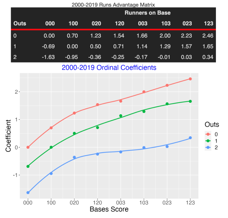
One drawback of the runs expectancy matrix is that runs potential is measured solely by the mean runs in the remainder of the inning. Section 7 introduces a more general approach where runs are represented as an ordinal variable and one measures the advantage of a given situation by use of an ordinal regression model. Section 8 provides some background material on this ordinal response approach. This section provides some interesting comparisons between the runs expectancy table and the “runs advantage” table which displays the ordinal regression coefficient for all states.
Of course, the objective of a team is not simply to score runs, but to win by scoring more runs than their opponent. Section 9 describes how one computes the in-game win probabilities that are typically displayed as part of the game report.
2 Getting Started
2.1 Downloading Retrosheet Data
Here’s an outline of how to download the Retrosheet play files for a particular season.
There is a blog posting on this at https://baseballwithr.wordpress.com/2014/02/10/downloading-retrosheet-data-and-runs-expectancy/
Download the Chadwick files following the advice from the website mentioned on the blog post – this will parse the original source files.
I set up the current working director to have the following file structure.
- I download the R function
parse.retrosheet2.pbp.R()from my gist site.
library(devtools)
source_gist("https://gist.github.com/bayesball/8892981",
filename="parse.retrosheet2.pbp.R")- Now I am ready to download the Retrosheet play-by-play data for the 2021 season.
parse.retrosheet2.pbp(2021)- Two new files “all2021.csv” and “roster.csv” are stored in the “download.folder/unzipped” folder. Using the
read_csv()function I read in the play-by-play data.
library(readr)
d2021 <- read_csv("download.folder/unzipped/all2021.csv",
col_names = FALSE)- Last I want to add variable names to the header of the data file. I read a header file from our Github site and use this to assign the variable names.
fields <- read.csv("https://raw.githubusercontent.com/beanumber/baseball_R/master/data/fields.csv")
names(d2021) <- fields[, "Header"]- The data frame
d2021is ready to explore. Here is the first row of the file.
d2021[1, ]2.2 Computing the Runs Values
Once the Retrosheet play-by-play data is downloaded, then the function compute.runs.expectancy() will compute the runs values for all plays.
One can download this function from the Github Gist site.
library(devtools)
source_gist("https://gist.github.com/bayesball/8892999",
            filename="compute.runs.expectancy.R")
Assuming the file “all2021.csv” is stored in the working directory, the following command will read in the csv file, compute the runs values and store the resulting data frame as `d2021’.
d2021 <- compute.runs.expectancy(2021)The following command will output the current state STATE, the new state NEW.STATE and the RUNS.VALUE for the first few plays in the season file.
library(dplyr)
d2018 %>%
  select(STATE, NEW.STATE, RUNS.VALUE) %>%
  head()
3 Summarizing a Runs Expectancy Matrix
3.1 Introduction
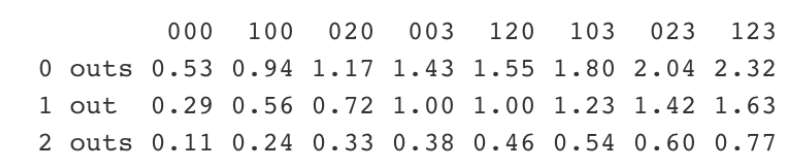
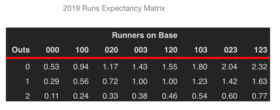
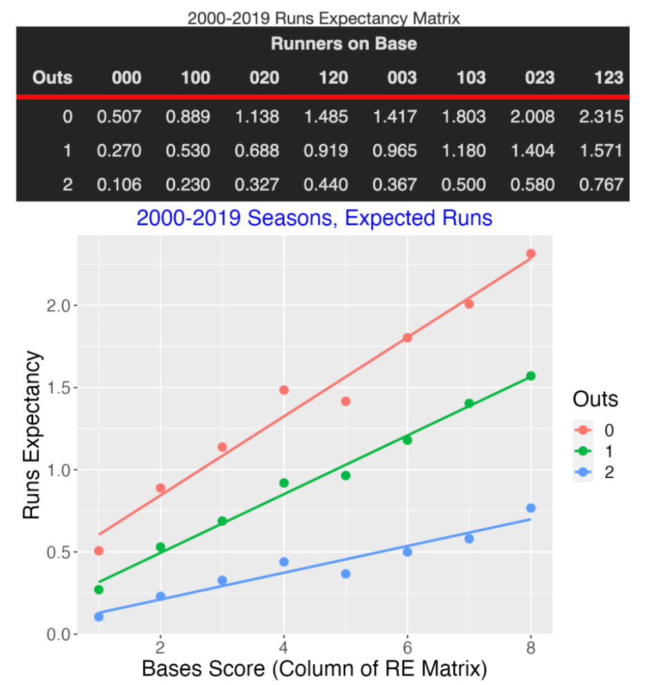
A basic object in sabermetrics research is the Runs Expectancy Matrix that gives the mean number of runs scored in the remainder of the inning for each possible state (number of outs and runners on base) of a half-inning. This FanGraphs page provides a general description of this matrix and why it is so useful in baseball analyses. Chapter 5 of Analyzing Baseball With R describes how to construct this matrix from Retrosheet data and illustrates the use of this matrix to measure the values of plays. Here is the matrix for the 2019 season. For example, reading the “1 out, 023 runners” entry, this says that, on average, there will be 1.42 runs scored in the remainder of the inning when there is 1 out and runners on 2nd and 3rd.
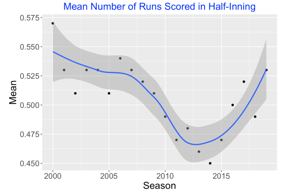
I am interested in exploring how the values in this matrix have changed over twenty seasons of Major League Baseball. Since the nature of run scoring has changed dramatically during the Statcast Era (due to the increasing count of home runs), I would think that this matrix would be changing in interesting ways.
If we focus on the top left entry (000 with no outs) of the matrix, this graph shows how the runs expectancy for this situation has changed in the 20-year period from 2000 to 2019. We see a decline in average run production from 2006 to 2014 followed by a steady rise in the Statcast era from 2015 to 2019.
To see the changes in the expectancy matrix over this period, I thought it would be helpful to summarize this matrix by use of a few numbers. If this could be done, it would facilitate comparisons across seasons. Here I present an attractive way to visualize and summarize the values in this 3 by 8 runs matrix.
3.2 Basic Pattern
If you look at the runs expectancy matrix, note that I have arranged the runners on base values so that for a specific row (number of outs) the run values increase from left to right. What is the nature of this increase? Let’s define a Bases Score equal to the sum of bases occupied plus one if there is more than one runner on base, that is
Bases Score = Sum(bases occupied) + I(# of Runners > 1)
where I() is the indicator function (1 if the argument is true and 0 otherwise). The Score values will go from 0 to 7 corresponding to the 8 columns of the matrix. Let’s graph the run values in the matrix as a function of the Score and fit a line to the points for each number of outs. Interestingly, we see three linear relations that appear to be a good fit to this data.
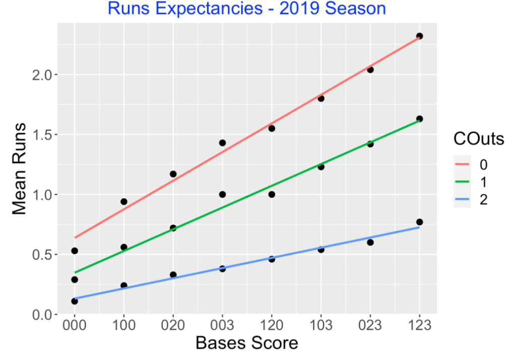
I have a data frame RE with three variables – Runs, Score (numeric) and Outs (categorical). To find the equations of these three lines, I fit a linear model to Runs where there is an interaction between Score and Outs. This model allows for varying intercepts and varying slopes among the three values of Outs.
fit <- lm(Runs ~ Outs * Score, data = RE)3.3 Interpreting the Fit
This fit provides intercepts and slopes for the three fitted lines corresponding to the three Outs values.
##   Outs Intercept Slope
## 1    0      0.64  0.24
## 2    1      0.35  0.18
## 3    2      0.13  0.08
The intercepts give estimates of the Runs when there are no runners on base (Score = 0). With the bases empty, we expect the team will score 0.64, 0.35, and 0.13 runs with 0, 1, and 2 outs, respectively.
The slopes give the increase in Runs when the Score value increases by one. When there are no outs, each unit increase in Score will increase the expected Runs by 0.24. So if a runner on first successfully steals second with no outs, the Score increases by one and the Runs increases by 0.24. Suppose there is a runner on 1st with no outs and there is a walk. One is transitioning from the 100 state (Score = 1) to 120 state (Score = 4) and so the Runs would increase by 3 (0.24) = 0.72.
Similarly, when there is one out, there will be a 0.18 increase in Runs for each unit increase in Score, and when there are two outs, there will be a 0.08 increase in Runs for each unit increase in Score. So for example, a walk with a runner on 1st, two outs, will increase the Runs by 3 (0.08) = 0.24.
The fitted slopes clearly shows the effect of outs on run scoring. An event that improves the bases situation has more runs impact with 0 outs compared to one or two outs.
3.4 Examining the Residuals
Of course, these lines don’t provide a perfect fit, and so we’re interested in exploring the vertical deviations (the residuals) for additional insight. Here I plot the residuals as a function of the Score using different colors for the Outs values. What do I see?
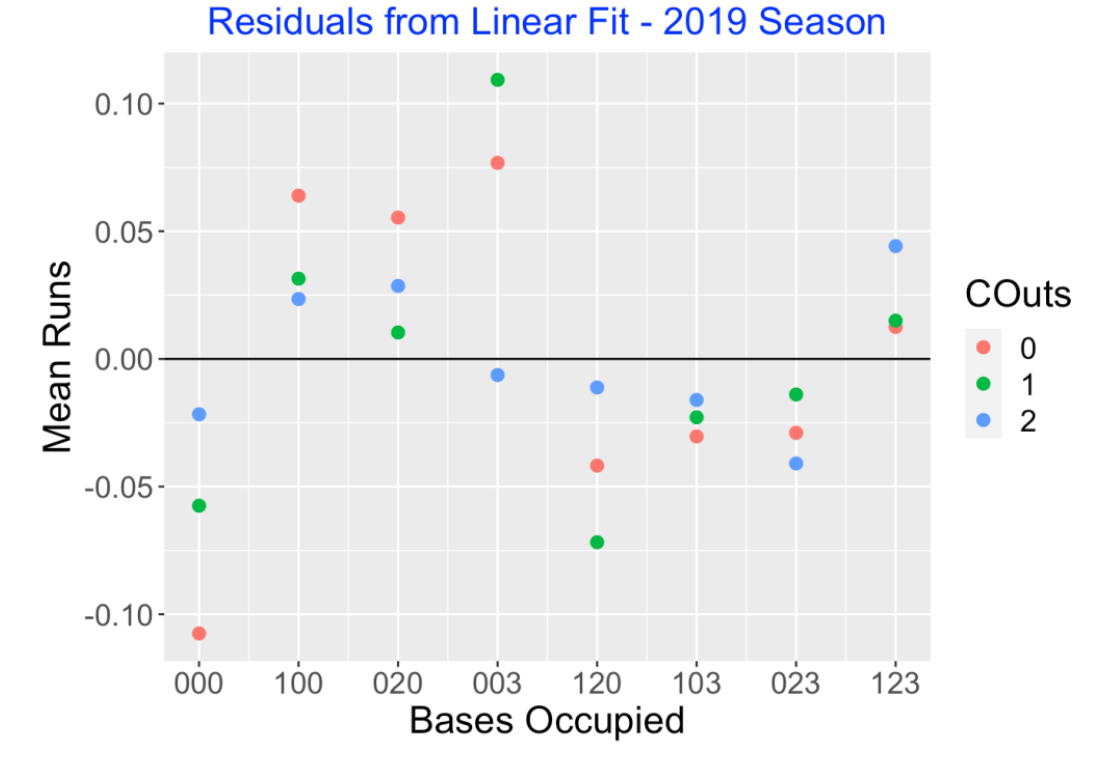
Although the sizes of the residuals are small relative to the fitted values, there is a clear pattern – NEGATIVE (bases empty), POSITIVE (one runner), NEGATIVE (two runners), POSITIVE (bases loaded). I could remove this general pattern with a more sophisticated fit, but I would lose the simple interpretation of the linear fit.
There are some interesting large residuals, 000 with no outs (LARGE NEGATIVE), 003 with 0 or 1 out (LARGE POSITIVE), and 120 with one out (LARGE NEGATIVE). Since there are multiple ways to advance a runner on 3rd with less than 2 outs (sac fly, wild pitch or passed ball), I am not surprised about the large positive residuals for 003 with 0 or 1 out. Perhaps the multiple ways to get outs in the 120 situation account for the large negative residual.
3.5 Using this Summary
Sometime next year, I’ll post something related to run production in the last 20 years of baseball. But here are some thoughts about these summaries of the runs expectancy matrix.
The Slopes. The main takeaway are the slopes 0.24, 0.18, and 0.08 which give the improvement in expected runs for each increase in the Bases Score variable. These are easy to remember and can be used in game situations. Suppose a manager wants to quickly compute the run value of a double that scores a runner on first with one out. The runners state has changed from 100 to 020 – since the change in Bases Score is 1, there is an advantage of 0.18 runs. Adding that to the single run scored, the runs value of this particular double is 0.18 + 1 = 1.18.
Comparing Seasons. We have summarized the runs expectancies by six numbers – the three intercepts and the three slopes. One can compare run scoring of two seasons by comparing the intercepts or by comparing the slopes. We did illustrate comparison of average run scoring across twenty seasons which is a comparison of the intercepts with no outs.
Impact of HR Hitting? One question is how the home run hitting impacts the run expectancy matrix. For example, if a team is really focusing on hitting home runs, what is the advantage of moving a runner from first to second? This is a question related to the slope summaries.
Beyond Mean Runs. It would also be interesting to see how home run hitting affects other metrics such as the probability of scoring from a given state. Some years ago, I wrote a paper “Beyond Runs Expectancy” published in the Journal of Sports Analytics that looked at distributions of run scoring and how they change across different situations.
4 Run Expectancies for Six Eras of MLB Baseball
4.1 Introduction
Tom Tango recently displayed tables of Runs Expectancy values over six eras of MLB baseball from 1900 through the recent 2023 season. A few years ago, I introduced in this post a simple graphical method for summarizing a runs expectancy matrix. I thought it would interesting to use Tom’s tables together with my method to explore changes in runs expectancy over MLB history.
4.2 The Runs Expectancy Graph
Here’s a brief description of my graphical method. We have a runs expectancy table that gives the mean runs in the remainder of the inning over the 24 states of an inning defined by runners on base and number of outs. Here is an example of this table.
For example, when there are runners on 1st and 2nd with 0 outs, the table shows that, on average, there are 1.55 runs scored in the remainder of the inning. We define a Bases Score defined by
Bases Score = Sum(bases occupied) + I(# of Runners > 1)
The I() indicator function means that we add a one to the bases score if the number of runners exceeds one. The values of Bases Score range from 0 to 7 over the eight possible runner scenarios. I graph the runs expectancy as a function of the bases score, using different colors for the three possible outs value. Here is a snapshot of the graph using data from the 2019 season:
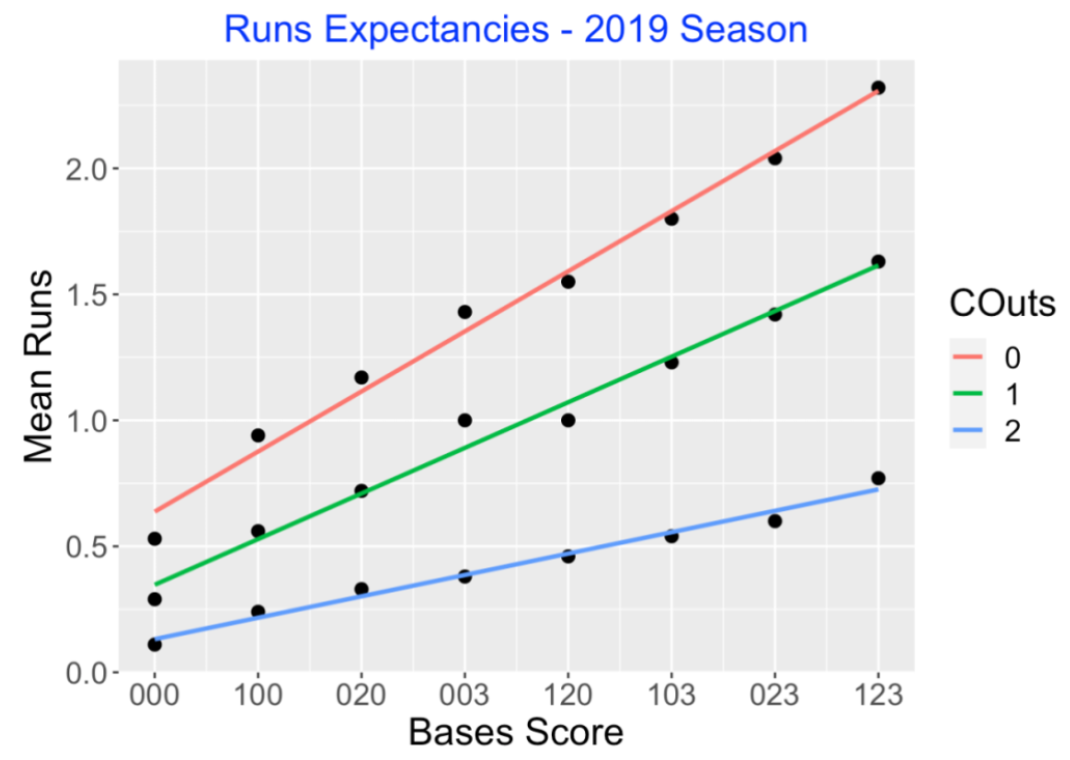
Since the pattern or runs for each value of outs is pretty linear, that motivates summarizing this table by fitted slopes and intercepts of the three lines. Here are the slopes and intercepts using 2019 season data.
##   Outs Intercept Slope
## 1    0      0.64  0.24
## 2    1      0.35  0.18
## 3    2      0.13  0.08
The first intercept value, 0.64, represents the mean runs scored at the beginning of an inning with no outs and no runners on base. The slope value, 0.24, gives the increase in runs scored for each unit increase in the bases score. So if there is a single and there is a runner on 1st (with no outs), the mean runs would increase to 0.64 + 0.24 = 0.88. Similarly, the slopes 0.18 and 0.08 represent the increase in mean runs for each unit change in bases scores for one and two outs, respectively.
4.3 Apply for the Six Eras
I apply this method individually to the runs expectancy tables that Tom provides for the six MLB eras 1900-1920, 1921-1946, 1947-1968, 1969-1992, 1993-2009, and 2010-2023. The runs expectancy graphs are displayed below. The obvious takeaway is that the patterns in these graphs look very similar. across eras. Of course, runs scored per game has gone through significant changes over MLB history, but the relationship of runs scored in the remainder of the inning and the inning states appears similar over these baseball eras.
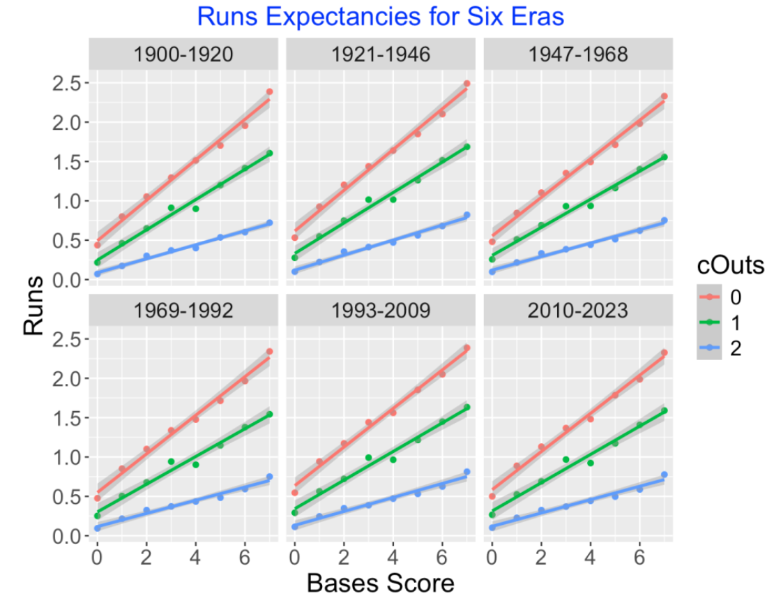
4.4 Focusing on the Slopes
To look deeper, I look at the fitted slopes in these graphs. For each baseball era, there will be three fitted slopes showing how the mean runs will increase for a unit change in the bases score. I’ve collected these slopes – the following graphs show, for each outs value, how these slopes have changed over baseball eras.
This is more interesting. Generally these slopes tend to be smallest for the modern eras of baseball. There is a runs advantage to having more runners on base – all of these slopes are positive. But the magnitude of this runs advantage tends to be smaller in the period 1947-2023 than it was in the period 1900-1946. Currently teams tend to produce most of their runs through home runs and fewer runs are produced through so-called “small ball” tactics (advancing runs through sacrifices, stealing bases, etc.). So that might explain why the runs advantage of extra runners on base is smaller now than it was in the early years of MLB baseball.
4.6 Adjustments to Line Fit
Tom Tango suggested several modifications to my line fits to the runs expectancy data. I will illustrate these modifications for the (bases score, runs) data for the modern era 2010-2023.
- Adjustment 1: The (bases score, runs) = (0, 0.5) point is special since 0.5 corresponding to the mean runs scored in a half-inning in the modern era. It is desirable that my fit goes through the (0, 0.5) point. We can accomplish this using the lm() function with the offset() argument. Essentially this forces the line to go through that point.
fit2 <- lm(Runs ~ offset(rep(.5, 8)) + 0 + Score, data = d10)
- Adjustment 2: Also since there are many more opportunities when, say the bases are empty than when there are runners on base, it is desirable to weight the fit by the opportunities or frequencies at each inning state. Tom has a table of the opportunities for all situations – we implement a weighted least squares fit where weights is given by the Opp variable.
fit3 <- lm(Runs ~ offset(rep(.5, 8)) + 0 + Score, weights = Opp, data = d10)
To see the impact of these adjustments on the fits, I display the basic fit and the adjusted fit below. The slope of the adjusted fit is larger than the slope of the basic fit.
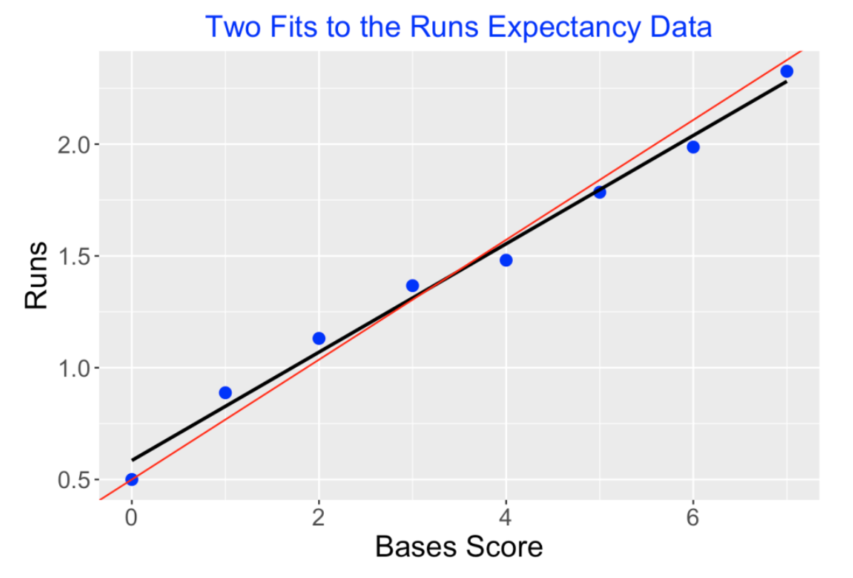
Thanks, Tom for the suggestions and I will at some point update my work with these modified fits.
5 Rates of Bases/Outs States in an Inning
5.1 Introduction - Review of Runs Expectancy
About a year ago, I posted on how one can summarize a Runs Expectancy Matrix. For each of the possible inning situations defined by runners on base and number of outs, the Runs Expectancy matrix gives the expected runs in the remainder of the inning. The matrix using 2019 data is displayed below. Looking at the entry in the Outs = 1 row and the 103 column, we can see that there will be, on average, 1.23 runs scored in the remainder of the inning when there are runners on 1st and 3rd with one out.
This matrix can be used to measure the Runs Value of any play using the formula:
Runs Value = Runs Value (after play) - Runs Value (before play) + Runs Scored on Play
For example, suppose there are runners on 1st and 2nd with one out and the batter hits a double, scoring both runners.
Before the play we have runners on 1st and 2nd with one out – by table, Runs Value = 1.00.
After the play, we have runner only on 2nd with one out – by table, Runs Value = 0.72
Two runs scored on the play.
So the Runs Value of this particular play (double with runners on 1st and 2nd with one out) would be
Runs Value = 0.72 - 1.00 + 2 = 1.72
Using this recipe, we can find the Runs Value for all plays in a particular season.
5.2 Runs Potential and Likelihood of States
The runs expectancy matrix is helpful for understand the potential for scoring runs in any bases/outs situation. But this matrix says nothing about the likelihood of reaching any of these bases/outs states during a game. For example, if it is rare to have, say, runners on 2nd and 3rd with two outs, then a team will not have the opportunity to score runs in this situation. We know one needs “ducks on the pond” (runners in scoring position) for a single to result in any runs scored.
In this post I take a historical look at the rates of being in different bases/outs situations. We will see some obvious trends in this rates that will indicate some issues with modern MLB baseball.
5.3 Measuring Excitement of a Bases/Outs State
A simple question: What bases/outs situations are exciting in baseball? I think most of us would agree that a particular situation is exciting if the play outcome can result in a wide range of outcomes. For example, suppose your team has the bases loaded with two outs. You might observe a single, scoring two runs, or instead observe a strikeout, ending the inning. The wide variation of outcomes (one very positive and one very negative) makes that particular situation exciting. In contrast, bases empty with two outs would not be exciting since the range of possible outcomes is limited – the only way a run can score from a bases-empty situation is a home run.
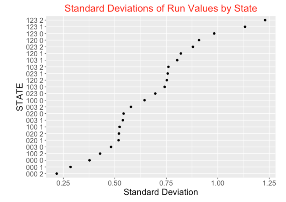
We can measure the value of any play by its Runs Value. Suppose, for each of the 24 possible bases/outs situations, we collect the Runs Values for all plays that are bat events. We define the excitement of a particular bases/outs situation as the standard deviation of the Runs Values:
Excitement (State) = Standard Deviation(Runs Value)
Using data from the 2021 season, I plot the standard deviation of the Runs Values for all states below. As you see, the highest standard deviations correspond to the bases loaded states – in fact, bases loaded with two outs (coded “123 2”) has the highest standard deviation. In contrast, the bases empty states with 0, 1, and 2 outs (“000 0”, “000 1”, “000 2”) have the smallest standard deviations. This seems to be a reasonable way of ordering states by excitement level.
5.4 Historical Look at State Rates
There has been a dramatic change in the frequencies of different bases/outs states in recent seasons of baseball. From Retrosheet data, I collected the frequencies of all 24 possible bases/outs states for each of the seasons 2000 to 2021 and converted the frequencies to rates. For each of the 24 states, I plot the rate of that state against the season and add a smoothing curve. I first display the rates for the eight different bases states for no outs, then display the rates for one out, and then display the rates for two outs. (I’m suppressing the rate values on the vertical axis since we are focusing on the changes in these rates over season.)
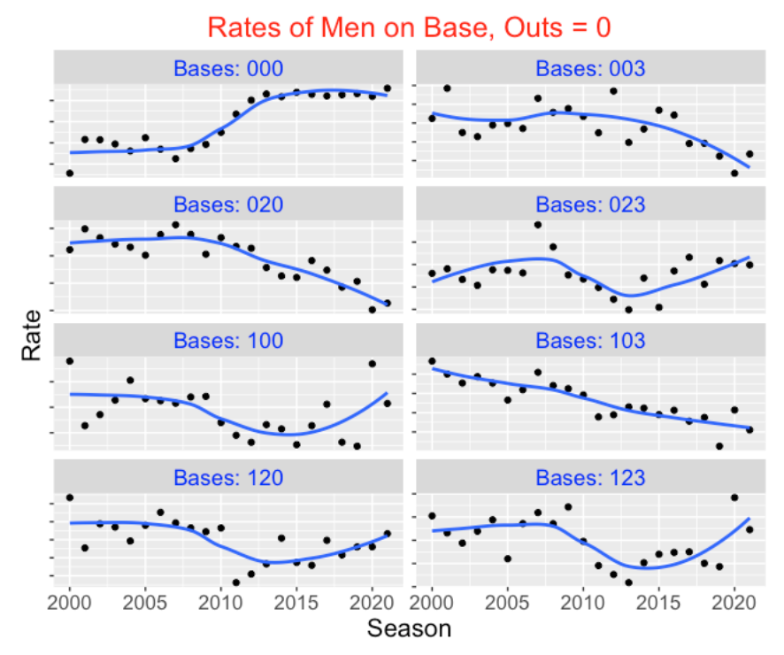
There are some clear takeaways from inspecting these graphs:
The rates of particular exciting (high standard deviation) runners on base situations such as “020”, “003”, “120”, “103” have significantly dropped in the period from 2000 to 2021. Generally these are the situations with runners in scoring position. These decreasing patterns don’t change by the number of outs.
In contrast, we see a rise in the rates of particular “boring” (low standard deviation) runner on base situations such as “000” (bases empty) in this period of baseball. Also we see an increase in the rate of particular one-runner situations such as “100” (runner on 1st) with 1 and 2 outs.
The general takeaway is that the exciting bases/outs situations are becoming less common in current baseball and the boring situations such as bases empty and runner on first with two outs are more prevalent.
5.5 Some Comments
- CJ Kelly in a recent article “Strike Three: Baseball is Dead” gives this bleak assessment of modern baseball:
“Over the past 20 years, Major League Baseball has moved from a game of movement and strategy to a static contest of boredom only interrupted by the occasional home run and even rarer base hit.” This R work gives some evidence for the current “static contest of boredom”.
In the past, teams scored runs by putting runners on base and advancing the runners to home by hits. In contrast, for 2021 baseball, batters aren’t getting to scoring positions on base and home runs play a large role in scoring runs. Part of the enjoyment of baseball is watching plays in “high standard deviation” bases/outs situations and these situations are becoming less common in modern baseball.
I believe baseball needs to make significant changes to the rules to make the game more exciting to watch. Reducing the strikeouts and eliminating infield defensive shifts would lead to more balls put into play and runners on base. There are opportunities to make changes to the game in the current negotiations between the players and the owners in a new contract.
Here we are focusing on the level of excitement of a particular inning situation defined by runners on base and number of outs. In my post on Leverage of Win Probabilities, I also used a standard deviation to measure the leverage or level of excitement of a particular game situation defined by the inning, game score, number of outs and runners on base.
6 Computing the wOBA Weights
6.1 Introduction
We start with the definition of \(wOBA\) as given on the FanGraphs web site.
\[ wOBA = \frac{w_1 uBB + w_2 HBP + w_3 1B + w_4 2B + w_5 3B + w_6 HR}{AB + BB - IBB + SF + HBP} \]
There are several features of this formula:
The weights \(w_1, ..., w_6\) are proportional to their runs values.
Note that the denominator includes all batting plays with the exception of intentional walks (\(IBB\)). Note that the outcome “out” does not appear in the numerator. Implicitly, this means that the weights for all “out” events are equal to zero.
To be similar to the \(OBP\) formula, we will see that we need to bump our weights so that the value assigned to the out outcome is zero.
In addition, there is a scaling factor to include so that the average \(wOBA\) value is equal to the average \(OBP\) across all players in the given season.
6.2 Runs Expectancy Matrix
To describe the process of obtaining the weights in the \(wOBA\) formula, we begin by finding the runs expectancy matrix.
A state of an half-inning consists the number of outs and the runners on base. Since there are three possible outs (0, 1, 2) and eight possible configurations of runners on base (each base can be occupied or not), there are 3 \(\times\) 8 = 24 possible states. For each state, we find the average number of runs scored in the remainder of the half-inning. If we do this for all states, we obtain the runs expectancy matrix.
Here is this matrix using all plays from the 2022 season:
    000   001   010   011   100   101   110   111
0 0.477 1.231 1.092 2.000 0.863 1.765 1.443 2.396
1 0.256 0.973 0.672 1.398 0.505 1.147 0.901 1.524
2 0.097 0.378 0.306 0.548 0.207 0.500 0.436 0.768
6.3 Runs Value of Play
For any batting play, there are two states:
- \(STATE_0\), the state of the inning when the hitter comes to bat
- \(STATE_1\), the state of the inning after the batting play
The runs value (\(Value\)) of the batting play is defined as the difference in the runs value of the two states plus the runs scored on the play (\(RUNS\)).
\[ Value = Runs(STATE_1) - Runs(STATE_0) + RUNS \]
Using this formula, we can compute the value of all batting plays in the 2022 season.
6.4 Runs Value of an Outcome
Suppose we are interested in the runs value of a particular batting outcome, say a home run. We average the runs values for all home runs hit in the 2022 season. We obtain the value of a home run hit in 2022 is 1.4. This likely seems small, but most home runs are hit with no runners on base and even when there are men on base, the runs value of the after state (bases are empty) will be smaller than the runs value of the state with runners on base.
6.5 Computing the Weights
In a similar fashion, we can compute the runs value for all six events (unintentional walk, hit-by-pitch, single, double, triple, home run) and we obtain the following weights. The table gives the name of each event with the corresponding value of the variable EVENT_CD in the Retrosheet dataset.
  Event EVENT_CD Weight
  <chr>    <int>  <dbl>
1 uBB         14  0.316
2 HBP         16  0.347
3 1B          20  0.458
4 2B          21  0.770
5 3B          22  1.02
6 HR          23  1.40
6.6 Bump the Weights So that Outs Have a Value of Zero
Actually, we can compute the runs value of all outcomes of a plate appearance. In particular, we note that outs have a value of \(-0.26\). Since the value of outs is 0 in the definition of OBP, we want to adjust all of our event values so that out has a value of 0. We do this adjustment by adding 0.26 to the values of the six events, obtaining the new weights displayed below.
  Event EVENT_CD Weight
  <chr>    <int>  <dbl>
1 uBB         14  0.576
2 HBP         16  0.607
3 1B          20  0.718
4 2B          21  1.03
5 3B          22  1.28
6 HR          23  1.66
6.7 Scaling wOBA
Last, we want to rescale the \(wOBA\) value so the the mean \(wOBA\) matches the mean on-base percentage \(OBP\).
By applying the \(wOBA\) formula to all batting plays, we obtain
\[ Mean(wOBA) = 0.2521 \]
Since the average \(OBP\) for all players in the 2022 season is .310, our adjusted \(wOBA\) is given by
\[ wOBA_{adj} = \frac{0.310}{0.2521} wOBA. \]
With this adjustment, we obtain the following new weights.
    Event EVENT_CD Weight adj_Weight
  <chr>    <int>  <dbl>      <dbl>
1 uBB         14  0.576      0.708
2 HBP         16  0.607      0.747
3 1B          20  0.718      0.883
4 2B          21  1.03       1.27
5 3B          22  1.28       1.57
6 HR          23  1.66       2.05
For comparison, I have added the 2022 wOBA weights as reported on the FanGraphs website.
   Event EVENT_CD Weight adj_Weight FanGraphs
  <chr>    <int>  <dbl>      <dbl>     <dbl>
1 uBB         14  0.576      0.708     0.689
2 HBP         16  0.607      0.747     0.72
3 1B          20  0.718      0.883     0.884
4 2B          21  1.03       1.27      1.26
5 3B          22  1.28       1.57      1.60
6 HR          23  1.66       2.05      2.07
Note that our adjusted weights agree pretty closely with the FanGraphs weights. There are small discrepancies, but essentially we have reproduced the FanGraphs wOBA formula from the raw Retrosheet data.
7 Pitch Value
7.1 Visualizations of Pitch Value
7.1.1 Introduction
In last week’s post, we explored pitch decisions and the influence of the count on those decisions. For example, pitchers are most likely to throw off-speed pitches when they are ahead in the count. Also, the location of the pitch depends on the count. For example, on a 0-2 count, it is common for a pitcher to throw a low off-speed pitch or a high fastball. In contrast, when the pitcher is behind in the count, he is likely to throw a fastball in the middle of the zone. By use of density estimate graphs, we saw some interesting pitch location patterns for individual pitchers.
Here we focus on the outcome of the pitch and how that outcome varies as a function of the pitch location. From the pitcher’s perspective, there are different ways to think about a desirable pitch outcome. During the plate appearance, the pitcher gains with a pitch resulting in an additional strike or loses with a pitch resulting in an additional ball. A pitch that ends the plate appearance with a strikeout or other out is a gain and a pitch that is put in-play for a hit is a loss for the pitcher. One way of measuring a desirable pitch outcome is by use of expected runs, specifically the runs gained (on average) from that pitch. We’ll review some of the material from the “Balls and Strikes Effects” chapter of Analyzing Baseball with R. Then we’ll use that material together with information about the runs value of different end-of-PA events to define pitch values. Once we have assigned a value to each pitch during the 2019 season, we can use graphs of a smoothed fit to understand the locations of the regions about the zone where a particular type of pitch is effective.
7.1.2 Review of Balls and Strikes Effects
In Chapter 6 of ABWR we explain how to measure balls and strikes effects. Using Retrosheet play-by-play data, we first compute (from Chapter 5 work) the runs value for each plate appearance outcome that changes the state (runners on base, number of outs and runs scored). Next, we define variables c01, c10, c11, etc. that indicate if the count for a plate appearance passes through the respective counts 0-1, 1-0, 1-1, etc. By averaging the run values over each of these indicator variables, we obtain the mean run value passing through each possible count. I’ve displayed these mean run values in the following figure using 2019 season data – these are similar to the values displayed in ABWR, Figure 6.2 from data from an earlier season.
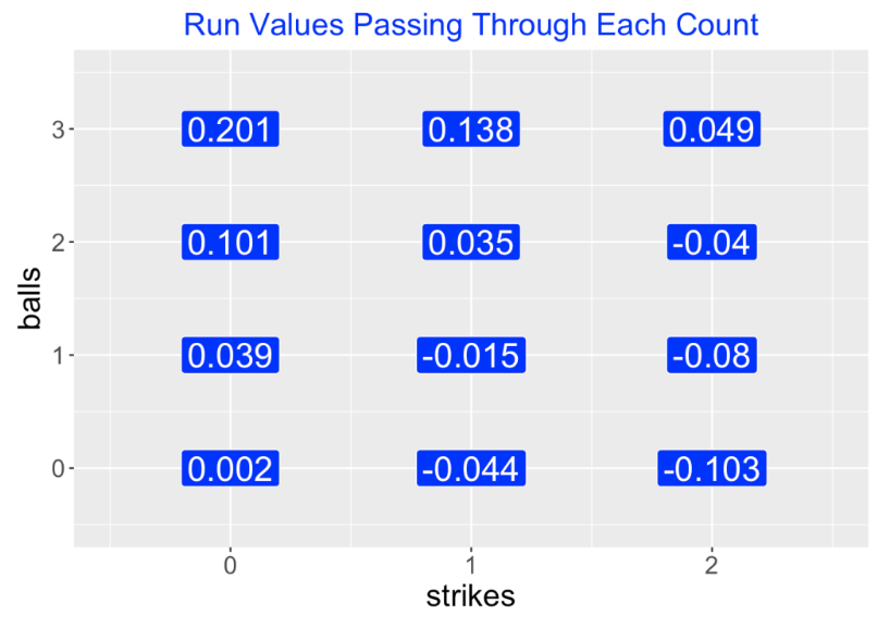
We also can compute the runs value of each possible end-of-PA event (out, single, walk, HBP, strikeout, etc) by averaging the run values. We learn for example, that an out loses on average 0.28 runs and a single and home run, gain on average 0.46 and 1.38 runs, respectively. Note that these run values are averages and don’t depend on the current situation of runners and outs.
7.1.3 Pitch Value
Once we’ve computed the runs value for each possible count and each end-of-PA event, then the value of a pitch is simply the change in runs value
Pitch Value = Runs Value (new count or end of PA event) - Runs Value (old count).
For example, suppose the count is 1-1 and the pitcher throws a ball, changing the count to 2-1. The value of that pitch (using numbers from the above figure) is
Value = Runs Value (2-1) - Runs Value (1-1) = 0.035 - (-0.015) = 0.050
Here a pitch adding a ball has a runs value of 0.05 favorable to the hitter. Suppose a batter hits a home run on an 0-2 pitch. The value of this pitch is
Value = Runs Value (HR) - Runs Value (0-2) = 1.38 - (-0.103) = 1.48.
Note that the pitch value of this home run exceeds the average HR runs value since the home run was hit on a 0-2 pitch.
7.1.4 Graph of Pitch Values
Now that we have assigned values to all pitches, we are interested in seeing how the pitch value varies across the zone. I have already illustrated the use of the CalledStrike package in an earlier post to display patterns of smoothed fits of different batting measures, say launch speed or swinging rates, and so it is straightforward to use similar functions to display patterns of smoothed pitch values over the zone. Basically, one fits a generalized additive model where the pitch value is represented as a smooth function of the plate_x and plate_z variables, one uses the fitted model to predict the pitch value over a grid, and then graphs the fitted values by a filled contour graph.
Usually we think of desirable pitch locations from the pitcher’s perspective. So we will consider the negative of the runs values, so a positive pitch value is advantageous to the pitcher. The values of the two pitches above (a ball on a 1-1 count) and a home run on a 0-2 pitch will be recoded as -0.050 and -1.48 respectively. The color scheme in the plots below will be orange for locations desirable for the pitcher and yellow for locations desirable to the hitter.
7.1.5 Values of Four-Seamers
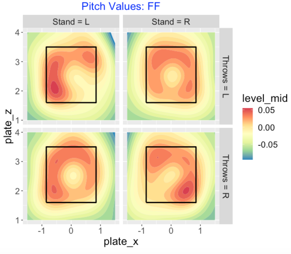
To begin, here is a contour graph display of the smoothed pitch values of all four-seam fastballs thrown in the 2019 season. Since the pattern of the values depends on the pitcher and batter sides, there are four displays, one for each combination of sides. Orange indicates a region advantageous to the pitcher and yellow indicates an advantage to the hitter. For a left-handed hitter (left side of the graph), for pitchers of both sides we see that a fastball is beneficial outside and high. We see a similar pattern of orange (high and outside) for right-handed hitters. It is interesting that southpaws also seem to have positive value for fastballs thrown inside to right-handed hitters. Clearly it is not desirable to throw a fastball in the middle of the zone.
7.1.6 Values of Sliders
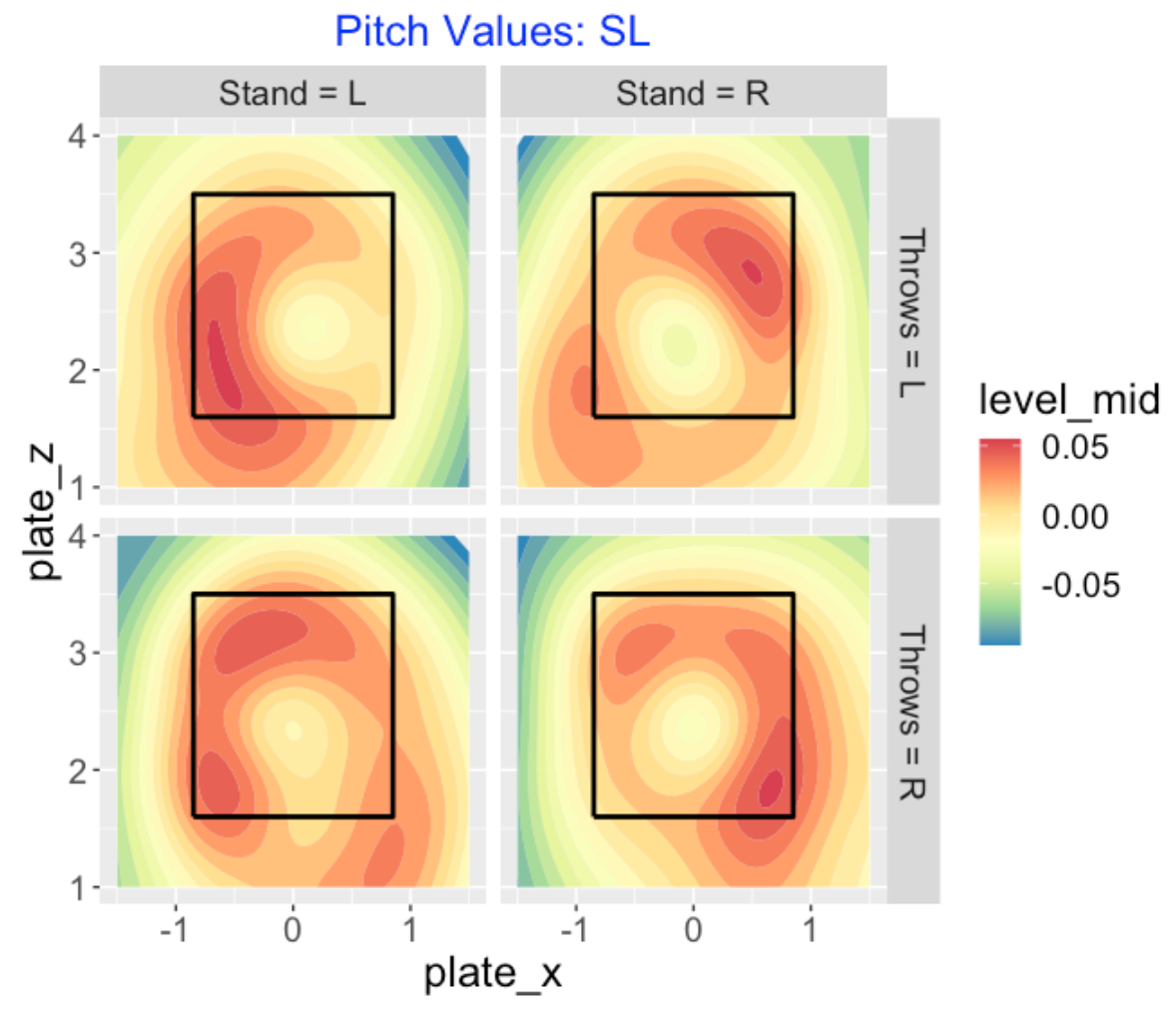
Here is a similar display for all sliders thrown by both sides of pitcher to both sides of batter. A right-handed pitcher (bottom row) wants to throw the slider to the outside, either low outside or high outside. For southpaw pitchers (top row), they want to throw their sliders outside to left-handed hitters and high outside to right-handed hitters. It is interesting that there appears to be some advantage for a leftie to throw low and inside to a right-handed hitter.
7.1.7 Values of Changeups
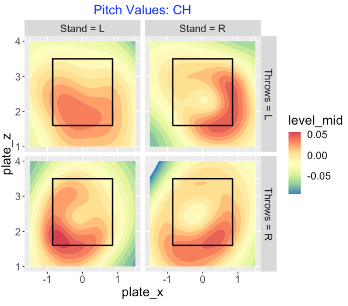
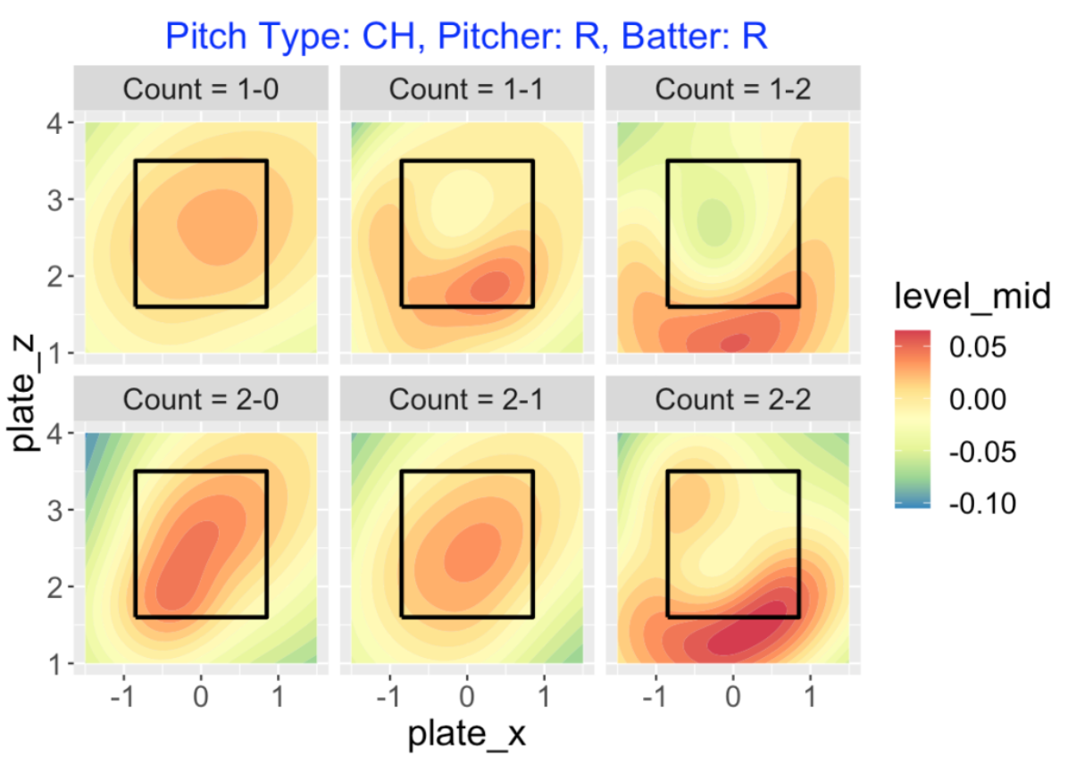
Here is a visual display of the pitch values of changeups. Generally effective changeups are ones that are low and outside. Looking at the right-right confrontation (bottom-right), note the large white circle in the middle indicating that poorly located sliders tend to have negative consequences.
7.1.8 R Work?
I have outlined all of my work creating the pitch values and graphing the smoothed values over the zone on my Github Gist site. There are several new functions in the CalledStrike package – the function compute_pitch_values() will compute the pitch values for a Statcast dataset and the function pitch_value_contour() will produce the type of filled contour plots shown here.
7.1.9 Further Reading on Pitch Value
The notion of pitch value has been around awhile in sabermetrics so there is a good literature on the subject. Here are some older references that I found including the first one by my ABWR coauthor Max (by the way, there is a graph in Max’s post of pitch values of sliders that resembles the one presented here).
Pitch Run Value and Count by Max Marchi, The Hardball Times
Searching for the Game’s Best Pitch by John Walsh, The Hardball Times
Pitch Type Linear Weights by Steve Slowinski, FanGraphs
Run Value by Pitch Location by Dave Allen, The Baseball Analysts
7.2 Pitch Values, Pitch Types and Counts
7.2.1 Introduction
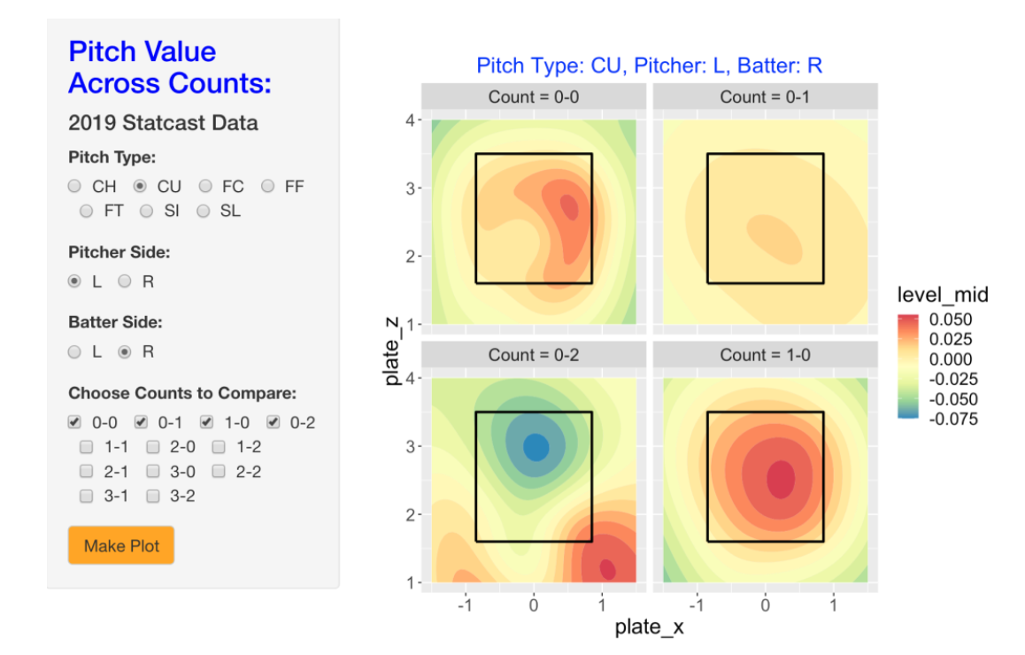
A few weeks ago, I reviewed the concept of pitch value and showed smoothed graphs of pitch value for different pitch types (four-seamers, sliders, and changeups) over the zone. One key thing that I ignored was the role of count in the choice of pitch type. For example, pitchers will typically throw a fastball on the first pitch (0-0 count) and throw an off-speed pitch when they are ahead in the count. Recently I’ve added some functions to my CalledStrike package that compute pitch values and make it easy to graph pitch values over the zone. This package includes a Shiny function PitchValue() that uses 2019 data to select a pitch type, a batting side and pitch side and displays the smoothed pitch values across a group of counts. Here I will use these displays to show how the value of a specific type of pitch can dramatically change across counts.
By the way, my Analyzing Baseball with R coauthor Max posted on this same subject in a Hardball Times post. A current introduction to many of the functions in the CalledStrike package can be found here.
7.2.2 Values of Four Seamers
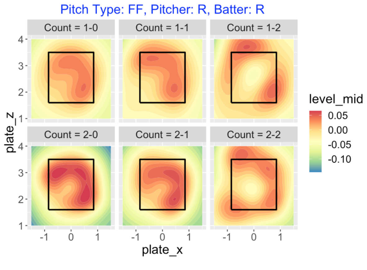
To begin, suppose we want to explore the pitch values of four-seamers (pitch type FF) across all 1 and 2 ball counts. Here I am focusing on right-handed pitchers to right-handed hitters, although it is easy to consider other matchups. Recall from my recent post that larger pitch values (orange color) are beneficial to the pitcher and negative pitch values (yellow towards blue) are beneficial to the hitter. What do we see below?
Generally it is desirable to throw a four-seamer high or outside to a right-handed hitter.
For 0-strike counts (1-0 or 2-0) the pitcher wants to locate the pitch within the zone.
As the number of strikes increases, it is desirable to locate somewhat outside of the zone. Note that there is a sizable orange area outside of the zone for the two-strike counts 1-2 and 2-2 – these correspond to swing and misses on these pitches out of the zone.
7.2.3 Values of Change-Ups
The count has a different effect on the value of off-speed pitches. To illustrate, here are graphs of the values of change-ups (pitch type CH) on one and two ball counts.
On 0-strike counts, the pitcher gets positive value from change-ups thrown in the middle of the zone.
On 2-strike counts, it is now desirable to throw change-ups low outside of the zone.
On a 1-2 count, note the green area inside the zone – this is a poorly placed changeup which tends to be put in play for a hit.
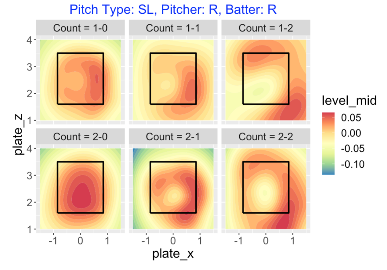
7.2.4 Values of Sliders
Sliders (pitch type of SL) have a similar pattern to changeups.
On a 1-0 count, pitcher wants to throw a slider on the outer side of the zone, and on a 2-0 pitch, any slider in the zone will be good.
On one-strike counts, it is now advantageous to throw the slider outside, even outside of the zone. There is some advantage in throwing high-inside on a 2-1 count
On two-strike counts, the pitcher really wants to throw his slider low-outside or high-inside, preferably outside of the zone. Again, note the sizeable regions of yellow in the middle of the zone for the two-strike counts – these correspond to the hanging sliders that are put in play for hits.
7.2.5 Summary Pitch Values of Pitch Types
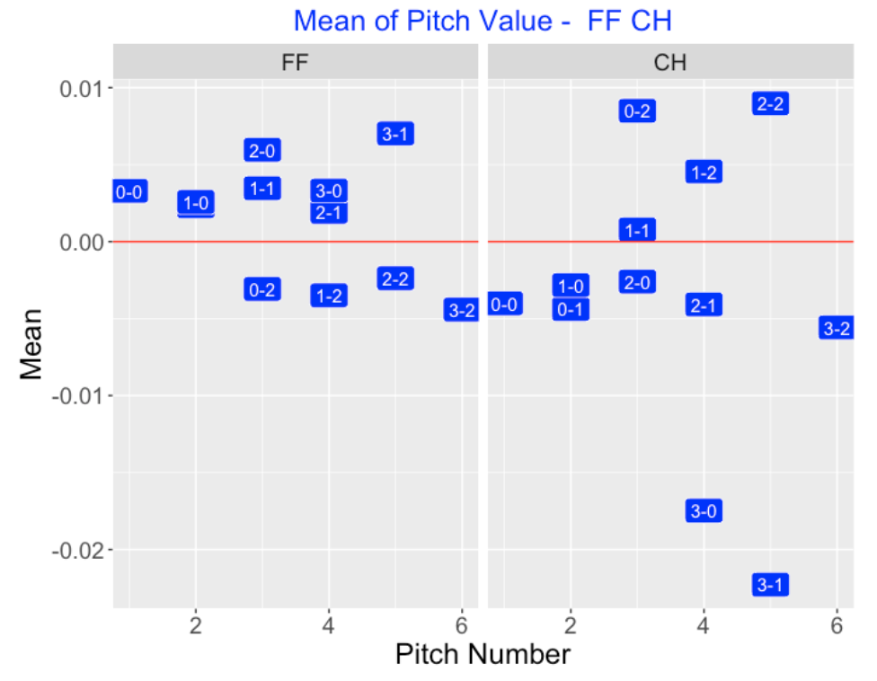
We know that specific counts like 1-2 and 0-2 favor the pitcher and counts like 2-0 and 3-0 favor the hitter. But do these advantages carry over to specific pitch types? I have a dataset that provides pitch values for all pitches for the 2019 season and it is straightforward to find mean pitch values for each pitch type and count.
Below I graphically compare the values of four-seamers (FF) with the values of change-ups (CH). I’m graphing the mean pitch value as a function of the pitch number where I use the count as a label. Note that the mean pitch value of a fastball (left panel) is positive for the neutral and hitter counts, and negative for the two-strike counts favoring the hitter. For change-ups (right panel) we see an opposite pattern – the mean value of a change-up is positive for two-strike counts and negative for the neutral and hitter counts. (Due to the large negative mean values, pitchers should not throw change-ups on 3-0 and 3-1 counts.)
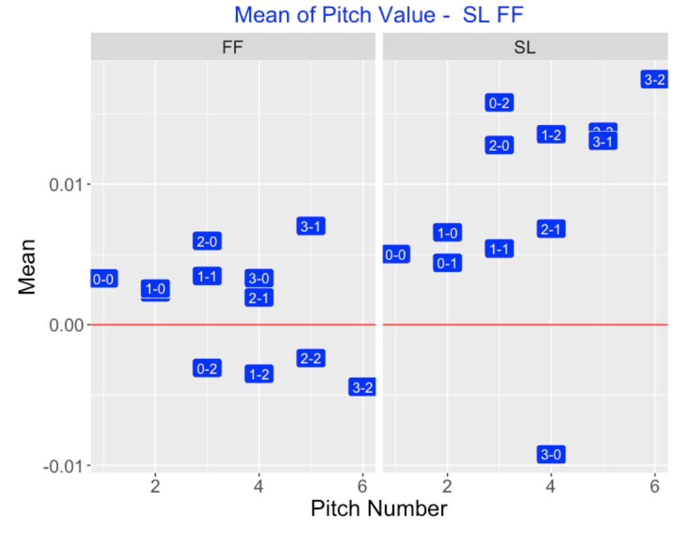
Here is a similar comparison of four-seamers (FF) and sliders (SL). Note that sliders tend to have positive values for essentially all counts (except 3-0). Sliders are especially valuable for two-strike counts (0-2, 1-2, 2-2, 3-2) and even 2-0 and 3-1 counts. This tells me that pitchers likely are throwing their sliders low and outside, the regions where we saw they had positive pitch values.
7.2.6 Shiny App
If you install my CalledStrike package, you can load the package and run my pitch value graphing Shiny app by typing
library(CalledStrike)
PitchValue()
Here’s a snapshot of the Shiny app where I am looking at the pitch values of southpaws against right-handed hitters for curve balls (CU) on the 0-0, 0-1, 0-2, 1-0 counts. A middle-of-the-zone curve ball on a 0-0 or 1-0 count is fine, but a middle-of-the-zone curve ball on a 0-2 count will be disastrous for the pitcher.
7.2.7 Looking Ahead
I’ve been playing with these pitch value displays for a couple of weeks. They seem potentially useful, but one would be interested in graphs for specific pitchers across different counts. Due to the small sample sizes, these smoothed displays for individual pitchers and counts won’t be as informative as the ones displayed here for aggregate data. Some collapsing of the count variable would help – for example, one might collapse the counts into “pitcher”, “hitter” and “neutral” categories. Anyway, this represents a work in progress on useful zone visualizations.
7.3 Pitch Value Visualizations of Leaders in Statcast Era
7.3.1 Introduction
In several posts in 2021, I displayed graphs of smoothed pitch values about the zone. Basically, a pitch value is the change in runs value when a particular pitch is thrown. Since we will be taking the pitcher’s perspective, we will actually consider the pitch value defined to be the negative of the change in runs value. For example, if there is a called strike, this is an advantage to the pitcher and the pitch value will be positive. Any hit on a pitch will generally give an advantage to the hitter (disadvantage to the pitcher) and a negative pitch value.
In the Visualizations of Pitch Value post, I displayed contours of pitch value for various pitch types such as four-seamers and sliders over the zone. In the Pitch Values, Pitch Types and Counts post, I showed how the pitch value over the zone varied by the count. For example, for a four-seamer, the region about the zone where a pitcher has a positive pitch value expands on two-strike counts. At the end of that post, I expressed the desire to explore pitch value for individual pitchers. My reluctance to do that was due to the lack of data – I didn’t think that one would get useful visualizations of pitch value for a specific pitcher using data for only one season.
Currently,we have eight seasons of Statcast data from the 2015 through the 2022 seasons and so this post will explore pitch location and pitch value for leading pitchers in this Statcast era. For a particular pitch type, we use a FanGraphs leaderboard to identify the top three pitchers with respect to total pitch value in the 2015-2022 seasons. Then we compare pitch locations and pitch values for these top pitchers for each of the common pitch types.
7.3.2 FanGraphs Pitch Value Leaderboard
The FanGraphs site displays pitcher leaderboards for a large number of measures. We focus on the Statcast Pitch Value leaderboard. By selecting the range of seasons from 2015 through 2022, we see a table displaying the total pitch value for these eight seasons for a variety of pitch types.
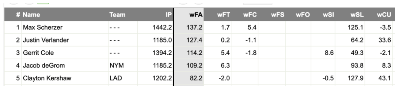
In this snapshot of this leaderboard below, we see that Max Scherzer had a total pitch value of 137.2 for his four-seamers (variable wFA) and 125.1 for his sliders (wSL). Justin Verlander had a total pitch value of 33.6 on his curve balls (wCU).
For each of the pitch types four-seamers, curve balls, sliders, changeups, and sinkers, we use this leaderboard to identify the best three pitchers with respect to total pitch value. One can represent a pitcher’s total pitch value \(PV\) as the sum
\[PV = \Sigma f(location) g(pv | location)\]
where \(f(location)\) is the density of the location, \(g(pv | location)\) is the density of the pitch value conditional on the location, and the sum is taken over all pitch locations. So both the likely pitch locations and the pitch values at pitch locations are relevant in obtaining a high total pitch value. We explore both the pitch locations and the regions of high pitch values across the zone for these leading pitchers.
7.3.3 The Data and Graph Types
I collected all of the Statcast data for the eight seasons 2015 through 2022. We collect the variables pitcher, zone location (plate_x and plate_z), pitch type, batter side and pitch value. There are a total of 5,264,631 rows in this dataset corresponding to the number of pitches thrown in these eight seasons.
For a particular pitcher and pitch type, we display two graphs:
A density estimate of the pitch locations about the zone. The yellow region corresponds to the area where 50% of the pitches are located and the green region is where 80% of the points are located.
A generalized additive model fit is used to smooth the pitch values about the zone and a filled contour graph is used to display these smoothed pitch values. A coloring scheme is used so that red/orange corresponds to regions where the pitcher is very effective, yellow is neutral, and blue corresponds to regions where the hitter has an advantage.
7.3.4 Four-Seamers
Gerrit Cole, Justin Verlander and Max Scherzer are the top three pitchers with respect to total value on their four-seamers. The left graph below compares the pitch locations of four-seamers thrown by these pitchers – generally it appears that these four-seamers are targeted in the zone. Looking at the right display, we see some interesting differences in the pitch values thrown to left and right-handed hitters.
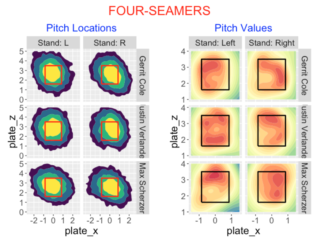
Generally these four seamers are effective in the top and outside portions of the zone.
Against right handed hitters, Cole and Verlander are equally effective on four-seamers thrown in the outside region of the zone.
Scherzer’s effectiveness against left-handed hitters seems best in the upper region of the zone. Verlander, in contrast, does well in the upper and lower regions against left-handed hitters.
7.3.5 Curve Balls
The top three pitchers for total pitch value on curve balls during the Statcast era were Charlie Morton, Corey Kluber and Stephen Strasburg. Looking at the pitch locations, they follow the familiar upper-left to lower-right orientation for right-handed pitchers. Approximately half of these pitches fall in the lower right region outside of the zone. What about the associated pitch values?
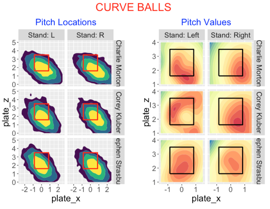
Against left-handed batters, Morton’s highest pitch values are low and outside. In contrast, Kluber’s highest values are outside and high-inside. Strasburg’s are highest middle and low in the zone.
Against right-handed batters, Morton’s and Kluber’s best pitch values are low and outside. Strasburg’s best values are in the middle of the zone.
7.3.6 Sliders
Clayton Kershaw, Jacob deGrom and Max Scherzer have the highest total pitch value on their sliders. Many of these pitches, like curve balls, fall outside of the zone. With respect to pitch value
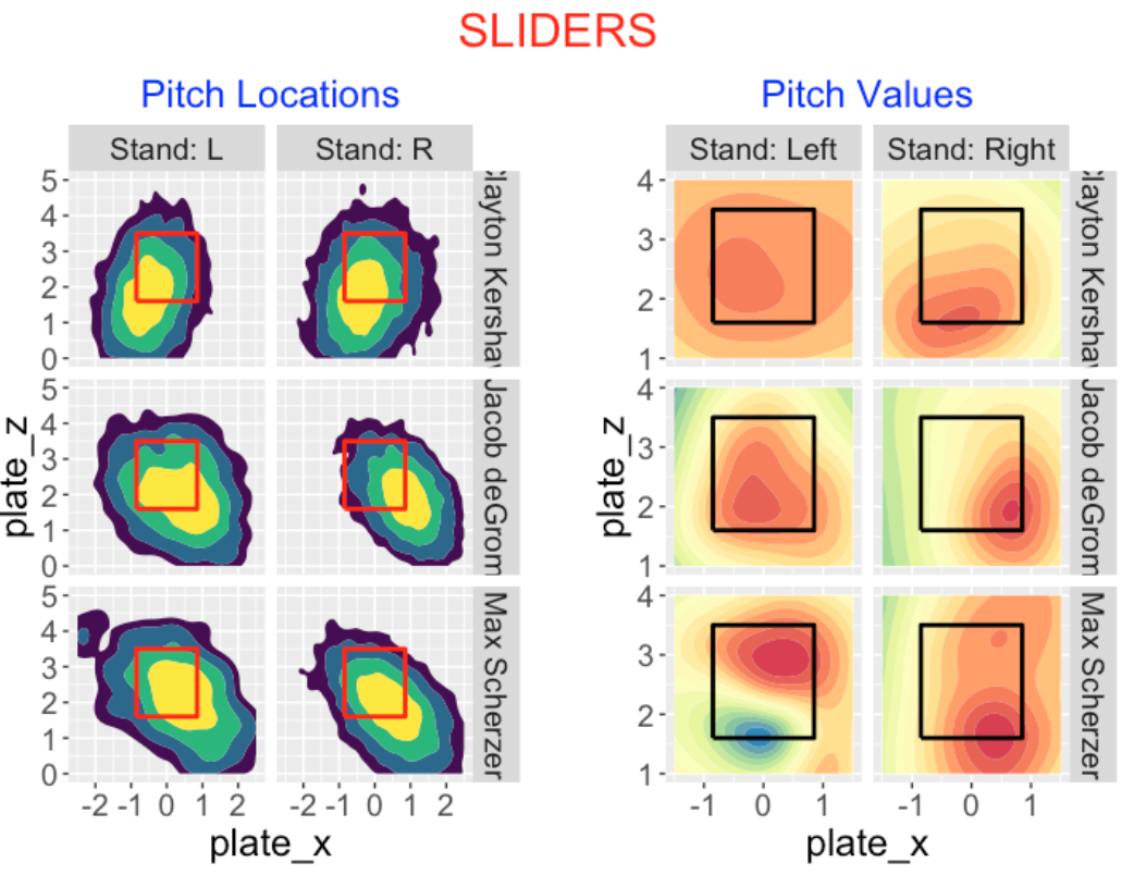
Kershaw shows high value throughout the zone against left-handed hitters, low and inside against right-handed hitters.
deGrom has high value in the middle of the zone against lefties, low and outside to righties.
Sherzer has high pitch values towards the bottom of the zone against righties. Interestingly, against lefties, Sherzer is strong high in the zone, but weak in the lower-outside region (this is the blue region in the contour plot).
7.3.7 Changeups
Kyle Hendricks, Luis Castillo and Zack Greinke achieve the highest total pitch value with changeups in the Statcast era. Similar to the other off-speed pitches, many of these changeups are located outside of the zone. With respect to pitch value …
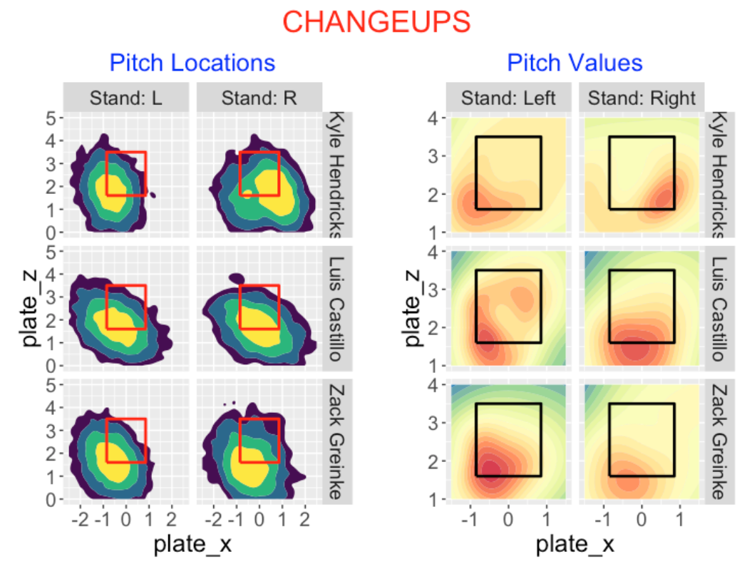
Hendricks has high pitch value low and outside (to both left and right-handed hitters).
Castillo has a similar pattern to left-handers, but achieves good value low in the zone to right-handers.
Greinke is unusual in that he has high pitch value low and inside to right-handed hitters.
7.3.8 Sinkers
Chris Bassitt, Sandy Alcantara and Zach Britton have the highest cumulative pitch value for sinkers. Generally, sinkers are thrown middle of the zone for these three pitches, although Britton appears to thrown lower in the zone. With respect to pitch value …
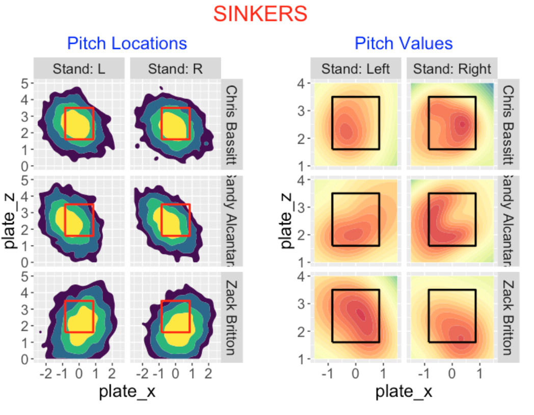
Bassitt has highest value on the outside part of the zone (to both sides of hitters).
Alcantara has high pitch value inside and low to both sides.
Britton has good pitch value in the whole zone for left-handed hitters and low outside to right-handed hitters.
7.3.9 R Notes
Here are some useful packages for constructing these displays.
The
geom_hdr()function from theggdensitypackage is helpful for constructing the bivariate density estimates of pitch location. I like the fact that the yellow region has a clear interpretation of containing about 50% of the values.The
compute_pitch_values()function from theCalledStrikepackage is used to compute the pitch values from a Statcast dataset.The
gam()function from themgcvpackage is used to fit a generalized additive model to the pitch value as a smooth function of the location. From the fit, the predicted pitch value is computed on a 50 x 50 grid of points, and thegeom_contour_fill()function from themetRpackage is used to construct the contour graph of pitch values.
7.3.10 Closing Comments
There are two aspects to throwing an effective pitch of a particular type, say a curve ball. First, the pitcher needs control – he needs to throw the pitch in a good location, say low in the zone. Second, the quality of the pitch is important – this includes the pitch speed and movement. A pitch value is essentially a measurement of the quality of the pitch. So an understanding of both the pattern of pitch locations and the pattern of pitch values at different locations are important in studying the effectiveness of a great pitcher.
These location and pitch value displays are potentially useful, but more experimentation is needed. Here are some questions for future study.
These graphs use information from a large number of pitches of a particular type thrown by a pitcher. What is the minimum sample size to get useful displays?
Can these displays be helpful in studying pitch value for a single pitcher season? If not, what alternataive methods can be used to glean information about pitch value?
8 Beyond Runs Expectancy
8.1 Introduction
We begin by displaying the well-known runs expectancy table (data from the recent 2022 season) introduced by George Lindsey in 1963. It gives the average runs scored in the remainder of the inning for each situation defined by runners on base and number of outs.
This table provides the foundation for the development of many measures of performance such as wOBA. However, it always has seemed a bit unsatisfying to me since it provides an incomplete view of run scoring potential. For example, when there is a single out and runners on 2nd and 3rd, we see from the table that teams will score an average of 1.42 runs. But this is only an average and does not directly inform us on the probability of not scoring or the probability of scoring 2 or 3 runs. It seems better to describe runs potential in a way that would say more about the future distribution of runs scored than just the mean.
Some years ago, I wrote a paper Beyond Runs Expectancy published in the Journal of Sports Analytics which models run scoring in a different way. Instead of focusing only on the average runs scored, I broke runs scored into the following 5 categories:
0 runs, 1 run, 2 runs, 3 runs, 4 or more runs
Then I used a popular regression model for ordinal outcomes to explore how run scoring differs between teams and how run scoring changes with respect to various situational effects like home vs away, runners on base, and so on. In this post, the plan is to introduce this modeling method and show how one can replace the runs expectancy table with a similar table (that I call a Runs Advantage Table) that gives us more information about the potential for scoring runs.
8.2 Runs Scored in a Half-Inning
We treat the runs scored as an ordinal variable and compute logits to describe changes in the runs scored probabilities as we move from one category to another.
Using 2022 season data, I collect the runs scored in the remainder of the inning in the situation where we have bases empty with no outs. From the following table, we see that in this situation, there were no runs scored in 73.4% of innings, 1 run scored in 14.3% of the innings and so on.
O_RUNS.ROI     n   Proportion
          0 33073   0.734
          1  6421   0.143
          2  3091   0.069
          3  1423   0.032
         4+  1050   0.023
For each outcome, we compute a logit defined as the log of the ratio of the fraction less than or equal to the outcome to the fraction larger than the outcome.
\[ Logit = \log\left(\frac{frac \, outcome \, or \, smaller}{frac \, larger \, than \, outcome}\right) \] So for the “0” outcome, we compute
\[ Logit = \log\left( \frac{.734}{.143 + .069 + .032 + .023}\right), \] for the “1” outcome, we compute
\[ Logit = \log\left( \frac{.734 + .143 }{.069 + .032 + .023}\right), \]
If we do this for all five outcomes we get the following table.
O_RUNS.ROI Percent smaller larger Logit
         0   0.734   0.734  0.266 1.015
         1   0.143   0.877  0.123 1.960
         2   0.069   0.945  0.055 2.846
         3   0.032   0.977  0.023 3.736
        4+   0.023   1.000  0.000   Inf
We call the values in the Logit column boundary values – on the logit scale, they divide the probabilities of the 0, 1, 2, 3 outcome categories.
8.3 Comparing Runs Scored Between Two Situations
Suppose now that we have runners on 1st and 2nd with no outs. There is more potential to score runs in this situation than in the “no runners, no outs” situation. How do we measure this advantage?
We fit an ordinal logistic regression model to measure the changes in the logits dividing the “smaller” and “larger” categories of run scored.
The model says that the logit of “smaller” in category \(k\) is equal to a boundary value \(a_k\) minus an effect \(\eta\) due to the new situation.
\[ logit P(smaller) = a_k - \eta \]
We fit this model using the polr() function in the MASS package.
polr(O_RUNS.ROI ~ 1 + STATE,
      data = filter(d2022, STATE %in% two_states))

Coefficients:
STATE110 0
  1.557154

Intercepts:
     0|1      1|2      2|3     3|4+
1.016599 1.956651 2.817440 3.704878
The “Intercepts” in the R output are familiar – these are just the boundary logit values that we found between the different run categories. The coefficient estimate is \(\eta = 1.557\) – this is the advantage of the “110 0” situation over the “000 0” situation on the logit scale.
For any runs value \(k\) and runners on 1st and 2nd with no outs. \[ logit P(category \, k \, or \, smaller) = a_k - 1.557 \] By construction, for the bases empty and no outs situation \[ logit P(category \, k \, or \, smaller) = a_k \] so the advantage of the new situation is 1.557.
It is probably easiest to understand this fit when expressed in terms of the runs probabilities. I display the fitted probabilities for the two states below. With this more advantageous runners on base situation, the chance of not scoring has dropped from 0.734 and 0.368 and the chance of a “big” inning (4 runs or more) has climbed from 0.024 to 0.105.
      State
   000 0 110 0
0  0.734 0.368
1  0.142 0.231
2  0.067 0.181
3  0.032 0.116
4+ 0.024 0.105
8.4 Advantage in All Situations
We can repeat this exercise for all situations defined by runners on base and number of outs. Using the polr() function we just fit the model
O_RUNS.ROI ~ 1 + STATEThe output of the fit are coefficients that give the advantage of each of the 24 states relative to the “bases empty, no outs” state.
8.5 A New Table
By letting runs scored be an ordinal response and fitting an ordinal logistic model, we obtain a new table of regression coefficients (called a Runs Advantage Table) that gives the advantage of a new situation over the “000 0” state.
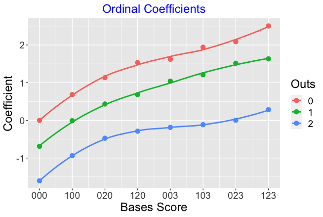
              RUNS ADVANTAGE TABLE
     000   100   020   120   003   103  023  123
 0  0.00  0.68  1.13  1.54  1.62  1.94 2.09 2.51
 1 -0.69 -0.01  0.43  0.68  1.04  1.21 1.52 1.63
 2 -1.60 -0.94 -0.47 -0.29 -0.19 -0.12 0.00 0.28
To make sense of this new table …
- Remember, by model definition the “000 0” state has a value of run advantage 0. Negative run advantage values correspond to runner/outs states that are worse (in terms of scoring runs potential) then the “000 0” state. Positive values (like the “120 0” state) correspond to situations that are more advantageous for scoring runs.
- The numbers don’t represent mean runs scored in the remainder of the inning. Instead, they represent the change in logits over the base situation. For example, we see from the table that the value for bases loaded and one out is 1.70. This means that the logit \[ logit \left(\frac{scoring \le 2}{scoring > 2}\right) \] is 1.70 smaller than the same logit for the bases empty and no outs situation. Also by the model definition, the logit \[ logit \left(\frac{scoring \le k}{scoring > k}\right) \] would be 1.70 smaller than the base rate for any choice of boundary value \(k\).
8.6 Graphing the Effects
As I did earlier for the runs expectancy table, I can graph the run advantages of the different situations (the regression coefficients) as a function of the bases score defined by
Bases Score = sum of runner on bases weights,
where runners on 1st, 2nd, and 3rd are assigned weights of 1, 2, and 4. As before, the color of the point corresponds to the number of outs and I have added smoothing curves to show the basic pattern of these run advantage values.
- The general behavior of these ordinal model coefficients is similar to the behavior of the runs expectancy values. As the bases score increases, there is an increasing trend in the coefficients.
- Also for a given value of the bases score, the coefficients decrease as a function of the number of outs.
- In contrast to the graph of run expectancies, the trend in these values for a given number of outs is nonlinear.
- The nonlinear pattern is most obvious for two outs. There is a sizable increase when the bases score goes from 0 to 2. But for base score values from 2 to 7, there are only small increases in the coefficients. In contrast, when there no outs, there is (approximately) a constant increase in the coefficient value for each one unit increase in bases score.
8.7 Why?
What is the point of introducing a new table describe the advantage of particular runner and bases situations?
Remember I was dissatisfied with just knowing the mean number of runs scored in the remainder of the inning. A mean number like 0.54 is not that helpful in the sense that a team can’t score 0.54 runs. It would be clearer to talk about the chance of scoring, say 0, 1, 2 runs in the remainder of the inning.
In this method, I am using an ordinal regression model to estimate the run probabilities in the five categories 0, 1, 2, 3, 4+. The probabilities in the five categories change when one goes from the “bases empty and no runners” to another state. The model fit gives a single coefficient which is an additive change to the logits.
Using this method, I can tell a manager exactly how the run distribution changes when there are runners on base. Although we are measuring things on a logit scale, one can also reexpress the logit distributions back to the probability scale.
In a future post, I’ll provide some illustrations how this new table can be used similar to the applications of the basic runs expectancy table.
8.8 A Statistical Note
The runs expectancy table gives the mean number of runs scored in the remainder of the inning. Is it possible to create a probability table for runs scored if we know only the mean? Yes, if the distribution of runs scored has a Poisson distribution. Unfortunately, the Poisson is a poor fit to run scoring data for a single half-inning. I did try some alternative distributions like negative binomial, zero-inflated distributions, but they required too many parameters. That led me to use the ordinal scale for run scoring described here.
9 Beyond Runs Expectancy - Some Background
9.1 Introduction: Modeling Runs Scored in an Inning
In last week’s post, I presented a different way of understanding runs potential over different states of an inning defined by the runners on base and the number of outs. The problem of modeling runs scored has addressed by many people over the years. For example, Keith Woolner in this article describes a RPI formula and Patriot describes in this post the Tango distribution and use of a zero-inflated negative binomial distribution.
Some years ago, I did explore the use of standard distributions to represent the runs scored in a half-inning. What I found was that the Poisson model underestimated the probability of a scoreless inning and the negative binomial model (which uses an additional parameter) was unsatisfactory. I could have continued with more sophisticated probability models, but the ordinal response approach seemed pretty easy to apply.
Since some readers may not be familiar with the cumulative logit ordinal response regression model, I will introduce this model by assuming that there is an unobserved run-scoring variable behind the scenes. This motivates the familiar logistic model, and by using more cutpoints, the ordinal regression model. There is an important assumption with this ordinal model, called proportional odds, and I’ll give evidence that this is approximately true for the run scoring data.
Last I’ll contrast runs expectancy and my runs advantage tables over 20 seasons of data. Tom Tango suggested in my ordering of states that the “120” state (runners on 1st and 2nd) should go before the “003” state (runner on third). Runs expectancy suggests that “120” is more valuable than “003” when there are 0 or 2 outs, but runs advantage gives an opposite conclusion.
9.2 Logistic Regression
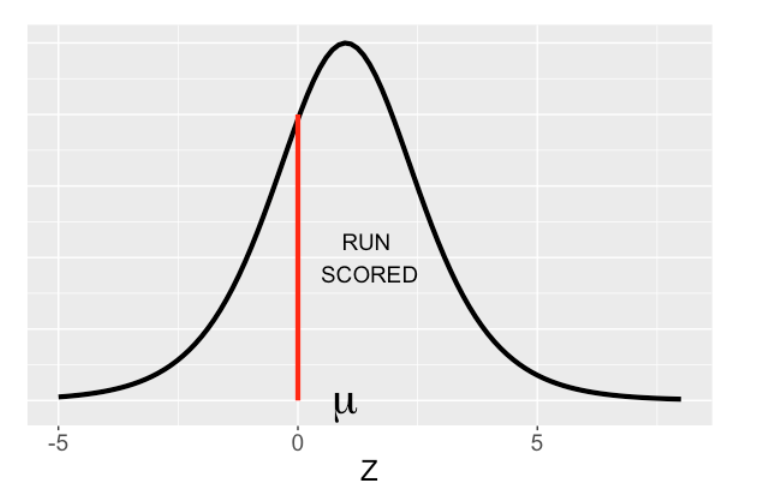
Here is a graphical way to think about logistic regression. Suppose you could measure the run-scoring performance \(Z\) of a team – you don’t observe this, but it is the culmination of the team’s ability to get on base and move runners to home. We assume that \(Z\) has a logistic (bell-shaped) curve distribution with mean \(\mu\) and scale 1 that I show below.
I’d added a vertical line at \(Z = 0\). We observe for each inning if one or more runs scores (\(Z > 0\)) or a run does not score (\(Z \le 0\)). The mean \(\mu\) might depend on other things like the team, home vs away or other covariates. This representation is equivalent to a logistic regression model.
9.3 More Cutpoints - Ordinal Regression
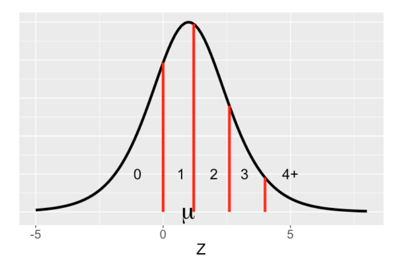
In logistic regression we just recorded 1 if one or more run scores in an inning. Suppose instead we record if one of the five outcomes happens:
no runs scored, 1 run, 2 runs, 3 runs, 4 or more runs
Now we have an ordinal response. We represent the ordinal response model using the same picture but now we have four lines dividing the five possible outcomes. The mean \(\mu\) is a function of different things that impact run scoring such as the state of the inning (number of outs and bases occupied.). So really ordinal regression and logistic regression follow the same representation about the logistic curve for \(Z\). The only difference is that we have one cutpoint (0) for the binary response in logistic regression and we have four cutpoints for the ordinal response in ordinal regression. When we fit the ordinal regression model, we estimate the boundaries (cutpoints) and the covariate effect.
9.4 Proportional Odds
There is one big assumption in ordinal logistic regression. Suppose we wish to compare the run scoring in two different states, say “no runners on with 0 outs” and “runner on 1st with 1 out”. We assume that the run scoring in the two states has the same logistic curve, where the only difference is the locations – that is, the two curves have the same spread.
Suppose we collect the run scoring \(R\) in two states and compute the logits
\[LOGIT = \log\left(\frac{P(R \le j)}{P(R > j)}\right)\]
and we plot these logits against the boundary (value of \(j\)) for each state. The model assumes that these logit curves are parallel. That is
LOGIT (state 2) = LOGIT(state 1) + constant.
We can state this in terms of odds which is the ratio of the probability of runs less than or equal to j to the probability of runs greater than j.
\[ODDS = \frac{P(R \le j)}{P(R > j)}\]
For one state the ODDS is a constant multiple of the ODDS for a second state – this is the proportional odds assumption.
ODDS (state 2) = constant \(\times\) ODDS (state 1).
We can check this assumption graphically for the 2022 season data. Below I plot the observed logits as a function of the boundary for all 24 states defined by number of outs and runners on base. Generally these logit curves do look parallel – this suggest that the ordinal regression model is reasonable for the run-scoring data.
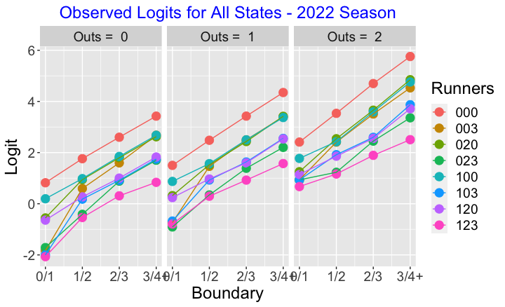
Since this graph is cluttered, let’s look at some specific comparisons of bases situations.
9.4.1 Consecutive Walks
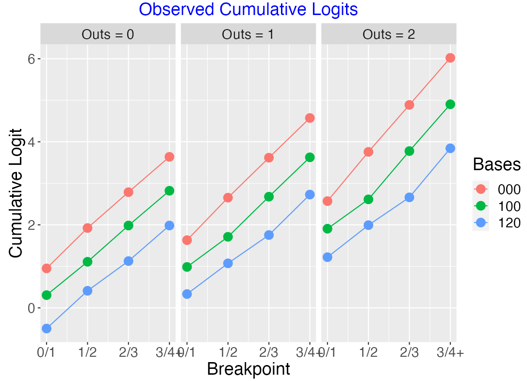
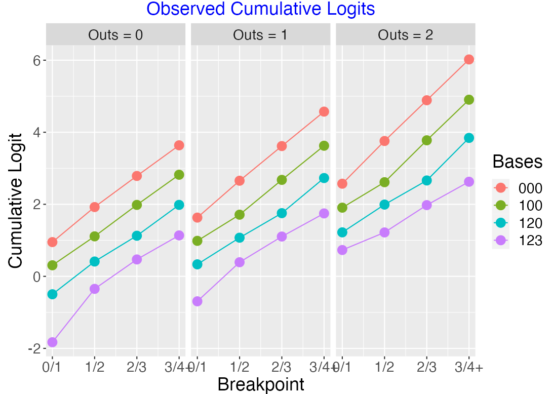
Suppose the bases are empty and there are two consecutive walks, so the bases situation moves from “000” to “100” to “120”. Using twenty seasons of data (2000 through 2019), the following plot graphs the cumulative logits \[LOGIT = \log\left(\frac{P(R \le j)}{P(R > j)}\right)\] against the boundary value \(j\) for the bases “000”, “100”, “120” and for 0, 1, and 2 outs. Here for each value of outs, the logits for the three bases situation look approxiately parallel, confirming the proportional odds assumption. By looking at the Runs Advantage Table, we can get some simple summaries from the fitted ordinal model. For example, when there is one out, moving from “000” to “100” will increase the coefficient by 0.68, and moving from “100” to “120” will increase the coefficient by another 0.69.
Suppose we consider the three consecutive walks situation, moving from “000” to “100” to “120” to “123”. The below figure plots the cumulative logits – again the lines look roughly parallel confirming the proportional odds assumption.
9.4.2 Comparing Runner on 3rd with Runners on 1st and 2nd
Suppose instead that we consider the “runner on 3rd” situation with the “runners on 1st and 2nd” situation. Here is a graph of the observed logits for those situations.
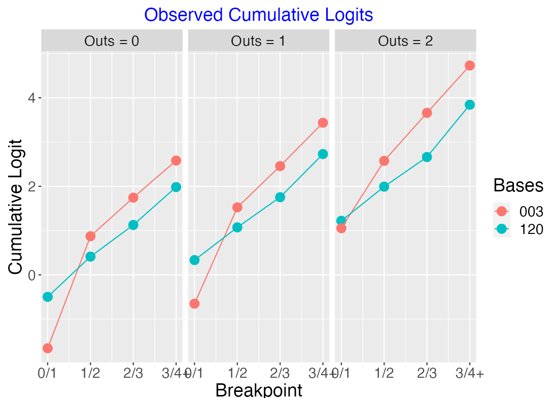
Here the logit lines are clearly not parallel. When there is one out …
the “003” situation is better than “120” at the 0/1 breakpoint. It is more likely for one run to score when there is a runner on 3rd.
for the other breakpoints, the “120” situation is better than “003”. There is a better chance for more runs to score when you have two runners.
9.4.3 One Runner Situations
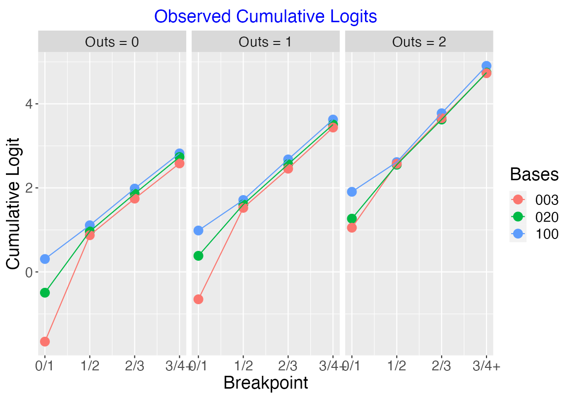
Let’s consider the three situations “100”, “020” and “003” where there is exactly one runner on base.
Looking at the below figure, note that the three situations are very similar with respect to the cumulative logits at 1/2, 2/3 and 3/4+. But the logits differ at 0/1 – this means that it is more likely for a runner to score from 3rd than from 2nd or from 1st.
9.4.4 Two Runner Situations
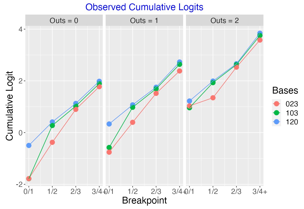
Next let’s consider the three two-runner situations “120”, “103” and “023” – the logits for these three states for all out values are displayed below.
When there are 0 or 1 outs, it is clearly less likely to score in the “120” situation than the other two situations. It is more likely to score more than 1 run in the “023” situation than the other two situations. The three states are similar in the chances of scoring three or more runs in the remainder of the inning.
9.5 Comparing Runs Expectancy with Ordinal Coefficients
There is an interesting comparison between the familiar runs expectancy table and my “runs advantage table” where you are displaying the ordinal regression slopes for all bases/outs situation.
Here is the run expectancy table (using data for 20 seasons 2000-2019) and the graph of these values. Following Tom Tango’s suggestion, the “Bases Score” is defined to be
Bases Score = 1 (runner on 1st) + 2 (runner on 2nd) + 4 (runner on 3rd)
Note that, for 0 and 2 outs, the “003” situation (column 5) has lower runs expectation than the “120” situation (column 4).
Here is the corresponding table and graph for my ordinal regression coefficients (again using 20 seasons of data). We note:
We don’t have that situation described above – “120” has a smaller coefficient than “003” for each of the three outs values.
Generally, the ordinal coefficients are monotone increasing as a function of the bases score for each values of outs.
9.6 Takeaways
Probability Modeling of Runs Scored? Run scoring in baseball is not well represented by typical probability models like the Poisson or negative binomial which motivates the ordinal response regression approach.
Ordinal and logistic regression are based on the same conceptual logistic distribution framework – you just have more boundaries with the ordinal approach.
The proportional-odds assumption in ordinal regression seems to be supported by the observed run scoring data.
Comparing Value of States. The ordinal regression coefficient estimates support the belief that the runner on 3rd situation is more valuable (from a run scoring perspective) than the runners on 1st and 2nd situation. The runs expectancy values don’t support this pattern.
How Can a Team Score 0.5 Runs? I think the runs advantage table is better than runs expectancy since it tells you something about the distribution of runs scored, not just the average.
Other Applications. I have illustrated the use of ordinal regression models in earlier posts. In this post, I explore the ordinal response that is the outcome in balls in play and in this post, I use an ordinal model to relate expected wOBA with the Statcast barrels definition.
10 Calculation of In-Game Win Probabilities
10.1 Part 1
When you visit Baseball Reference’s boxes pages, such as the extended box score of the final game of the 2014 season, you will see a display of win probabilities. One particular graph shows the probability of the Giants winning the game after each play. These are used to measure player performances. For example, Madison Bumgarner was the most valuable player of this game since his total win probability added (WPA) over all of his plays was 0.603. (On a side note, Jay Bennett and I presented these type of calculations in Curve Ball.)
It is straightforward to compute these win probabilities. A first step in this calculation is to compute, at the end of each inning, the probability the home team wins the game. We illustrate one method of performing this computation using Retrosheet game logs for a particular season.
A function plot.prob.home() is available on this github gist page. Let me outline the main steps of this function.
- The game logs for the particular season are downloaded from Retrosheet. A short file is also downloaded from my site that gives the header (variable
names) for the game log file. - The game log file contains the line scores for the home and visiting teams. The function will parse these line scores and create a numerical variable of runs scored for all innings. (The string function
strsplit()is helpful for doing this parsing.) - It didn’t seem obvious how to parse line scores for games where with innings where 10 or more runs are scored. So I have omitted those line scores – I don’t think this would impact the results very much.
- A logistic regression model is used to develop a smooth curve for predicting the probability of a home team victor given the winning margin. This model has the form \[ \log\left(\frac{p}{1-p}\right) = \beta_0 + \beta_1 {\rm Home.Team.Lead} \] This model is applied for each of the bottoms of the eight innings. The regression intercept \(\beta_0\) represents the home team advantage and \(\beta_1\) represents the additional advantage for the home team (on the logit scale) for each additional run lead.
- I use the
ggplot2package to plot the probability the home team wins as a function of the inning number (1 through 8) for each of the home team leads -4, -3, -2, -1, 0, 1, 2, 3, 4.
Here are a couple of illustrations of the use of this function for two seasons – 1980 and 2013. Assuming you have the packages devtools , arm , and ggplot2 installed, you can just type the following R code into the Console window to see these graphs and have the probabilities displayed in a data frame.
library(devtools)
source_gist("70a166149f71622fed97")
plot.prob.home(1993)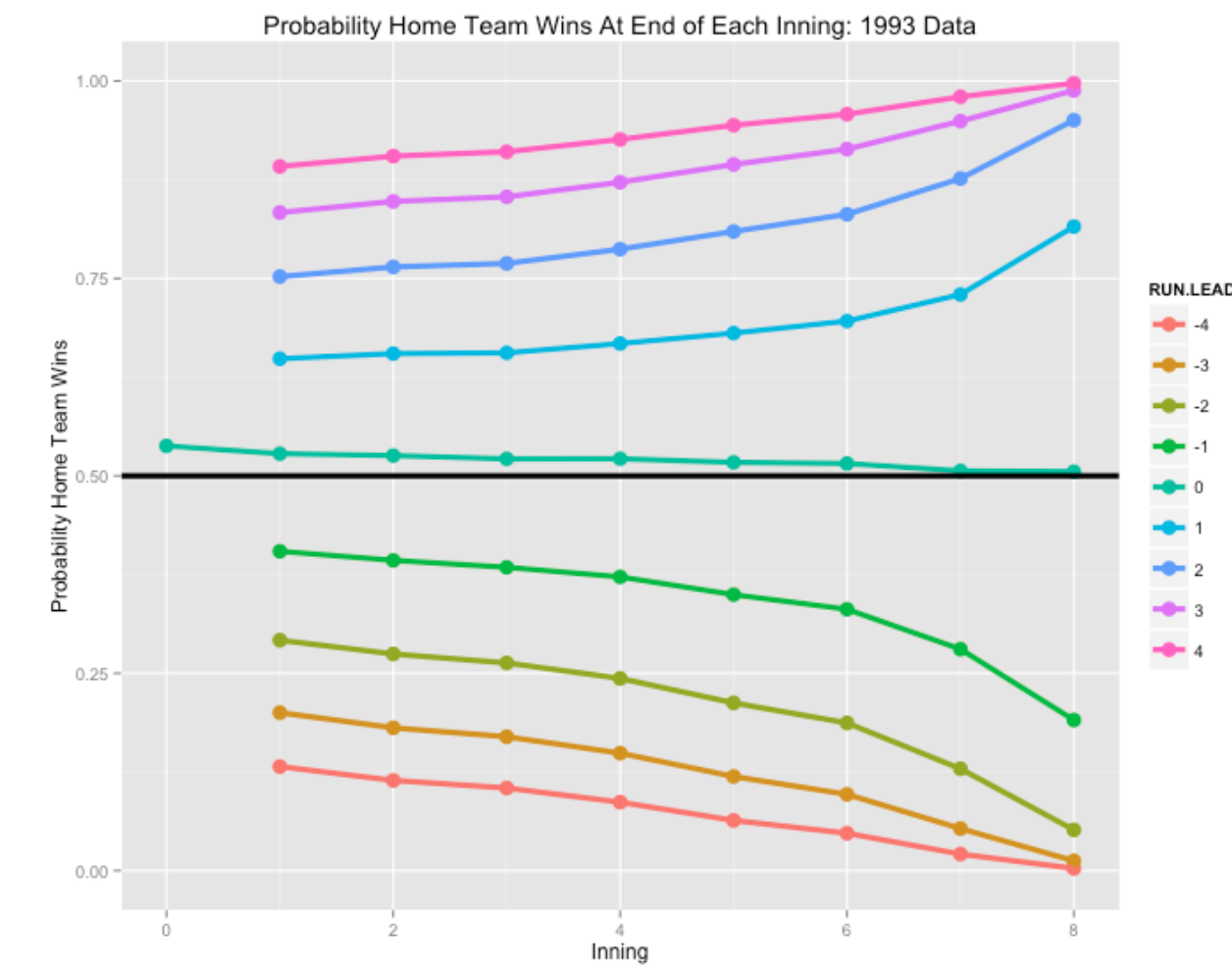
plot.prob.home(2013)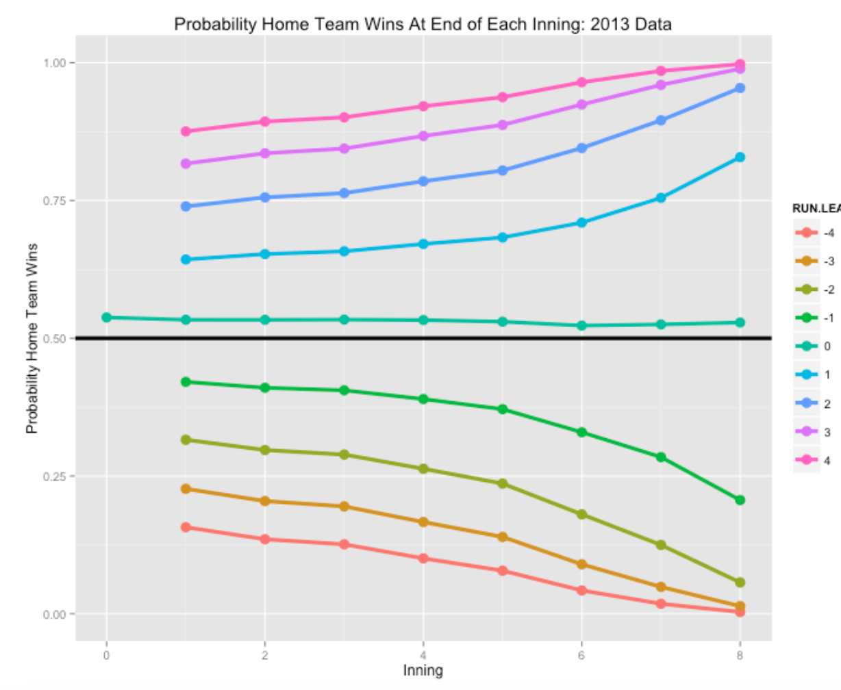
Several comments about what we see in these graphs.
- Note that the home team has a slight advantage at the beginning, about 0.54, of winning the game. The size of the home advantage has stayed pretty consistent through recent baseball seasons. Also, the home team maintains this slight advantage for tied games at the end of each inning.
- As one might expect, the probability the home team wins with a small lead gets closer to 1 as the game approaches the end. One way of measuring the impact of a team’s closer is to compare these late-game probabilities across teams.
- Following up this last comment, if you look at the description of the WPA methodology, you will note that these probability calculations are for an “average team”, and it would be desirable to get probability and WPA estimates that take in account the offense and defense capabilities of the individual teams.
The calculation of these win probabilities is a start towards computing the WPAs after each baseball play. The WPAs can be found by using this work together with run expectancies and the details of this work will be found in a future post.
10.2 Part 2
In an earlier post, I described how one can compute end-of-inning win probabilities for the home team using Retrosheet game log data. One is usually interested in computing win probabilities after each play, and using these to find so-called WPA (win-probability added) values that we can attribute to specific players. Here we describe using Retrosheet play-by-play data to compute these win probabilities and we’ll contrast these values with the ones posted on the Baseball-Reference site.
To review some previous work, we have already described in a previous post the process of downloading all play-by-play data for a specific season from Retrosheet and computing the run values (from the run expectancy table) for all players. We will be using these run values in this work.
10.2.1 Computing the Inning Win Probabilities
I wrote a new function prob.win.game2() that will download the Retrosheet play-by-play data for a specific season and use these to estimate the probability the home team wins at the end of each half-inning. Essentially, I collect the winning margin (home score - visitor score) and the ultimate game outcome (1 if the home team wins, and 0 otherwise) at the end of a specific half-inning and fit the logistic model \[
\log \left( \frac{p} {1 - p}\right) = \beta_0 + \beta_1 \times (WIN MARGIN)
\] where \(p\) is the probability the home team wins. We fit 16 of these models, corresponding to each of the half-innings top-of-first, bottom-of-first, …, top-of eighth, bottom-of-eighth. (In the 9th inning and beyond, we use the same model that was used for the 8th inning.) For example, at the end of the 4th inning, we have the fit \[
\log \left( \frac{p} {1 - p}\right) = 0.074 + 0.632 \times (WIN MARGIN)
\] So by leading by an additional run after 4 innings, the home team’s probability of winning (on the logit scale) is increased by 0.632.
10.2.2 Computing the Play Win Probabilities
Actually, we want to compute the probability the home team wins after each play in an inning. For example, suppose the home team has runners on 1st and 2nd with one out in the 4th – what is the probability they will win? Using a rule of probabilities \[ P(Win) = \sum P(R) P(Win | R), \] where \(P(R)\) is the probability the team scores R runs in the inning, and \(P(Win | R)\) is the probability the team wins at the end of the inning if they have scored R runs. This probability is tedious to compute, but we can approximate it by \[ P(Win) \approx P(Win | \bar R), \] where \(\bar R\) is the expected run value, and \(P(Win | \bar R)\) is the probability the home team wins (computed using the logistic model) if the team has scored \(\bar R\) runs. For example, suppose that a home team currently has a 2 run lead, and runners on 1st and 2nd with two outs in the bottom of the forth. The expected number of runs in the remainder of the inning is 0.40 (from 2014 data). Using the logistic model, the logit of the probability of the home team winning at the bottom of that inning is estimated to be \[ \log \left( \frac{p} {1 - p}\right) = 0.074 + 0.632 \times (2 + 0.40) = 1.59, \] and the probability the home team wins the game is \[ \frac{\exp(1.59)}{(1 + \exp(1.59))} = 0.83. \]
To compute these win probs, I first use the function compute.runs.expectancy() to compute all of the run values and then use a new function compute.win.probs() to compute the win probabilities after all plays. This last function uses both the data frame that contains the Retrosheet data and run values, and also the data frame containing the logistic regression coefficients for all half-innings.
10.2.3 Displaying Play Win Probabilities
I have saved the data frame containing all of this work for the 2014 season on my website. You can plot the win probabilities for a specific game by downloading the data frame and sourcing in a new function graph.game() that will do the plotting. The function outputs the rows of the data frame corresponding to the game. Here is an illustration of how it works – we’ll plot the win probabilities for the New York Yankees at Tampa Bay Rays game of April 18, 2014. The plays
load(url("http://bayes.bgsu.edu/baseball/pbp2014winprob.Rdata"))
library(devtools)
source_gist("a8e5255c98954d151974")
d.game <- graph.game(d, "TBA201404180")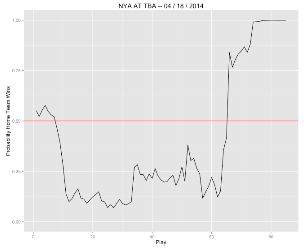
You can plot win probabilities for any game for the 2014 season – just change the game code in the input of graph.game().
10.2.4 Checking My Work
If you look at the Baseball-Reference description of this game here, you’ll see the same type of win probabilities plotted and each play has an associated value of WPA. I’m not sure of the exact method that was used, but it is easy to download their data and compare their values of WPA with my values. Here is a scatterplot of the two sets of values for this particular game.
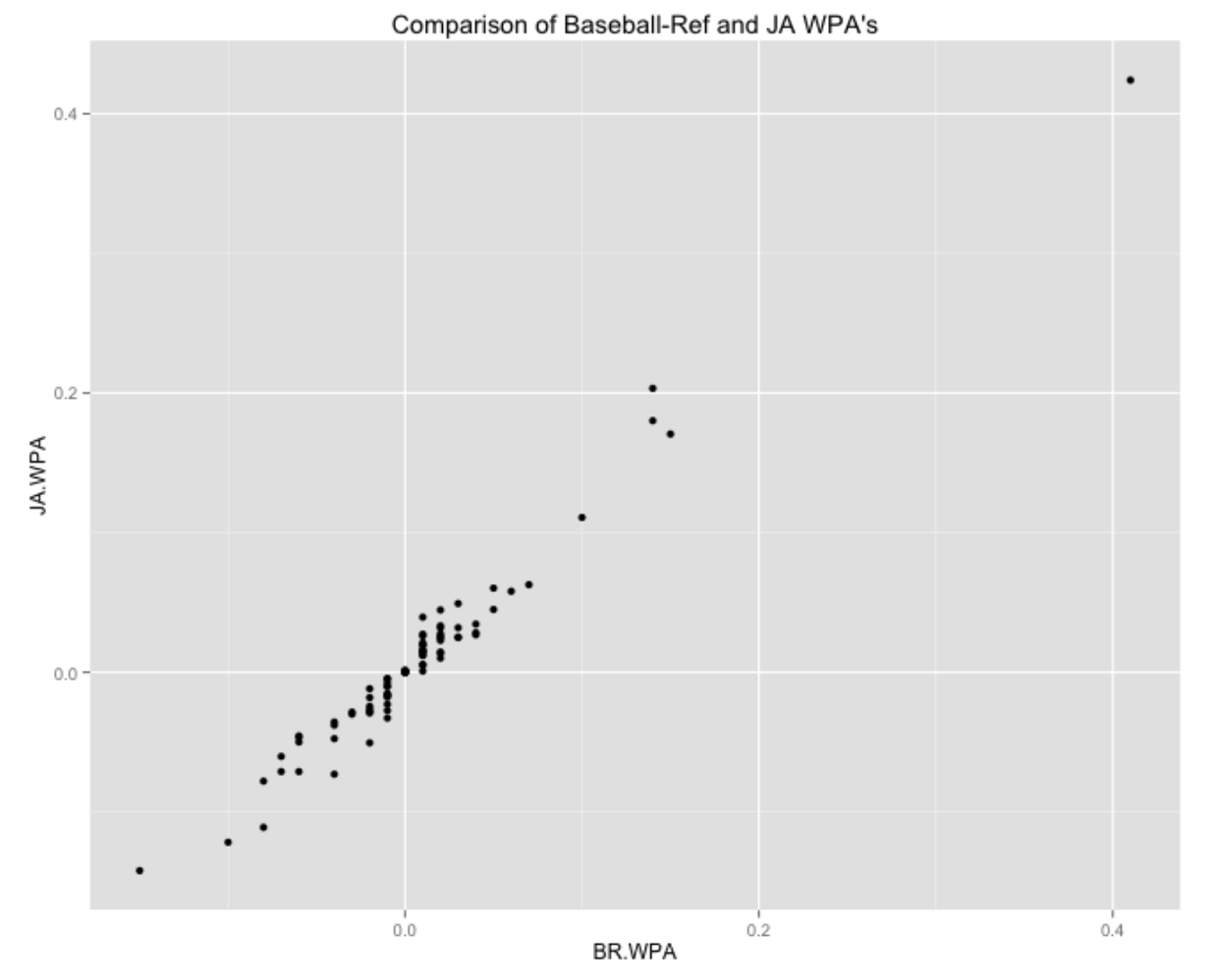
I’m encouraged that the WPA values are similar in this case. In particular, both methods would identify the important plays in this game. The key play was James Loney’s single in the bottom of the 7th that raised the Tampa win probability by over 40%.
The code for the two new functions prob.win.game2() and compute.win.probs() can be found on my gist site here.