22 Binned Data II
22.1 Introduction
In the last lecture, we illustrated fitting a Gaussian (normal) curve to a histogram. But the Gaussian curve is just one of many possible symmetric curves that we can fit to binned data. Here we illustrate fitting a more general symmetric curve to grouped data. This is a nice closing topic for this class, since it will illustrate
- reexpression using a power transformation
- smoothing using a resistant smooth (3RSSH)
- straightening a plot
library(LearnEDAfunctions)
library(tidyverse)
22.2 Meet a simulated, but famous, dataset
I have to apologize at this point – we are going to look at a collection of simulated (fake) data. But it’s a famous type of simulated data. I believe a famous brewer in the 19th century looked at a similar type of data.
[ASIDE: Can you guess at the name of this brewer? A particular distribution is named after him. I’ll give you the name of this brewer later in this lecture.]
Here’s how I generated this set of data. First, I took a random sample of eight normally distributed values. Then, I computed the mean \(\bar X\) and the standard deviation \(S\) from this sample and computed the ratio \[ R = \frac{\bar X}{S}. \] I repeated this process (take a sample of 8 normals and compute \(R\)) 1000 times, resulting in 1000 values of R.
my.sim <- function() {
    x <- rnorm(8)
    mean(x) / sd(x)
}
df <- data.frame(R = replicate(1000, my.sim()))
I group these data using 14 equally spaced bins between the low and high values; the table below gives the bin counts
bins <- seq(min(df$R), max(df$R), length.out = 15)
p <- ggplot(df, aes(R)) +
  geom_histogram(breaks = bins)
out <- ggplot_build(p)$data[[1]]
select(out, count, x, xmin, xmax)
## count x xmin xmax
## 1 1 -1.690 -1.8213 -1.5595
## 2 4 -1.429 -1.5595 -1.2977
## 3 4 -1.167 -1.2977 -1.0359
## 4 22 -0.905 -1.0359 -0.7741
## 5 54 -0.643 -0.7741 -0.5123
## 6 146 -0.381 -0.5123 -0.2505
## 7 260 -0.120 -0.2505 0.0113
## 8 262 0.142 0.0113 0.2731
## 9 155 0.404 0.2731 0.5349
## 10 58 0.666 0.5349 0.7967
## 11 22 0.928 0.7967 1.0585
## 12 9 1.189 1.0585 1.3203
## 13 2 1.451 1.3203 1.5821
## 14 1 1.713 1.5821 1.843922.3 Smoothing the root counts
Remember how we handled bin counts in the last lecture? We observed that the variation of large counts tends to be larger than the variation of small counts. To remove the dependence of spread and level of these counts, we reexpressed by a square root (the resulting graph was called a rootogram).
So the first thing we do is to take the roots of the counts, shown below.
out <- mutate(out, ROOT = sqrt(count))
select(out, count, x, xmin, xmax, ROOT)
## count x xmin xmax ROOT
## 1 1 -1.690 -1.8213 -1.5595 1.00
## 2 4 -1.429 -1.5595 -1.2977 2.00
## 3 4 -1.167 -1.2977 -1.0359 2.00
## 4 22 -0.905 -1.0359 -0.7741 4.69
## 5 54 -0.643 -0.7741 -0.5123 7.35
## 6 146 -0.381 -0.5123 -0.2505 12.08
## 7 260 -0.120 -0.2505 0.0113 16.12
## 8 262 0.142 0.0113 0.2731 16.19
## 9 155 0.404 0.2731 0.5349 12.45
## 10 58 0.666 0.5349 0.7967 7.62
## 11 22 0.928 0.7967 1.0585 4.69
## 12 9 1.189 1.0585 1.3203 3.00
## 13 2 1.451 1.3203 1.5821 1.41
## 14 1 1.713 1.5821 1.8439 1.00We plot the root counts using a line graph.
ggplot(out, aes(x, ROOT)) +
  geom_line() +
  xlab("Bin Mid Points")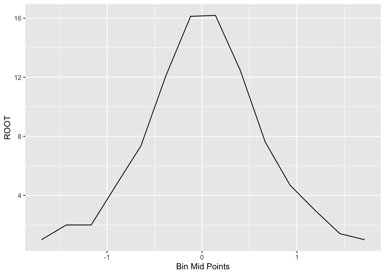
Generally, we’ll see some unevenness in this plot of the root counts. Here the unevenness is most obvious near the peak of the graph. We smooth out the curve by applying our resistant smooth (a 3RSSH, twice) to the sequence of root counts. We use R to apply a 3RSSH smooth. The table below shows the values of the smoothed roots and the figure below the table plots the smooth in red.
out <- mutate(out,
  Smooth.Root = as.vector(smooth(ROOT, twiceit = TRUE)))
select(out, count, x, ROOT, Smooth.Root)
## count x ROOT Smooth.Root
## 1 1 -1.690 1.00 2.00
## 2 4 -1.429 2.00 2.00
## 3 4 -1.167 2.00 2.00
## 4 22 -0.905 4.69 4.69
## 5 54 -0.643 7.35 7.35
## 6 146 -0.381 12.08 12.08
## 7 260 -0.120 16.12 16.12
## 8 262 0.142 16.19 16.12
## 9 155 0.404 12.45 12.45
## 10 58 0.666 7.62 7.62
## 11 22 0.928 4.69 4.69
## 12 9 1.189 3.00 3.00
## 13 2 1.451 1.41 1.41
## 14 1 1.713 1.00 1.00ggplot(out, aes(x, ROOT)) +
geom_line() +
geom_line(aes(x, Smooth.Root), color="red") +
xlab("Bin Mid Points")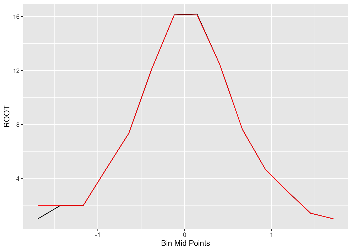
22.4 Fitting a symmetric curve
Now that we have a smoothed version of the root counts, we want to fit a symmetric curve. A general form of this symmetric curve is \[ ({\rm some \, reexpression \, of } \, \sqrt{count}) = a + b (bin - peak) ^ 2, \] where - \(bin\) is a value of a bin midpoint - \(peak\) is the value where the curve hits its peak
We fit this symmetric curve in three steps.
- First, we find where the histogram appears to peak. Here I have strong reason to believe that the histogram peaks at 0, so \[ peak = 0. \]
- Next, we find an appropriate power transformation (that is, choice of a power \(p\)) so that \[ {\sqrt{count}} ^ p \] is approximately a linear function of \[ (bin - shift)^2 = shift ^ 2. \] where \(shift\) is the difference between the bin midpoint and the peak. In the table below, we show the bin midpoints (BIN MPT) and the values of the \(shift^2 = (bin - peak)^2\) for all bins.
out <- mutate(out, Shift.Sq = round((x - 0) ^ 2, 2))
select(out, count, x, ROOT, Smooth.Root, Shift.Sq)
## count x ROOT Smooth.Root Shift.Sq
## 1 1 -1.690 1.00 2.00 2.86
## 2 4 -1.429 2.00 2.00 2.04
## 3 4 -1.167 2.00 2.00 1.36
## 4 22 -0.905 4.69 4.69 0.82
## 5 54 -0.643 7.35 7.35 0.41
## 6 146 -0.381 12.08 12.08 0.15
## 7 260 -0.120 16.12 16.12 0.01
## 8 262 0.142 16.19 16.12 0.02
## 9 155 0.404 12.45 12.45 0.16
## 10 58 0.666 7.62 7.62 0.44
## 11 22 0.928 4.69 4.69 0.86
## 12 9 1.189 3.00 3.00 1.41
## 13 2 1.451 1.41 1.41 2.11
## 14 1 1.713 1.00 1.00 2.93- To find the appropriate reexpression, we plot \(\sqrt{smoothed \, root}\) against the squared shift for all bins.
ggplot(out, aes(Shift.Sq, Smooth.Root)) +
  geom_point()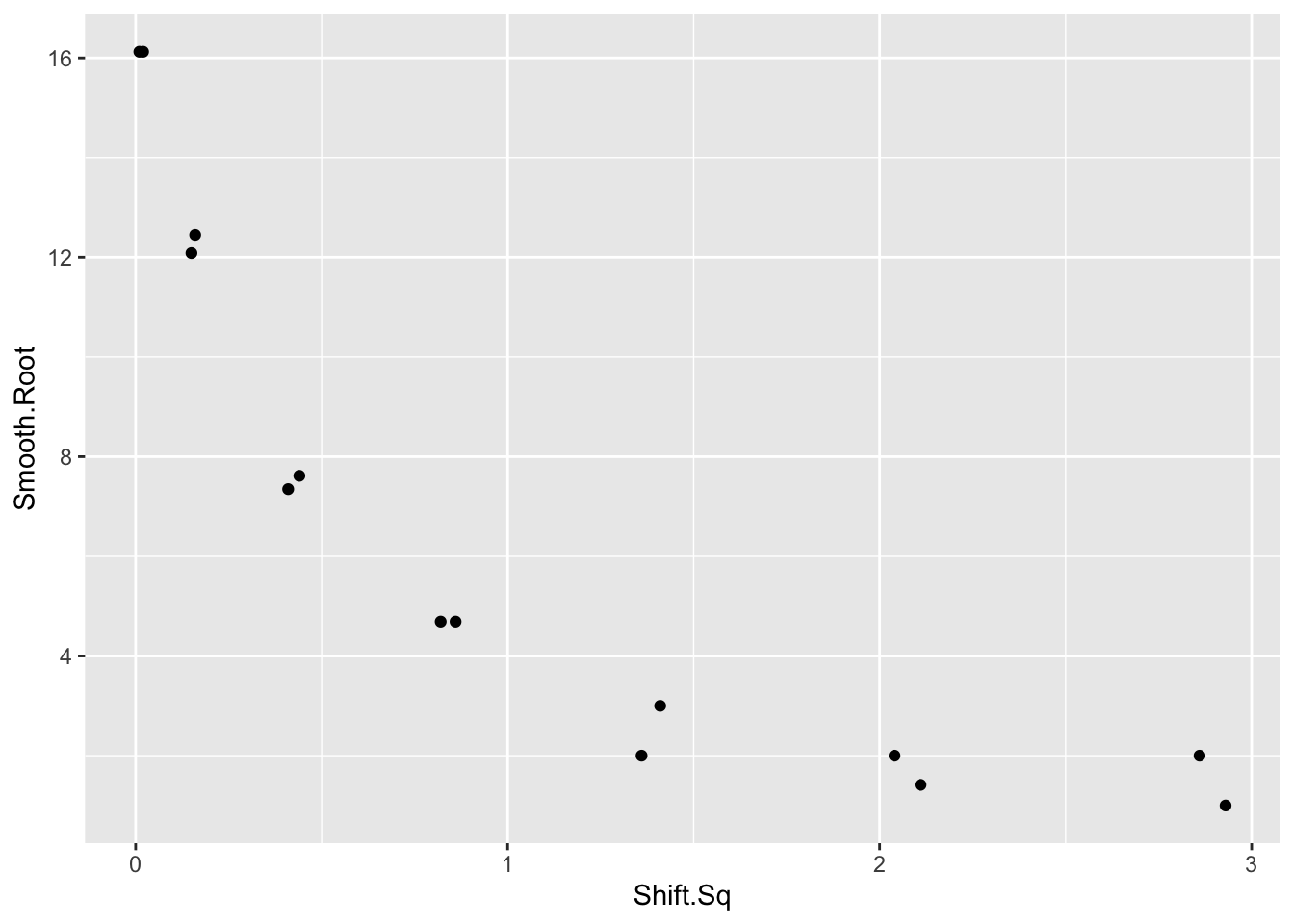
We see strong curvature in the graph and a reexpression is needed to straighten. We wish to reexpress the \(y\) variable (that is, the smoothed root count) so that the curve is approximately linear.
We could choose three summary points and find an appropriate choice of reexpression so that the half-slope ratio is close to 1. But this method seems to give unsatisfactory results for this example. As an alternative, we will plot the shift squared against different power transformations of the smoothed roots, and look for a power p that seems to straighten the graph.
In the following figure, we graph the shift squared against the smoothed roots using reexpressions \(p\) = 0.5 (roots), \(p\) = .001 (logs), \(p = -0.5\) (reciprocal roots), and \(p = -1\) (reciprocals) for the smoothed roots. We have placed a lowess smooth on each graph to help in detecting curvature.
library(gridExtra)
p1 <-  ggplot(out,
      aes(Shift.Sq, power.t(Smooth.Root, 0.5))) +
      geom_point() + ylab("New Y") + ggtitle("Power = 0.5")
p2 <-  ggplot(out,
      aes(Shift.Sq, power.t(Smooth.Root, 0))) +
      geom_point() + ylab("New Y") + ggtitle("Power = 0")
p3 <-  ggplot(out,
      aes(Shift.Sq, power.t(Smooth.Root, - 0.5))) +
  geom_point() + ylab("New Y") + ggtitle("Power = -0.5")
p4 <-  ggplot(out,
      aes(Shift.Sq, power.t(Smooth.Root, - 1))) +
      geom_point() + ylab("New Y") + ggtitle("Power = -1")
grid.arrange(p1, p2, p3, p4)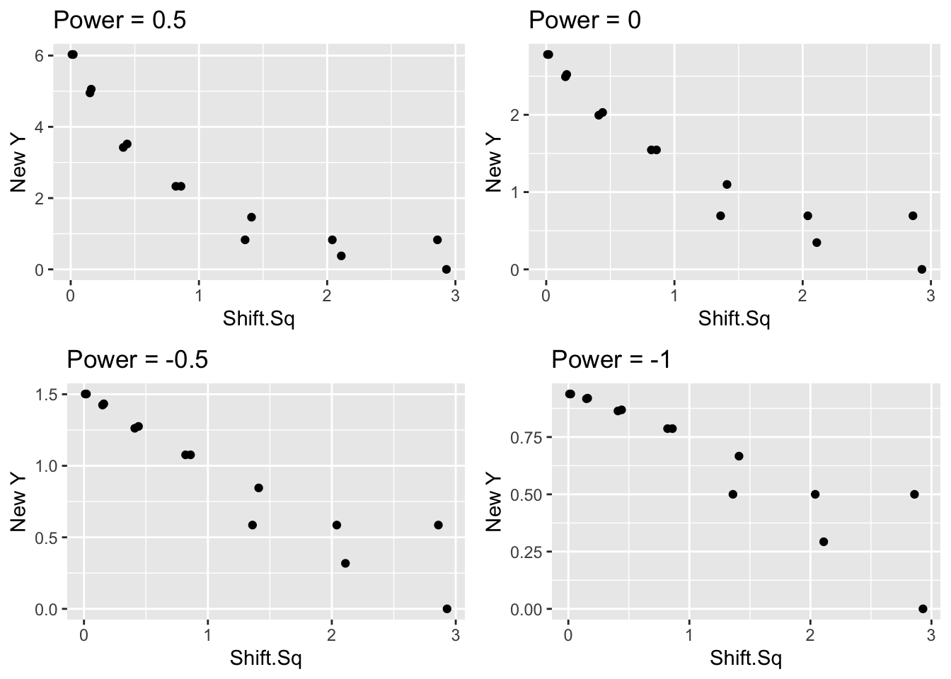
Looking at the four graphs, we see substantial curvature in the \(p=0.5\) and \(p=0.001\) plots and the straightening reexpression appears to fall between the values \(p = -0.5\) and \(p = -1\).
Since a reexpression has straightened the graph, we can now fit a line. Our linear fit has the form \[ (smoothed \, root)^p = a + b \, shift^2. \] If we write this fit in terms of the count, we have \[ smooth = (a + b \, shift ^ 2)^{(2/p)} \] Suppose we use a reexpression \(p = -0.75\). A resistant line to the reexpressed data gives the fit \[ (smoothed \, root)^{-0.75} = a + b \, shift^2. \] which is equivalent to \[ smooth = (a + b \, shift ^ 2)^{(2/-0.75)} \]
In the R code, we estimate \(a\) and \(b\) and use the formula
\[ smooth = (a + b \, shift ^ 2)^{(2/-0.75)} \]
to find the fitted smoothed count, and then take the square root to find the fitted smooth root count.
out <- filter(out, Smooth.Root > 0)
fit <- lm(I(Smooth.Root ^ (- 0.75)) ~ Shift.Sq,
          data=out)
b <- coef(fit)
out <- mutate(out, Final.Smooth =
      (b[1] + b[2] * Shift.Sq) ^ (-2 / 0.75),
      Final.S.Root = sqrt(Final.Smooth))
select(out, count, x, ROOT, Final.Smooth, Final.S.Root)
## count x ROOT Final.Smooth Final.S.Root
## 1 1 -1.690 1.00 1.61 1.27
## 2 4 -1.429 2.00 3.40 1.84
## 3 4 -1.167 2.00 7.80 2.79
## 4 22 -0.905 4.69 19.50 4.42
## 5 54 -0.643 7.35 52.69 7.26
## 6 146 -0.381 12.08 129.59 11.38
## 7 260 -0.120 16.12 248.08 15.75
## 8 262 0.142 16.19 235.51 15.35
## 9 155 0.404 12.45 124.40 11.15
## 10 58 0.666 7.62 48.31 6.95
## 11 22 0.928 4.69 18.01 4.24
## 12 9 1.189 3.00 7.27 2.70
## 13 2 1.451 1.41 3.16 1.78
## 14 1 1.713 1.00 1.52 1.23On the following figure, we graph the original bin counts against the shift and overlay the symmetric fitting curve.
ggplot(out, aes(x, ROOT)) +
  geom_line() +
  geom_line(aes(x, Final.S.Root), color="red") +
  xlab("Bin Mid Points")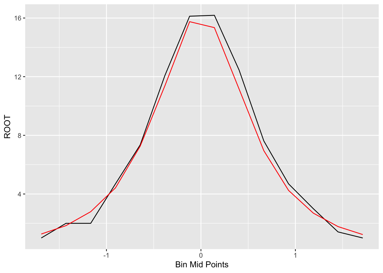
22.5 Is it a reasonable fit?
Does this fit provide a good description of the counts? To check the goodness of fit, we compute residuals. Recall how we defined residuals from the last lecture. We look at the difference between the observed root count (we called it \(\sqrt{d}\) ) and the root of the expected count \(\sqrt{e}\) from the smooth curve: \[ r = \sqrt{d} - \sqrt{e} \] We plot the residuals against the bin midpoints below.
out <- mutate(out,
              Residual = ROOT - Final.S.Root)
ggplot(out, aes(x, Residual)) +
  geom_point() +
  geom_hline(yintercept = 0)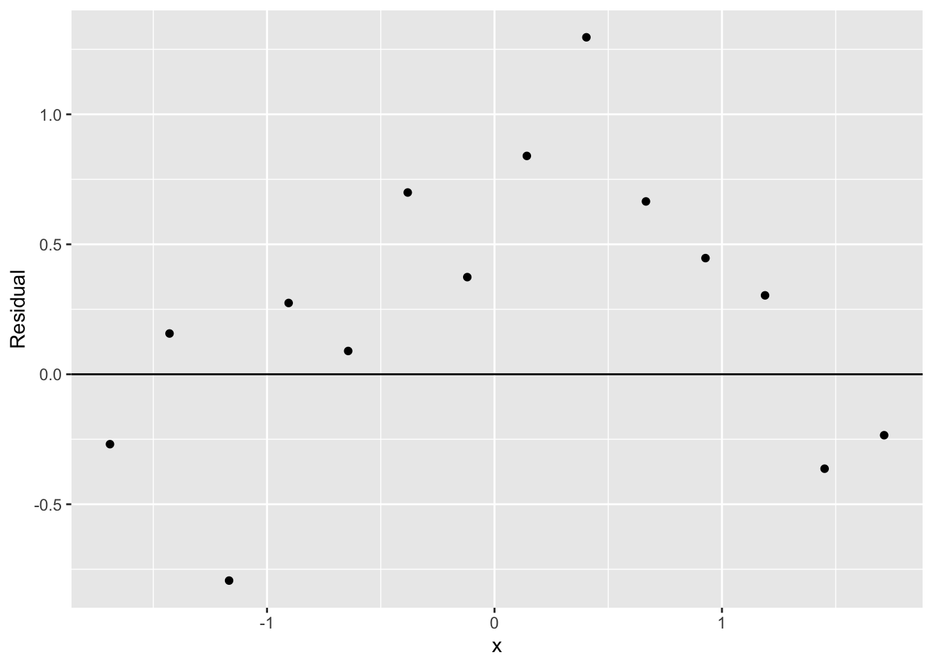
If we don’t see any pattern in the residuals, then this will appear to be a reasonable fit.
The curve we fit is actually a famous probability density
Does the curve \[ smooth = (a + b \, shift ^ 2)^{(2/-0.75)} \] look familiar? It should if you are familiar with the popular sampling distributions in statistical inference.
If we take a random sample of size \(n\) from a normal population with mean \(\mu\) , then the distribution of the statistic \[ T = \frac{\sqrt{n}(\bar X - \mu)}{S} \] has a \(t\) distribution with \(n - 1\) degrees of freedom. The general form of the density function of a \(t\) curve with mean \(\mu\) , scale parameter \(\sigma\) , and degrees of freedom \(\nu\) has the form \[ f(y) \propto \left(1 + \frac{(y-\mu)^2}{\sigma^2 \nu}\right)^{-(\nu +1)/2} \]
If we compare this form of this density with our smooth curve , we see that it has the same form. By matching up the powers \[ - \frac{\nu + 1}{2} = -\frac{2}{0.75} \] and solving for \(\nu\) , we obtain that \(\nu\) = 4.3. So our fit to our data is a t curve with 4.3 degrees of freedom. This is not quite right – the true distribution of \(\bar X / S\) is \(t\) with 7 degrees of freedom (remember we took samples of size 8) – but we’re close to the true distribution.
22.6 The famous brewer
Who was the famous brewer/statistician? William Gossett worked for a brewery in England in the 18th century. He did mathematics on the side and published a result about the \(t\) distribution using the pseudonym Student. (He didn’t want the brewery to know that he had a second job.) So that’s why we call it the Student-t distribution.