7 Comparing Batches III
7.1 A Case Study where the Spread vs Level Plot Works
Baseball data: Team homerun numbers for years 1900, …, 2000.
Background: In baseball, the most dramatic play is the home run, where the batter hits the pitch over the outfield fence. In a current typical baseball game, you may see 1-3 home runs hit. Home runs were not always so common. Here we compare the quantity of home runs hit over the years. Specifically, we look at the total numbers of home runs hit by all teams in the Major League for the years 1900, 1910, …, 2000.
To compare these 11 batches, we use parallel boxplots. In the LearnEDA package, the data is available in the data frame homeruns.2000.
The boxplot function is used to construct parallel boxplots of the team home runs by year.
library(LearnEDAfunctions)
library(tidyverse)
ggplot(homeruns.2000, aes(factor(YEARS), HOMERUNS)) +
  geom_boxplot() + coord_flip() +
  xlab("Year")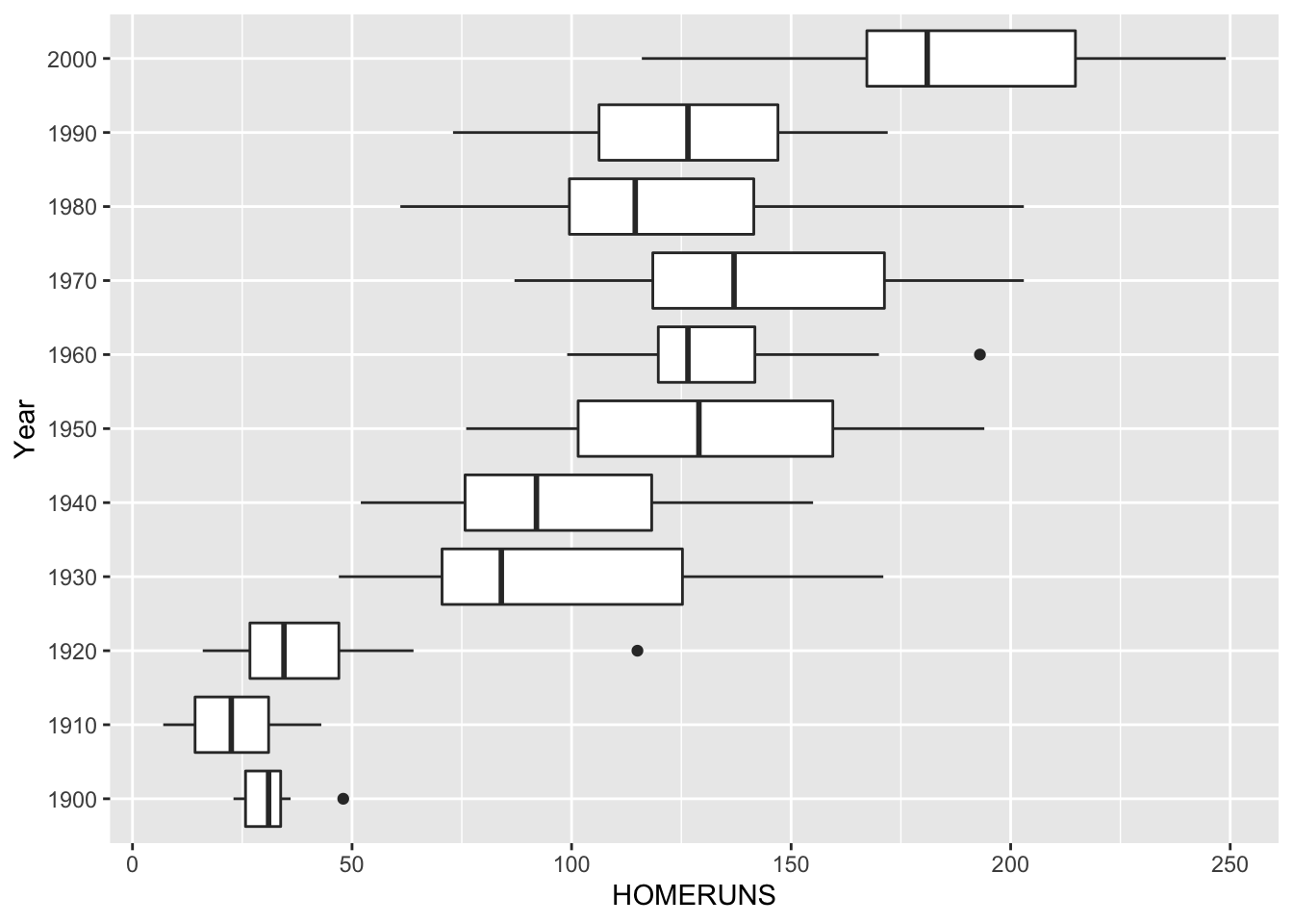
Looking at this graph, what do we see?
- We see that there were a small number of home runs hit by teams in the early years (1900-1920) compared with the later years (1930-2000).
- Also the spreads of the batches are not the same. The batches with the small home run numbers are also the ones with the smallest spreads.
- So there appears to be a dependence between spread and level here.
To construct a spread vs. level plot, we apply the R function spread.level.plot(). This function outputs a table of the medians, dfs, log10(medians), log10(dfs) for all years. Also it constructs a spread versus level graph with a ``best line” line superimposed.
spread_level_plot(homeruns.2000, HOMERUNS, YEARS)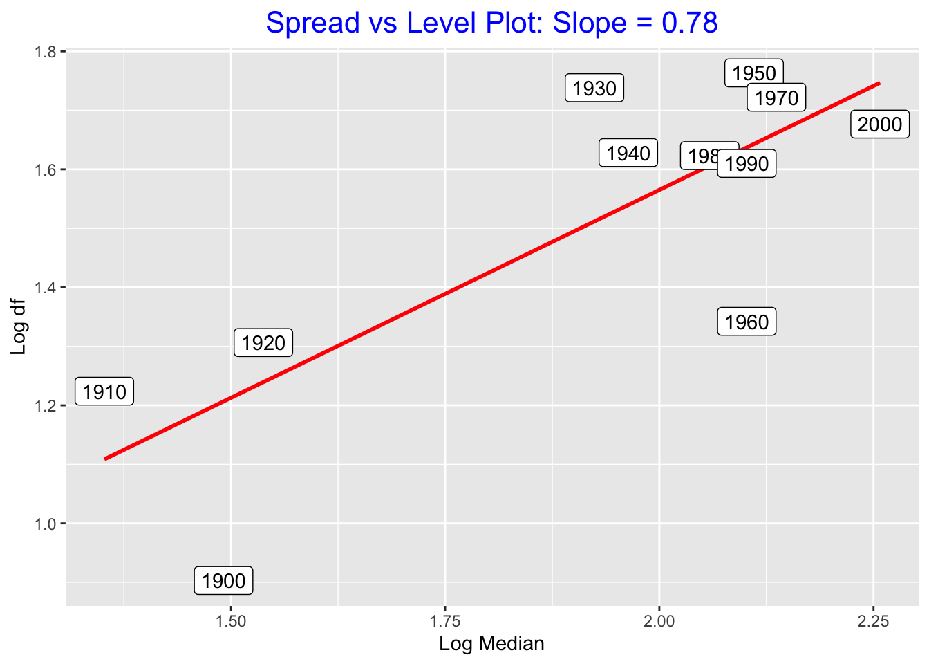
## # A tibble: 11 × 5
##    YEARS     M    df log.M log.df
##    <int> <dbl> <dbl> <dbl>  <dbl>
##  1  1900  31     8    1.49  0.903
##  2  1910  22.5  16.8  1.35  1.22
##  3  1920  34.5  20.2  1.54  1.31
##  4  1930  84    54.8  1.92  1.74
##  5  1940  92    42.5  1.96  1.63
##  6  1950 129    58    2.11  1.76
##  7  1960 126.   22    2.10  1.34
##  8  1970 137    52.8  2.14  1.72
##  9  1980 114.   42    2.06  1.62
## 10  1990 126.   40.8  2.10  1.61
## 11  2000 181    47.5  2.26  1.68
We see a positive association in the graph, indicating a dependence between level (measured by \(\log M\)) and spread (measured by \(\log d_F)\).
We fit a line to this graph. We use a resistant procedure called ``resistant line” to fit this line (we’ll talk more about this procedure later in this course). The slope of this line is \(b = .64\). So, by using our rule-of-thumb, we should reexpress our home run data by a power transformation with power \(p = 1 - b = 1 - .64\) which is approximately \(p = .5\). In other words, this method suggests taking a root transformation.
On R, we create a new variable roots that will contain the square roots of the home run numbers.
homeruns.2000 %>% mutate(roots = sqrt(HOMERUNS)) ->
  homeruns.2000
We construct a parallel boxplot display of the batches of root home run numbers.
ggplot(homeruns.2000, aes(factor(YEARS), roots)) +
  geom_boxplot() + coord_flip() +
  xlab("Year")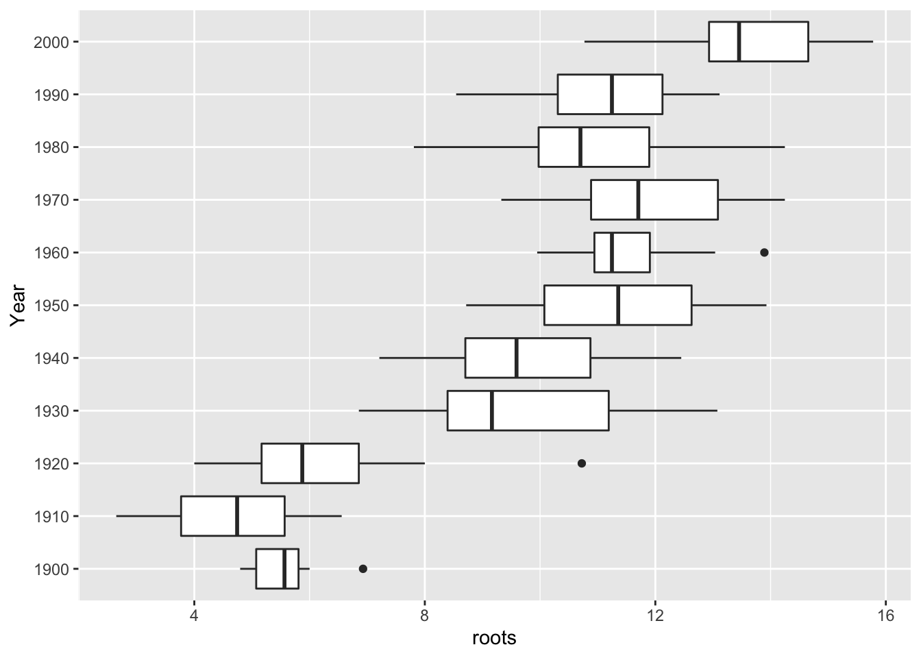
This plot looks better – the spreads of the batches are more similar. The batches with the smallest home run counts (1900-1920) have spreads that are similar in size to the spreads of the batches with large counts.
If you perform a spread vs. level plot of this reexpressed data (that is, the root data), you won’t see much of a relationship between \(\log M\) and \(\log d_F\). (Remember, \(M\) and \(d_F\) are computed using the root home run data.)
7.2 A Case Study where the Spread vs Level Plot Doesn’t Work
Music Data: Time in seconds of tracks of the Fab Four
Background: The Beatles were a famous pop group that played in the 60’s and 70’s. The style of the Beatles’ music changed over their career – this change in style is reflected by the length of their songs.
We look at six Beatles’ albums: The BBC Tapes, Rubber Soul, Revolver, Magical Mystery Tour, Sgt. Pepper, and The White Album. For each album, we measure the time (in seconds) for all of the songs. The data is stored in the LearnEDA data frame beatles.
ggplot(beatles, aes(album, time)) +
  geom_boxplot() + coord_flip() +
  xlab("Album") +
  ylab("Time (Seconds)")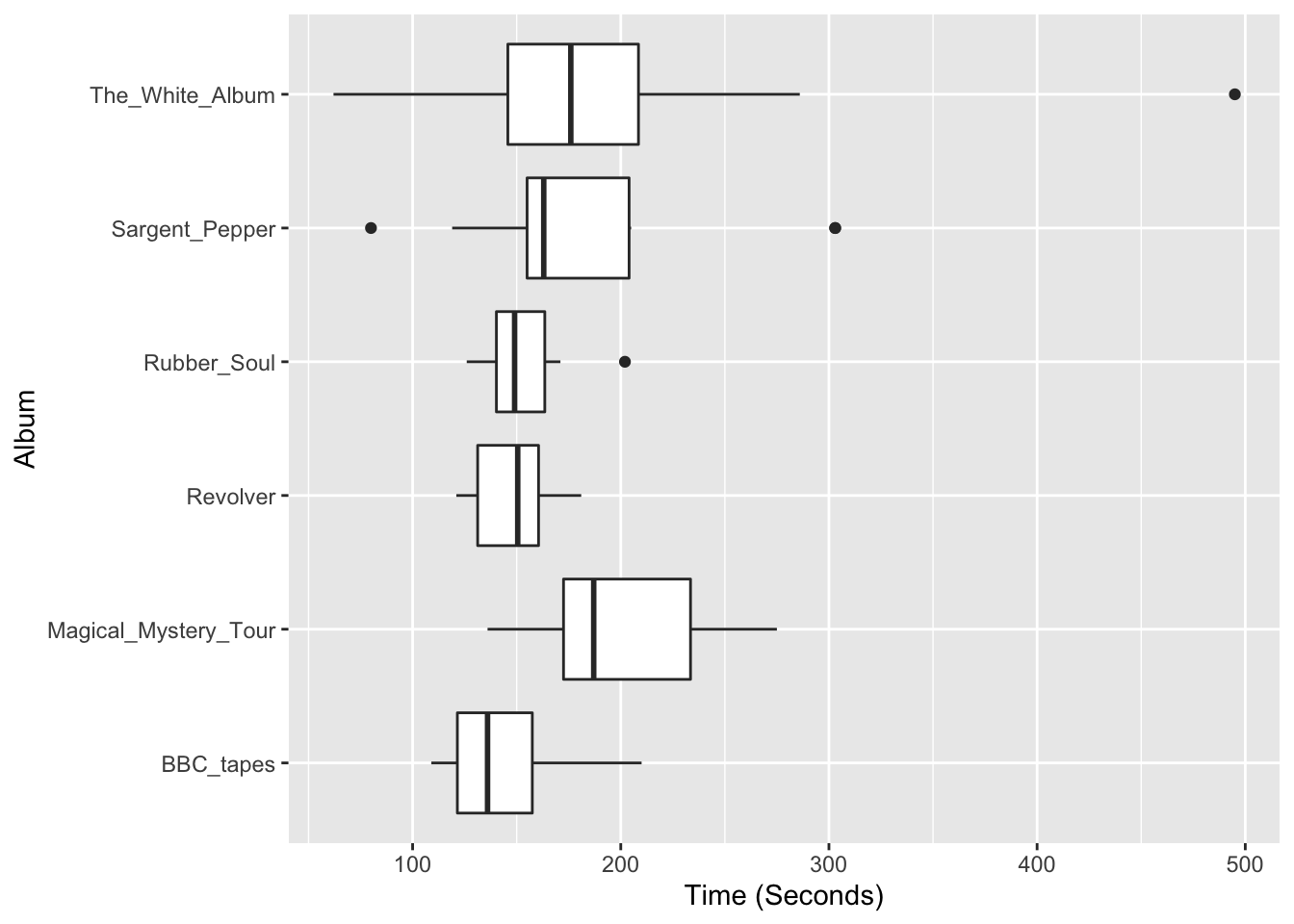
Here are parallel boxplots of the times of the songs on the six albums. We see differences in the average song lengths – Magical Mystery Tour and The White Album tend to have longer songs than Rubber Soul and Revolver. But we also see differences in the spreads of the batches and so we try our spread vs. level plot to suggest a possible reexpression of the data.
The table below shows the medians, fourth-spreads, and logs for the six batches, followed by a spread vs level plot.
spread_level_plot(beatles, time, album)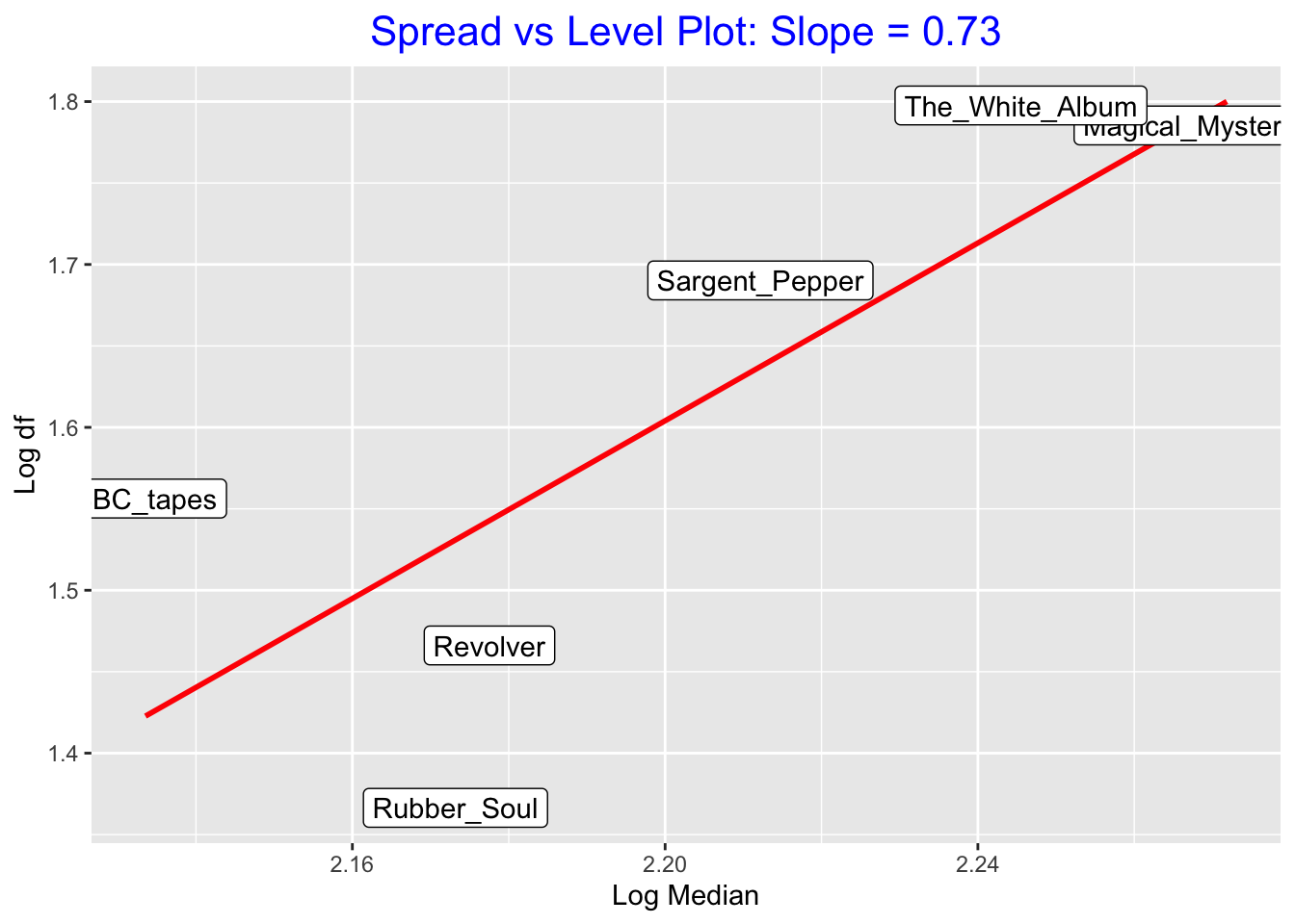
## # A tibble: 6 × 5
##   album                    M    df log.M log.df
##   <fct>                <dbl> <dbl> <dbl>  <dbl>
## 1 BBC_tapes             136   36    2.13   1.56
## 2 Magical_Mystery_Tour  187   61    2.27   1.79
## 3 Revolver              150.  29.2  2.18   1.47
## 4 Rubber_Soul           149   23.2  2.17   1.37
## 5 Sargent_Pepper        163   49    2.21   1.69
## 6 The_White_Album       176   62.8  2.25   1.80
We see a positive association in this plot – a resistant fit to this graph gives a slope of 3.1 which suggests a power of \(p = 1 - 3.1 = -2.1\) which is approximately equal to \(-2\).
We try out this reexpression – we transform the time data to \((time)^{-2}\). The first graph shows parallel boxplots of \((time)^{-2}\); the second graph does a spread vs. level plot for this reexpressed data.
beatles %>%
  mutate(New = 10 * (time) ^ (-2)) ->
  beatles
ggplot(beatles, aes(album, New)) +
  geom_boxplot() +
  coord_flip() + xlab("ALBUM") +
  ylab("Reexpressed Data")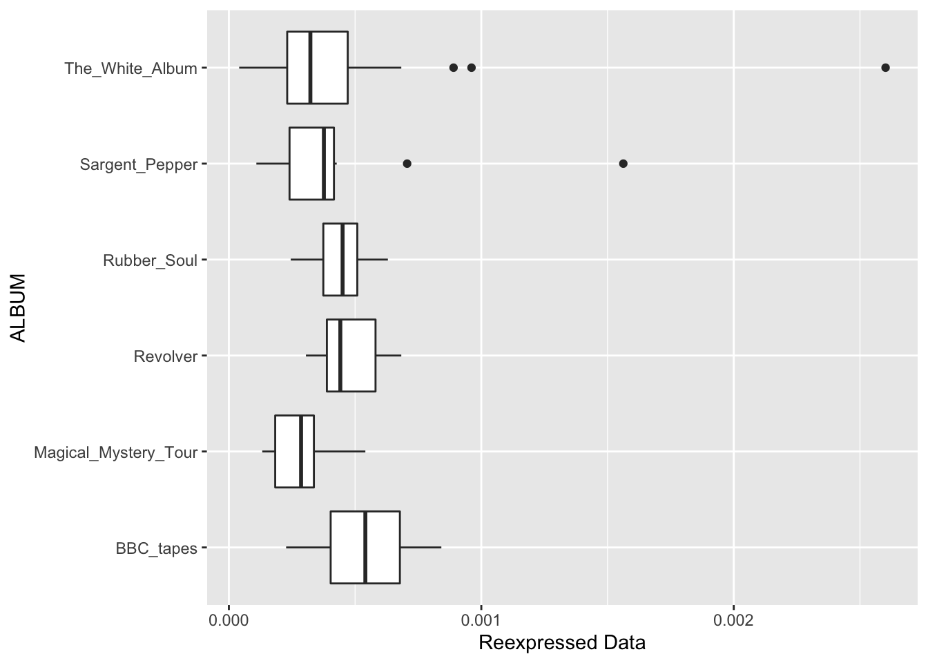
spread_level_plot(beatles, New, album)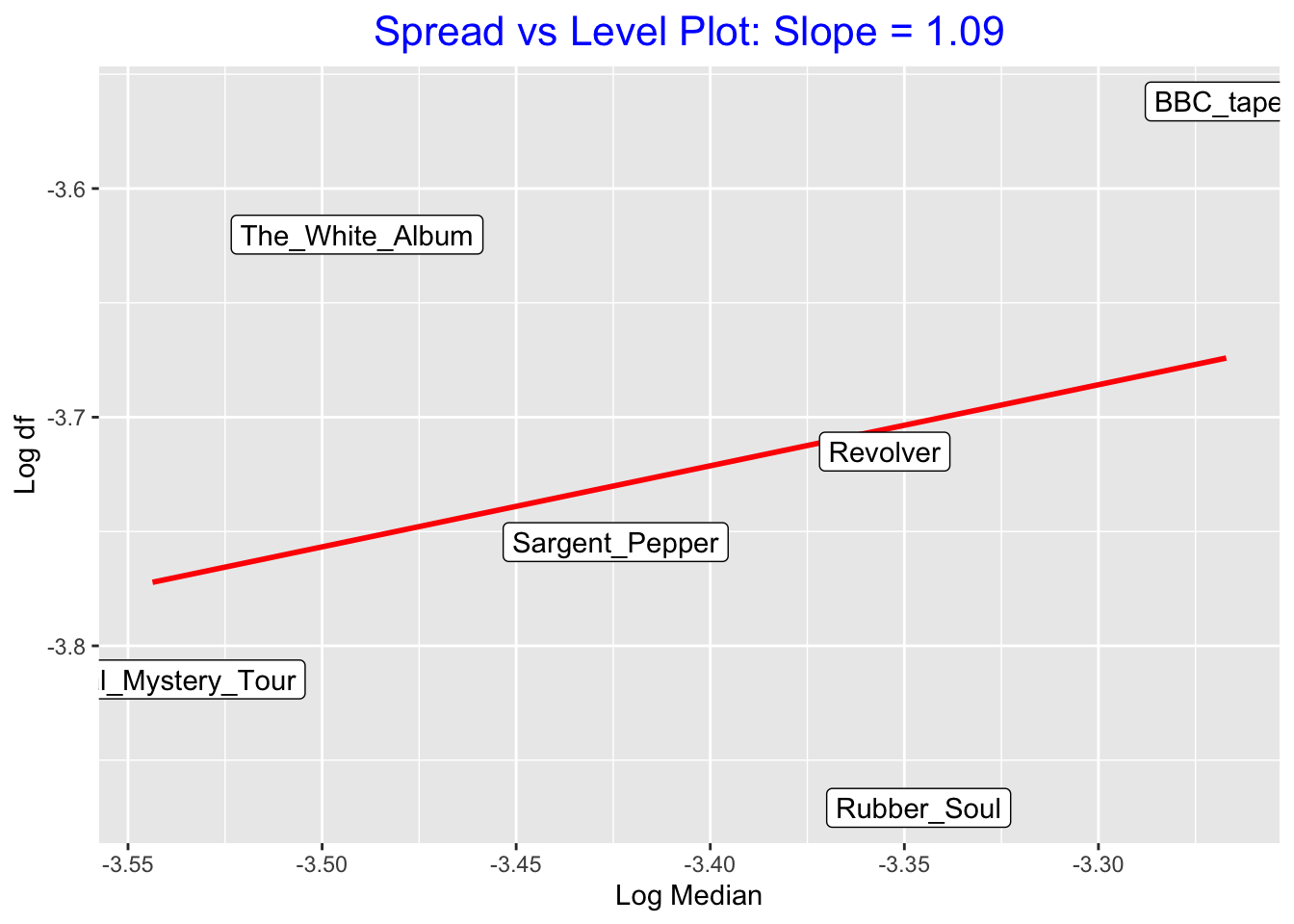
## # A tibble: 6 × 5
##   album                       M       df log.M log.df
##   <fct>                   <dbl>    <dbl> <dbl>  <dbl>
## 1 BBC_tapes            0.000541 0.000274 -3.27  -3.56
## 2 Magical_Mystery_Tour 0.000286 0.000153 -3.54  -3.81
## 3 Revolver             0.000442 0.000193 -3.36  -3.72
## 4 Rubber_Soul          0.000450 0.000135 -3.35  -3.87
## 5 Sargent_Pepper       0.000376 0.000176 -3.42  -3.75
## 6 The_White_Album      0.000323 0.000240 -3.49  -3.62
Are we successful in this case in reducing the dependence between spread and level?
First, look at the spread vs level plot for the reexpressed data \((time)^{-2}\). I don’t see much of a relationship between \(\log M\) and \(\log d_F\) in this plot, suggesting that we have removed the trend between spread and level.
Next, look at the boxplot display of the reexpressed data – we do see some differences in spreads between the batches. Are the batches of the reexpressed data more similar in spread than the batches of the raw data? Let’s compare the spreads (\(d_F\)s) side by side.
dF (raw)    dF (reexpressed)
38.00   0.287
69.00   0.176
35.50   0.227
25.25   0.147
50.50   0.183
74.00   0.272
I see a slight improvement using this reexpression. The spreads of the raw data range from 25.25 to 74 – the largest spread is 74/25.25 = 2.9 times the smallest. Looking at the reexpressed data, the spreads range from .147 to .287 – the ratio is 2.0. Actually, this is a small improvement – it probably doesn’t make any sense in this case to reexpress the times.
7.3 Some final comments about spread vs. level plots
In practice, one chooses a power transformation where p is a multiple of one-half, like \(p = 1/2, p = 0, p = -1/2\) , etc. (We’ll see soon that the \(p = 0\) power corresponds to taking a log.)
If the spread versus level plot suggests that you should take a power of p, you should check the effectiveness of the reexpression by o Constructing parallel boxplots of the data in the new scale o Making a spread versus level plot using the reexpressed data
Sometimes a certain form of reexpression is routinely made. For example, population counts are typically reexpressed using logs.
7.4 Why does the spread vs. level plot work?
Using some analytic work (not shown here), we can see when the spread versus level plot method is going to work. Generally the method will work when the fourth spread in the new scale is small relative to the median in the new scale.
Let’s return to our music example. Here is the table of the medians and fourth-spreads of the reexpressed song lengths:
M   df
0.541   0.287
0.286   0.176
0.442   0.227
0.450   0.147
0.376   0.183
0.323   0.272
If we divide the fourth-spreads by the corresponding medians, we get the values
0.5305 0.6154 0.5136 0.3267 0.4867 0.8421These aren’t really that small (I was hoping for ratios that were 0.2 or smaller). This explains why the spread vs level doesn’t work very well for this example.