6 Spread Level Plot
6.1 Let’s Meet the Data
The following table displays the population densities of each state in the U.S. for the years 1960, 1970, 1980, 1990, 2000, 2008. Here population density is defined to be the number of people who live in the state per square mile, counting only land area. We know that the U.S. population has been increasing substantially in this last century and since the land area has remained roughly constant, this means that the population densities have been increasing. Our goal here is to effectively compare the six batches of densities to investigate the rate of change in this time period.
library(LearnEDAfunctions)
library(tidyverse)
pop.densities %>% select(-State) %>% head()
## Abbrev y1960 y1970 y1980 y1990 y2000 y2008
## 1 AL 64.37 67.88 76.74 79.62 87.6 91.87
## 2 AK 0.40 0.53 0.70 0.96 1.1 1.20
## 3 AZ 11.46 15.62 23.92 32.26 45.2 57.20
## 4 AR 34.30 36.94 43.91 45.15 51.3 54.84
## 5 CA 100.77 128.05 151.76 191.15 217.2 235.68
## 6 CO 16.91 21.30 27.86 31.76 41.5 47.626.2 Comparing Batches in the Raw Scale
We begin by comparing the six batches of population densities (1960, 1970, 1980, 1990, 2000, 2008) using parallel boxplots. Recall our basic construction process:
- we construct stem and leafs for each batch
- we find 5-number summaries of each
- we set fences for each batch and identify outliers
- we construct parallel boxplots, ordering by the median value.
I had R construct the boxplots – here’s the display:
pop.densities %>% select(-State, -Abbrev) %>%
   gather(Year, Time) -> stacked.data
ggplot(stacked.data, aes(Year, Time)) +
  geom_boxplot() + coord_flip()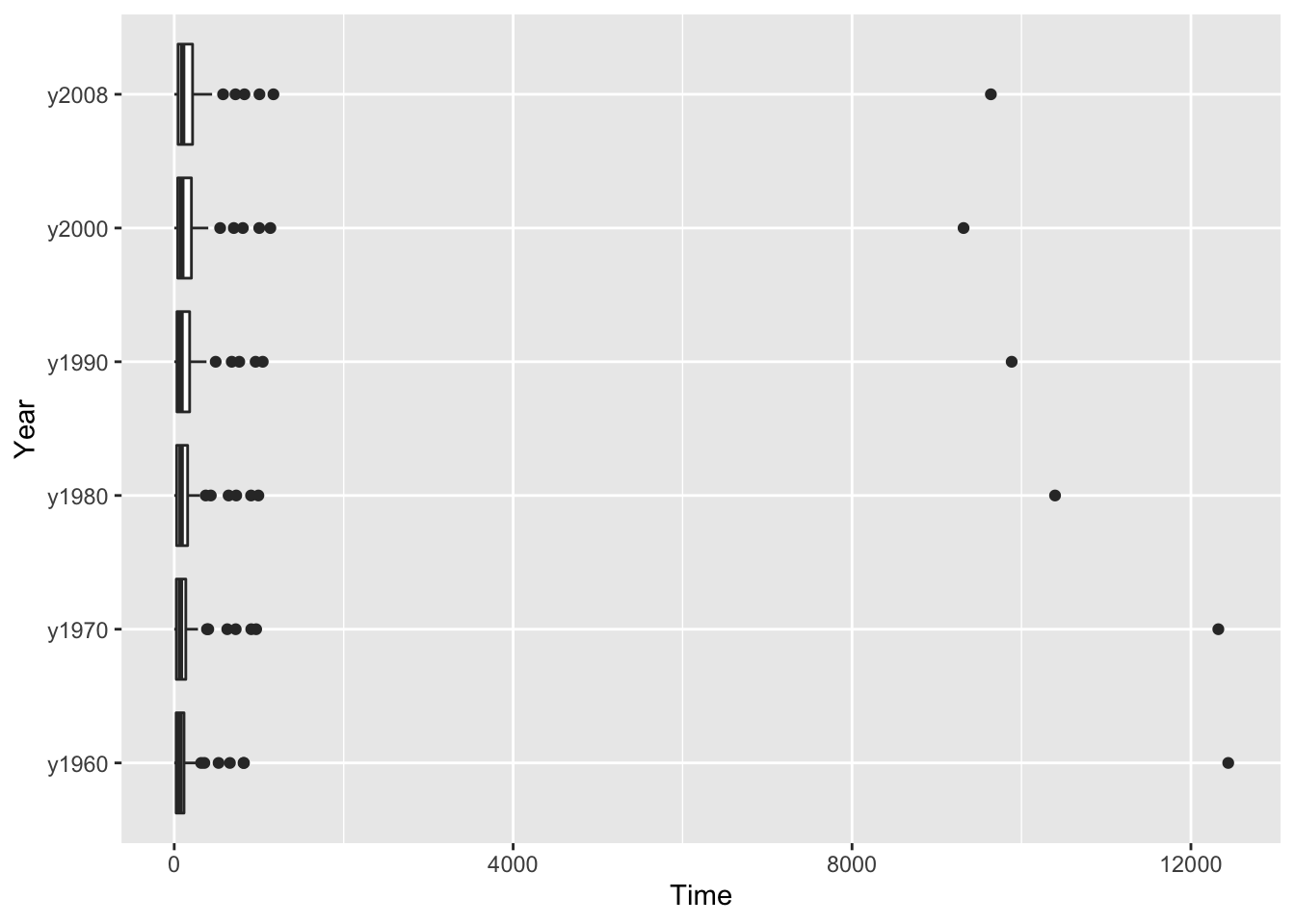
6.3 What’s Wrong?
It’s hard to compare the six batches of densities. Why?
Each batch is strongly right-skewed. The length of the right tail is longer than the length of the left tail (look at the lengths of the whiskers) and there are a number of outliers at the high end.
The batches have different spreads. If we look at the length of the boxes (the fourth spread), we see that the 2008 data is more spread out than the 1980 data which is more spread out than the 1960 data.
Looking further, we see a tendency for the batches of larger densities to have larger spreads. This is obvious if you compare the 2008 densities (large median and large spread) with the 1960 densities (smaller median and smaller spread).
In other words, we see a dependence between spread and level in this boxplot display.
It is difficult to compare these batches since they have unequal spreads. This is a common problem. If we have several batches that contain positive values (like counts or amounts), the batches with larger values will tend also to have larger spreads.
6.4 The Spread vs Level Plot
We can see the relationship between the averages and spreads by use of a spread vs. level plot. For each batch, we compute the median \(M\) and the fourth spread \(d_F\). Then we construct a scatterplot of the (\(\log M, \log d_F\)) values. (In this class, we will generally take logs to the base 10 power. Actually, it doesn’t make any difference in most settings what type of log we take, but it is easier to interpret a base 10 log.)
The work for the spread vs level plot for our example is shown in the table below the graph. For each batch, we list the median and the fourth spreads and the corresponding logs. Then we plot log M against log df.
(S <- spread_level_plot(stacked.data, Time, Year))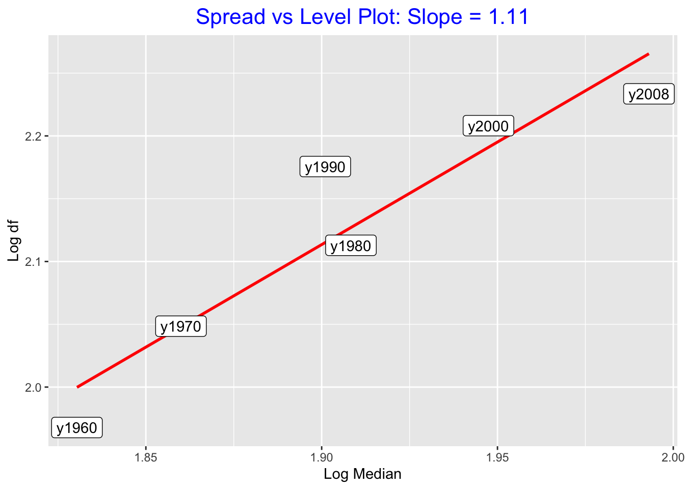
## # A tibble: 6 × 5
##   Year      M    df log.M log.df
##   <chr> <dbl> <dbl> <dbl>  <dbl>
## 1 y1960  67.7  92.8  1.83   1.97
## 2 y1970  72.4 112.   1.86   2.05
## 3 y1980  81.0 130.   1.91   2.11
## 4 y1990  79.6 150.   1.90   2.18
## 5 y2000  88.6 161.   1.95   2.21
## 6 y2008  98.4 171.   1.99   2.23
Clearly there is a positive association in the graph, indicating that batches with small medians tend also to have small dfs (spreads).
6.5 Reexpression
We can correct the dependence between spread and level by reexpressing the data to a different scale. We focus on a special case of reexpressions, called power transformations, that have the form \[ data^p, \] where \(p\) is the power of the transformation. If \(p = 1\), we just have the raw or original scale. The idea here is to choose a value of \(p\) not equal to 1 that might help in removing the dependence between spread and level.
Here is a simple algorithm to find the power \(p\).
- Find the medians and fourth-spreads for all batches and compute \(\log M\) and \(\log d_F\).
- Construct a scatterplot of \(\log M\) against \(\log d_F\). (we’re already done the first two steps)
- Fit a line by eye that goes through the points. (There can be some danger in fitting a least-squares line – we’ll explain this problem later.)
- If \(b\) is the slope of the best line, then the power of the reexpression will be \[ p = 1 - b. \]
In the spread versus plot of \((\log M, \log d_F)\), a best line is drawn on top. The slope of the line (as shown in the plot) is b = 1.7. So the power of the reexpression is \[ p = 1 - b = 1 - 1.7 = -0.7 , \] which is approximately \(-0.5\). So this method suggests that we should reexpress the density data by taking a \(-0.5\) power.
6.6 Reanalysis of the data in new scale
Let’s check if this method works. We redo our comparison of the 1960, 1970, 1980, 1990, 2000, 2008 batches using the data
stacked.data %>%
  mutate(Reexpressed = Time ^ (-0.5)) ->
  stacked.data
ggplot(stacked.data, aes(Year, Reexpressed)) +
  geom_boxplot() + coord_flip()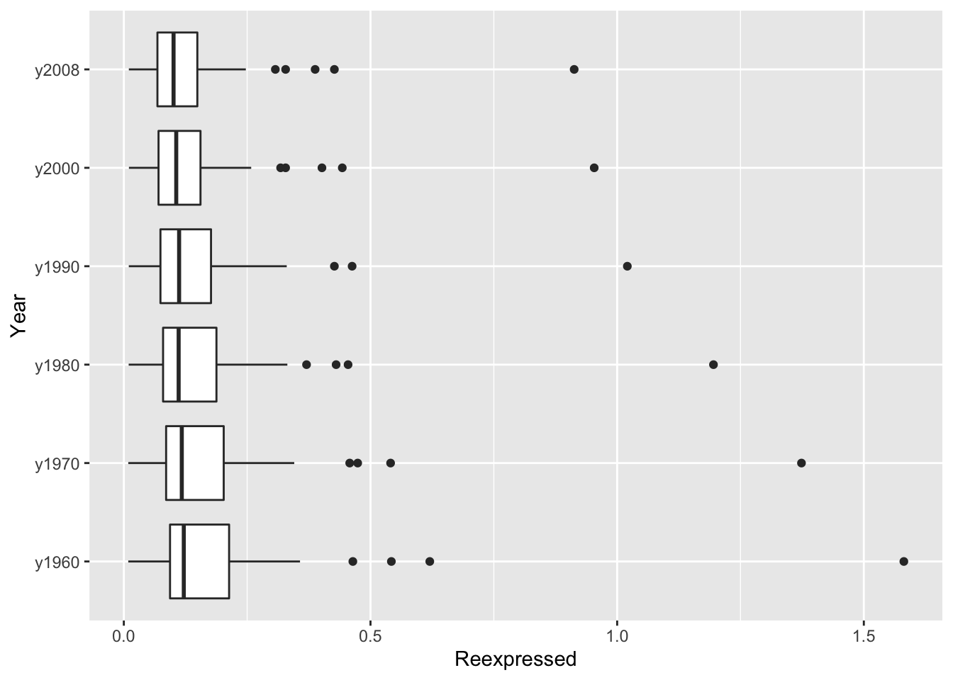
Actually this display doesn’t look much better than our original picture. There is still right skewness in each batch and we can’t help but notice the number of high outliers.
But there is one improvement – the spreads of the middle half of each batch are roughly equal and we have removed the dependence between level and spread.
We can check out this point by performing a spread vs. level plot for the reexpressed data. In the table, we’ve listed the median \(M\) and the fourth spread \(d_F\) for the rexpressed data and computed the logs of \(M\) and \(d_F\). We look at a scatterplot of log \(M\) against log \(d_F\) for the reexpressed data.
(S <- spread_level_plot(stacked.data, Reexpressed, Year))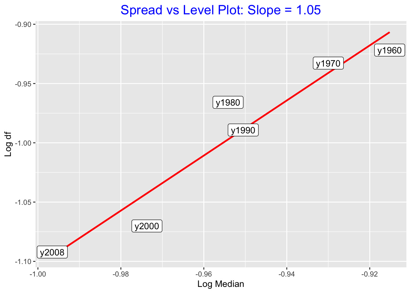
## # A tibble: 6 × 5
##   Year      M     df  log.M log.df
##   <chr> <dbl>  <dbl>  <dbl>  <dbl>
## 1 y1960 0.122 0.120  -0.915 -0.922
## 2 y1970 0.117 0.117  -0.930 -0.933
## 3 y1980 0.111 0.108  -0.954 -0.966
## 4 y1990 0.112 0.103  -0.951 -0.989
## 5 y2000 0.106 0.0851 -0.974 -1.07
## 6 y2008 0.101 0.0809 -0.997 -1.09
Actually, we still see a positive relationship between level and spread, which indicates that a further reexpression may be needed to remove or, at least, decrease the relationship between level and spread. (One can show that reexpressing the data by a 0.1 power seems to do a better job in reducing the dependence between spread and level.)
6.7 Wrap Up
What have we learned?
- Batches are harder to compare when they have unequal spreads.
- The goal is to reexpress the data by a power transformation so that the reexpressed data has equal spreads across batches.
- We have introduced a simple plot (spread vs. level) which is designed to find the correct choice of the power p to accomplish our goal.
- However, this method may not work, and so we should reanalyze our data using the reexpression to see if the dependence between spread and level is reduced.