16 Smoothing
16.1 Meet the data
The dataset braves.attendance in the LearnEDAfunctions package contains the home attendance (the unit is 100 people) for the Atlanta Braves baseball team (shown in chronological order) for every game they played in the 1995 season. The objective here is to gain some understanding about the general pattern of ballpark attendance during the year. Also we are interested in looking for unusual small or large attendances that deviate from the general pattern.
library(LearnEDAfunctions)
library(tidyverse)
head(braves.attendance)
## Game Attendance
## 1 1 320
## 2 2 261
## 3 3 332
## 4 4 378
## 5 5 341
## 6 6 27716.2 We need to smooth
To start, we plot the attendance numbers against the game number.
ggplot(braves.attendance,
       aes(Game, Attendance)) +
  geom_point()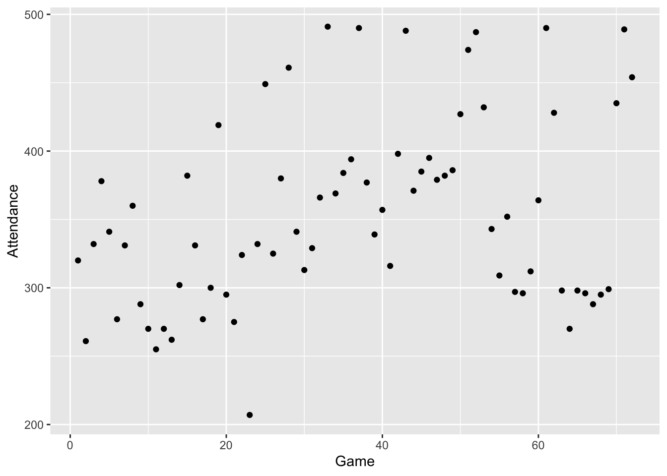
Looking at this graph, it’s hard to pick up any pattern in the attendance numbers. There is a lot of up-and-down variation in the counts – this large variation hides any general pattern in the attendance that might be visible. There is definitely a need for a method that can help pick up a general pattern.
In this lecture, we describe one method of smoothing this sequence of attendance counts. This method has several characteristics:
This method is a hand smoother, which means that it is a method that one could do by hand. The advantages of using a hand smoother, rather than a computer smoother, were probably more relevant 30 years ago when Tukey wrote his EDA text. However, the hand smoothing has the advantage of being relatively easy to explain and we can see the rationale behind the design of this method.
This method is resistant, in that it will be insensitive to unusual or extreme values.
We make the basic assumption that we observe a sequence of data at regularly spaced time points. If this assumption is met, we can ignore the time indicator and focus on the sequence of data values: \[ 320, 261, 332, 378, 341, 277, 331, 360, ... \]
16.3 Running medians
Our basic method for smoothing a sequence of data takes medians of three, which we abbreviate by “3”.
Look at the first 10 attendance numbers shown in the table below.
slice(braves.attendance, 1:10)## Game Attendance
## 1 1 320
## 2 2 261
## 3 3 332
## 4 4 378
## 5 5 341
## 6 6 277
## 7 7 331
## 8 8 360
## 9 9 288
## 10 10 270The median of the first three numbers is median {320, 261, 332} = 320 — this is the smoothed value for the 2nd game. The median of the 2nd, 3rd, 4th numbers is 332 – this is the smoothed value for the 3rd game. The median of the 3rd, 4th, 5th numbers is 341. If we continue this procedure, called running medians, for the 10 games, we get the following “3 smooth”:
Smooth3 <- c(NA, 320, 332, 341, 341, 331, 331, 331, 288, NA)
cbind(braves.attendance[1:10, ], Smooth3)
## Game Attendance Smooth3
## 1 1 320 NA
## 2 2 261 320
## 3 3 332 332
## 4 4 378 341
## 5 5 341 341
## 6 6 277 331
## 7 7 331 331
## 8 8 360 331
## 9 9 288 288
## 10 10 270 NA16.4 End-value smoothing
How do we handle the end values? We do a special procedure, called end-value smoothing (EVS), to handle the end values. This isn’t that hard to do, but it is hard to explain – we’ll give Tukey’s definition of it and then illustrate for several examples.
Here is Tukey’s definition of EVS:
“The change from the end smoothed value to the next-to-end smoothed value is between 0 to 2 times the change from the next-to-end smoothed value to the next-to-end-but-one smoothed value. Subject to this being true, the end smoothed value is as close to the end value as possible.”
Let’s use several fake examples to illustrate this rule:
Example 1:
| – | End | Next-to-end | Next-to-end-but-one |
|---|---|---|---|
| Data | 10 | ||
| Smooth | ??? | 40 | 50 |
Here we see that - the change from the next-to-end smoothed value to the next-to-end-but-one smoothed value is 50-40 = 10 - so we want the change from the end smoothed value to the next-to-end smoothed value to be between 0 and 2 times 10, or between 0 and 20. This means that the end-smoothed value could be any value between 20 and 60.
Subject to this being true, we want the end-smoothed value to be as close to the end value, 10, as possible. So the end smoothed value would be 20 (the value between 20 and 60 which is closest to 20).
Example 2:
| – | End | Next-to-end | Next-to-end-but-one |
|---|---|---|---|
| Data | 50 | ||
| Smooth | ??? | 40 | 60 |
In this case … - the difference between the two smoothed values next to the end is 60 - 40 = 20 - the difference between the first and 2nd smoothed values can be anywhere between 0 and 2 x 20 or 0 and 40. So the end smoothed value could be any value between 0 and 80.
What is the value between 0 and 80 that’s closest to the end value 50? Clearly it is 50, so the end smoothed value is 50. We are just copying-on the end data value to be the smoothed value.
Example 3:
| – | End | Next-to-end | Next-to-end-but-one |
|---|---|---|---|
| Data | 50 | ||
| Smooth | ??? | 80 | 80 |
In this last example, - the difference between the two smoothed values next to the end is 80 - 80 = 0 - the difference between the first and 2nd smoothed values can be anywhere between 0 and 2 x 0, or 0 and 0. So here we have no choice – the end-smoothed value has to be 80.
When we do repeated medians (3), we will use this EVS technique to smooth the end values.
Suppose we apply this repeated medians procedure again to this sequence – we call this smooth “33”. If we keep on applying running medians until there is no change in the sequence, we call the procedure “3R” (R stands for repeated application of the “3” procedure).
In the “3R” column of the following table, we apply this procedure applied to the ballpark attendance data; a graph of the data follows.
braves.attendance <- mutate(braves.attendance,
            smooth.3R = as.vector(smooth(Attendance, kind="3R")))
ggplot(braves.attendance,
       aes(Game, Attendance)) +
  geom_point() +
  geom_line(aes(Game, smooth.3R), color="red")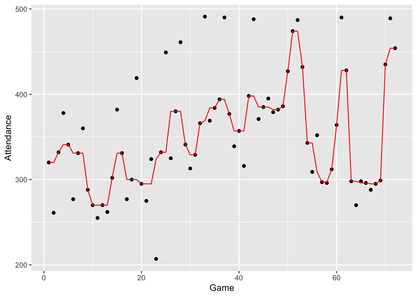
16.5 Splitting
Looking at the graph, the 3R procedure does a pretty good job of smoothing the sequence. We see interesting patterns in the smoothed data. But the 3R smooth looks a bit artificial. One problem is that this smooth will result in odd-looking peaks and valleys. The idea of the splitting technique is to break up these 2-high peaks or 2-low valleys. This is how we try to split:
- We identify all of the 2-high peaks or 2-low valleys.
- For each 2-high peak or 2-low valley
- We divide the sequence at the peak (or valley) to form two subsequences.
- We perform end-value-smoothing at the end of each subsequence.
- We combine the two subsequences and perform 3R to smooth over what we did.
Here is a simple illustration of splitting
- We identify a 2-low valley at the smoothed values 329, 329
- We split between the two 329’s to form two subsequences and pretend each 329 is an end value.
- Now perform EVS twice – once to smooth the top sequence, and one to smooth the bottom sequence assuming 329 is the end value. The results are shown in the EVS column below.
- We complete the splitting operation by doing a 3R smooth at the end.
| Smooth | EVS | 3R |
|---|---|---|
| 380 | 380 | |
| 341 | 341 | 341 |
| 329 | 329 | 341 |
| 329 | 360 | 360 |
| 366 | 366 | 366 |
| 369 | 369 |
If we perform this splitting operation for all two-high peaks and two-low valleys, we call it an “S”.
Finally, we repeat this splitting twice – the resulting smooth is called “3RSS”. Here is a graph of this smooth.
smooth.3RSS <- smooth(braves.attendance$Attendance,
                      kind="3RSS")
braves.attendance <- mutate(braves.attendance,
            smooth.3RSS = as.vector(smooth(Attendance, kind="3RSS")))
ggplot(braves.attendance,
       aes(Game, Attendance)) +
  geom_point() +
  geom_line(aes(Game, smooth.3R), color="red") +
  geom_line(aes(Game, smooth.3RSS), color="blue")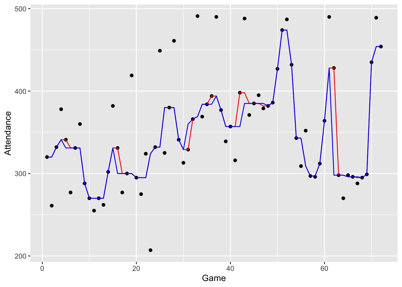
If you compare the 3R (red) and 3RSS (blue) smooths, you’ll see that we are somewhat successful in removing these two-wide peaks and valleys.
16.6 Hanning
This 3RSS smooth still looks a bit rough – we believe that there is a smoother pattern of attendance change across games.
The median and splitting operations that we have performed will have no effect on monotone sequences like \[ 295, 324, 332, 332, 380 \] We need to do another operation that will help in smoothing these monotone sequences.
A well-known smoothing technique for time-series data is called hanning – in this operation you take a weighted average of the current smoothed value and the two neighboring smoothed values.
By hand, we can accomplish a hanning operation in two steps:
- for each value, we compute a skip mean – this is the mean of the observations directly before and after the current observation
- we take the average of the current smoothed value and the skip mean value
We illustrate hanning for a subset of our ballpark attendance data set. Let’s focus on the bold value “320” in the table which represents the current smoothed value. In the skip mean column, indicated by “>”, we find the mean of the two neighbors 320 and 331. Then in the hanning column, indicated by “H”, we find the mean of the smoothed value 320 and the skip mean 325.5 – the hanning value (rounded to the nearest integer) is 323.
| 3R | \(>\) | H |
|---|---|---|
| 320 | 320 | 320 |
| 320 | 320 | 320 |
| 320 | 325.5 | 323 |
| 331 | 325.5 | 328 |
| 331 | 331 | 331 |
| 331 | 331 | 331 |
How do we hann an end-value such as 320? We simply copy-on the end value in the hanning column (H). If this hanning operation is performed on the previous smooth, we get a 3RSSH smooth shown below.
braves.attendance <- mutate(braves.attendance,
      smooth.3RSSH = han(as.vector(smooth(Attendance,
                            kind="3RSS"))))
ggplot(braves.attendance,
       aes(Game, Attendance)) +
  geom_point() +
geom_line(aes(Game, smooth.3RSSH), color="red") 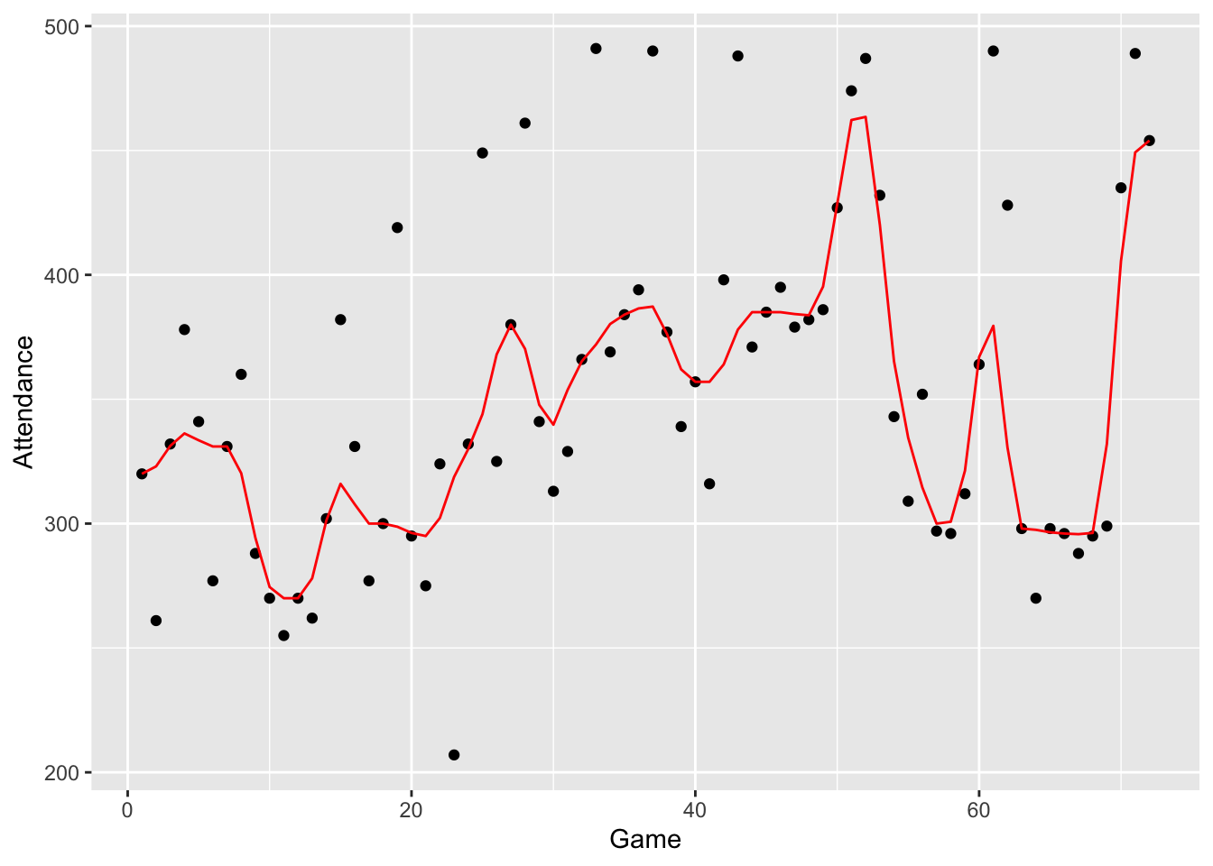
Note that this hanning operation is good in smoothing the bumpy monotone sequences that we saw in the 3RSS smooth.
16.7 The smooth and the rough
In the table below, we have displayed the raw attendance data and the 3RSSH smooth. We represent the data as
\[
DATA = SMOOTH + ROUGH,
\]
where “SMOOTH” refers to the smoothed fit obtained using the 3RSSH operation and “RESIDUAL” is the difference between the data and the smooth. We compute values of the rough into the variable Rough
and display some of the values.
braves.attendance <- mutate(braves.attendance,
                  Rough = Attendance - smooth.3RSS)
slice(braves.attendance, 1:10)
## Game Attendance smooth.3R smooth.3RSS smooth.3RSSH Rough
## 1 1 320 320 320 320.00 0
## 2 2 261 320 320 323.00 -59
## 3 3 332 332 332 331.25 0
## 4 4 378 341 341 336.25 37
## 5 5 341 341 331 333.50 10
## 6 6 277 331 331 331.00 -54
## 7 7 331 331 331 331.00 0
## 8 8 360 331 331 320.25 29
## 9 9 288 288 288 294.25 0
## 10 10 270 270 270 274.50 016.8 Reroughing
In practice, it may seem that the 3RSSH smooth is a bit too heavy – it seems to remove too much structure from the data. So it is desirable to add a little more variation in the smooth to make it more similar to the original data.
There is a procedure called reroughing that is designed to add a bit more variation to our smooth. Essentially what we do is smooth values of our rough (using the 3RSSH technique) and add this “smoothed rough” to the initial smooth to get a final smooth.
Remember we write our data as \[ DATA = SMOOTH + ROUGH . \] If we smooth our rough, we can write the rough as \[ ROUGH = (SMOOTHED \, ROUGH) + (ROUGH \, ROUGH) . \] Substituting, we get \[ DATA = SMOOTH + (SMOOTHED \, ROUGH) + (ROUGH \, ROUGH) \] \[ = (FINAL \, SMOOTH) + (ROUGH \, ROUGH) . \]
We won’t go through the details of this reroughing for our example since it is a bit tedious and best left for a computer. If we wanted to do this by hand, we would first smooth the residuals
options(width=60)
braves.attendance$Rough
## [1] 0 -59 0 37 10 -54 0 29 0 0 -15
## [12] 0 -8 0 51 31 -23 0 119 0 -20 29
## [23] -117 0 117 -55 0 81 0 -16 -31 0 122
## [34] -15 0 10 96 0 -18 0 -41 41 103 -14
## [45] 0 10 -6 0 0 0 0 13 0 0 -34
## [56] 43 0 -1 0 0 62 130 0 -28 2 0
## [67] -8 0 0 0 35 0using the 3RSSH smooth that we described above. Then, when we are done, we add the smooth of this rough back to the original smooth to get our final smooth. This operation of reroughing using a 3RSSH smooth is called \[ 3RSSH, TWICE, \] where “TWICE” refers to the twicing operation.
braves.attendance <- mutate(braves.attendance,
                            smooth.3RS3R.twice = as.vector(smooth(Attendance, kind="3RS3R",  twiceit=TRUE)))
16.9 Interpreting the final smooth and rough
Whew! – we’re done describing our method of smoothing. Let’s now interpret what we have when we smooth our ballpark attendance data. The first figure plots the smoothed attendance data.
ggplot(braves.attendance, aes(Game, Attendance)) +
  geom_point() +
  geom_line(aes(Game, smooth.3RS3R.twice), col="red")
What do we see in this smooth?
- The Atlanta Braves’ attendance had an immediate drop in the early games after the excitement of the beginning of the season wore off.
- After this early drop, the attendance showed a general increase from about game 10 to about game 50.
- Attendance reached a peak about game 50, then the attendance dropped off suddenly and there was a valley about game 60. Maybe the Braves clinched a spot in the baseball playoffs about game 50 and the remaining games were not very important and relatively few people attended.
- There was a sudden rise in attendance at the end of the season – at this point, maybe the fans were getting excited about the playoff games that were about to begin.
Next, we plot the rough to see the deviations from the general pattern that we see in the smooth.
braves.attendance <- mutate(braves.attendance,
                            FinalRough = Attendance -
                              smooth.3RS3R.twice)
ggplot(braves.attendance,
       aes(Game, FinalRough)) +
  geom_point() +
  geom_hline(yintercept = 0, color = "blue")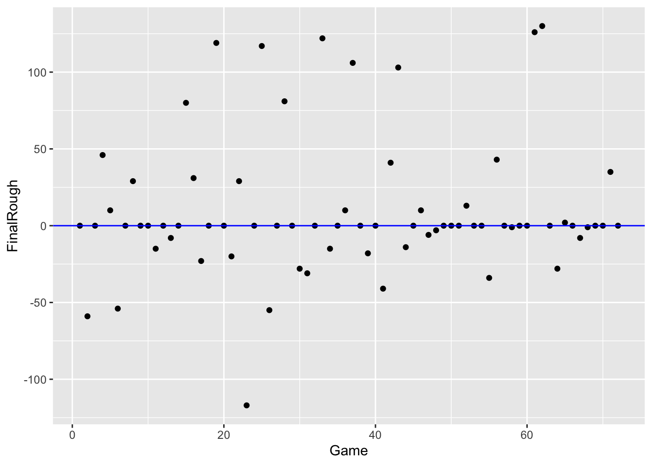
What do we see in the rough (residuals)?
- There are a number of dates (9 to be exact) where the rough is around +100 – for these particular games, the attendance was about 10,000 more than the general pattern. Can you think of any reason why ballpark attendance would be unusually high for some days? I can think of a simple explanation. There are typically more fans attending baseball games during the weekend. I suspect that these extreme high rough values correspond to games played Saturday or Sunday.
- There is one date (looks like game 22) where the rough was about -120 – this means that the attendance this day was about 12,000 smaller than the general pattern in the smooth. Are there explanations for poor baseball attendance? I suspect that it may be weather related – maybe it was unusually cold that day.
- I don’t see any general pattern in the rough when plotted as a function of time. Most of the rough values are between -50 and +50 which translate to attendance values between -5000 and +5000.