5 Boxplots
5.1 The Data:
In this topic, we start discussing how to compare batches of data effectively. Our dataset is taken from the 2001 Boston Marathon race. On the www.bostonmarathon.org website, one can obtain results for participants of different genders, ages, and home countries. Here we focus on the time-to-completion for woman runners. We take a sample of women of ages 20, 30, 40, 50, and 60. In the display below, we show the data and then construct parallel stemplots of the times (in minutes) for all the runners in our study. The unit in our stemplot is one, so the shortest time among all 20-year women in our sample had a finish time of 150 minutes, which is equivalent to 2 1/2 hours.
Official times (minutes) of some women runners in the 2001 Boston Marathon.

Age=20
    244    213    274    240    225    269    214    223    271    237
    232    229    209    272    230    229    203    236    222    239
    233    150

age=30
    194    207    259    287    319    252    237    330    236    210
    226    213    241    235    194    216    272    227    278    211
    219    259    237    234    205

age=40
    286    256    247    166    275    284    239    235    163    214
    227    346    210    223    238    221    271    224    248    231
    314    224    258    244    262

age=50
    281    287    222    251    253    302    235    231    254    253
    262    231    230    284    326    349    269    327    258    270
    260    279    263    245    271

age=60
    219    338    278    315    278    258    274    233    280    270
    271

PARALLEL STEMPLOTS

One unit = 1 minute.

AGE=20     AGE=30        AGE=40     AGE=50       AGE=60

 15 0        15            15         15            15
 16          16            16 36      16            16
 17          17            17         17            17
 18          18            18         18            18
 19          19 44         19         19            19
 20 39       20 57         20         20            20
 21 34       21 01369      21 04      21            21 9
 22 23599    22 67         22 13447   22 2          22
 23 023679   23 45677      23 1589    23 0115       23 3
 24 04       24 1          24 478     24 5          24
 25          25 299        25 68      25 13348      25 8
 26 9        26            26 2       26 0239       26
 27 124      27 28         27 15      27 019        27 01488
 28          28 7          28 46      28 147        28 0
 29          29            29         29            29
 30          30            30         30 2          30
 31          31 9          31 4       31            31 5
 32          32            32         32 67         32
 33          33 0          33         33            33 8
 34          34 6          34         34 9          34
We are interested in graphically comparing the batches of times from the five age groups. An effective display is based on a boxplot, which is a graph of a five-number summary with outliers indicated.
5.2 Constructing A Single Boxplot
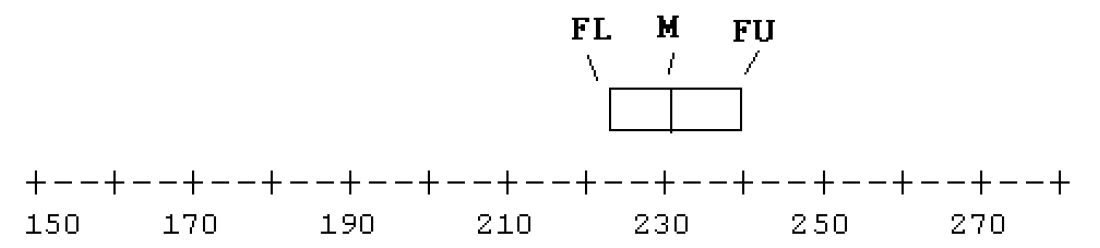
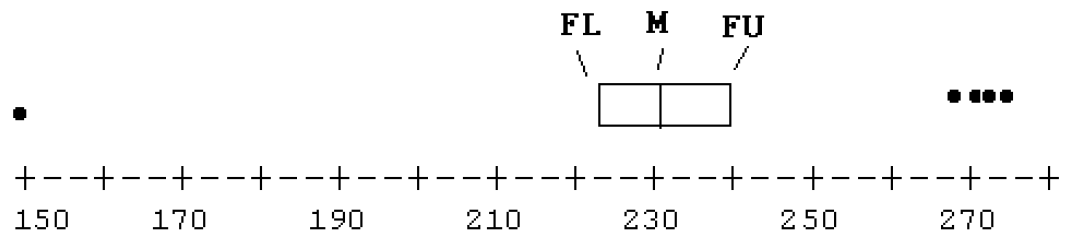
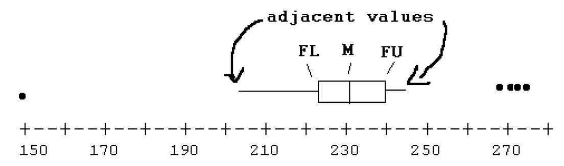
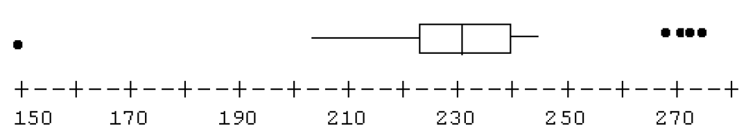
Let’s first illustrate the construction of a single boxplot for the times of the 20-year old women. There are \(n\) = 22 runners. So the location of the median is (22+1)/2 = 11 1/2, and the location of the fourths is (11+1)/2 = 6. From the stemplot, we find
\[ LO = 150, F_L = 222, M = 231, F_U = 240, HI = 274 . \]
Do we have any outliers? Here the fourth spread is \(d_F = 240 - 222 = 18\) and a step is 1.5 (18) = 27. The inner fences are at \[ 222 - 27 = 195 \,\, {\rm and} \,\, 240 + 27 = 267 \] Looking at the stemplot, we see one time (150) beyond the lower fence and four times (269, 271, 272, 274) beyond the upper fence. Certainly the low outlier is interesting since that corresponds to a very fast marathon runner.
To draw a boxplot:
- Draw a number line with tic marks covering the range of the data.
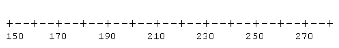
- Draw a box where the lines of the box correspond to the locations of the fourths and the median. (See diagram.)
- Indicate the outliers using separate plotting points.
- To complete the box, draw lines out from the box to the most extreme values that are not outliers. (These points are called adjacent values.)
Of course, we don’t need our labels and so our boxplot would look like
Here is a software generated boxplot display using the ggplot2 package in R.
library(LearnEDAfunctions)
library(tidyverse)
ggplot(filter(boston.marathon, age == 20),
       aes(x = 1, y = time)) + xlim(0, 2) +
  geom_boxplot() + coord_flip() +
  theme(axis.title.y=element_blank(),
        axis.text.y=element_blank(),
        axis.ticks.y=element_blank())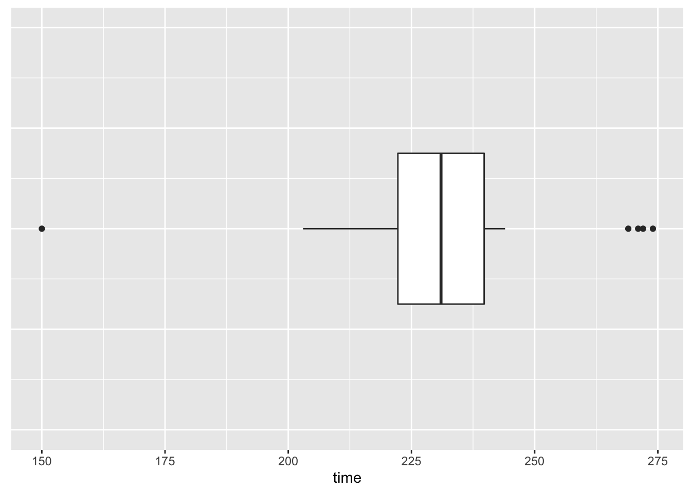
5.3 Interpreting a Boxplot
Before we use boxplots to compare batches, let us spend some time interpreting a boxplot for a single batch. The figure below shows the histogram and corresponding boxplot for two datasets. The first dataset (left side) is symmetric with long tails on both sides.
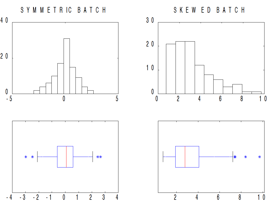
If we look at the corresponding boxplot of this symmetric dataset, we see
- the location of the median (red line) is roughly half-way across the box (the location of the fourths)
- the lengths of the right and left whiskers (the lines extending from the box) are about the same – this means that the width of the lower quarter of the data is equal to the width of the upper quarter
Let’s contrast this boxplot of the symmetric batch with the boxplot of the batch on the right. From the histogram, we see that this data is skewed right – most of the data is in the 0-4 range and the values tail off towards large values. If we look at the corresponding boxplot, we see
- the length of the box from the median to the upper fourth is longer than the length from the lower fourth to the median – this indicates skewness in the middle half of the data
- the length of the right whisker is significantly longer than the length of the left whisker – this shows right skewness in the tail portion of the data
After some practice looking at boxplots, you’ll see that a boxplot is pretty informative about the shape of a batch.
5.4 Boxplots to Compare Batches
Now we are ready to use boxplots to compare the batches of running times for the different age groups. For each batch, we compute (1) the five-number summary, (2) the fences, and (3) indicate any outliers. Below, we have summarized our calculations for the five age groups, and then we use the calculations to construct boxplots for the batches. We display all of the boxplots on a single plot using one scale.
Age = 20

      Depth       Lower        Upper
 N=   22
 M    11.5           231.000
 F     6.0      222.000      240.000
STEP = 27
FENCES = 195, 258
OUTLIERS:  150, 269, 271, 272, 274

Age = 30

        Depth   Lower        Upper
 N=   25
 M    13.0           235.000
 F     7.0    213.000      259.000
STEP = 69
FENCES: 144, 328
OUTLIERS:  330, 346

Age = 40

      Depth       Lower        Upper
 N=   25
 M    13.0           239.000
 F     7.0      224.000      262.000
STEP = 57
FENCES = 167, 319
OUTLIERS:  163, 166

Age = 50

      Depth       Lower        Upper
 N=   25
 M    13.0           262.000
 H     7.0    251.000      281.000
STEP = 45
FENCES:  206, 326
OUTLIERS:  327, 349

Age = 60

      Depth       Lower        Upper
 N=   11
 M     6.0           274.000
 H     3.5      264.000      279.000
STEP = 22.5
FENCES:  241.5, 301.5
OUTLIERS: 219, 233, 315, 338ggplot(boston.marathon, aes(x = factor(age), y = time)) +
geom_boxplot() + coord_flip() +
xlab("Age") + ylab("Time")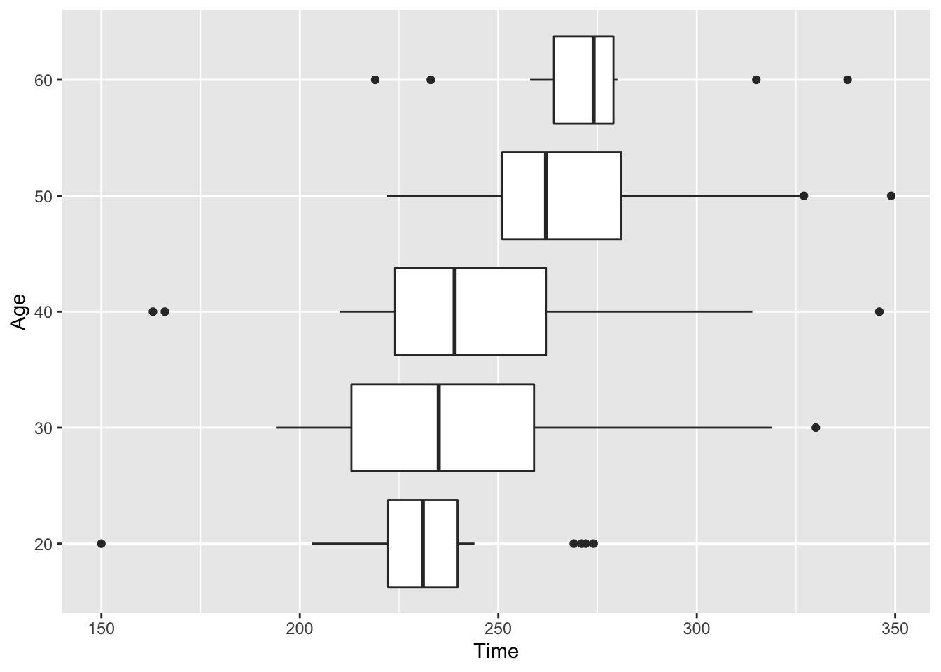
What do we see in this display of boxplots?
It is easier to interpret this display when the boxplots are sorted by the medians of the groups. Here this sorting occurs naturally, since the 20 year-olds generally have smaller times than the 30 year-olds, and the 30 year-olds have smaller times for the 40 year-olds, and so on.
We notice a number of outlying points. In each age group, there are one or two unusually large times. Since we give special recognition to short times, we notice the 20-year woman who ran the race in 150 minutes.
If we focus on the three middle age groups, we notice that each group has about the same spread. (The spreads of the times for the 20 year-olds and the 60 year-olds are a bit smaller.) The lengths of the boxes for the three groups are about the same, indicating they have similar fourth spreads.
5.5 Comparisons using Medians
When batches have similar spreads, it is easy to make comparisons. Let’s illustrate this for the three middle age groups that have similar spreads. The medians and fourth spreads for these batches are
            Median  Fourth-Spread

age30       235 min 46 min

age40       239 min 38 min

age50       262 min 30 min
Since the times for the 30-year-old and 40-year-old groups have approximately the same spread, the batch of 40-year-old times can be obtained by adding 4 minutes (the difference in medians) to the batch of 30-year-old times. In other words,
\[ age40 = age30 + 4 \] which means that the 40-year-olds run, on average, 4 minutes longer than the 30-year-older runners.
Similarly, comparing the two older groups, we can say that \[ age50 = age40 + 23 \] which means that the batch of 50-year-old times can be found by adding 23 minutes to the 40-year-old times.
Do older women runners run slower than younger women in the Boston Marathon? Looking back at our boxplot display and comparing medians of the five groups, we see that women of ages 20, 30, and 40 have (approximately) the same median completion time. The median time for the 50 year-old runners seems significantly higher that the times for the 20-40 year-olds, and the runners of age 60 have a significantly higher median than the 50-year-olds. So it appears that the best times for women marathoners are in a broad range between 20 and 40 years, and the times don’t appear to deteriorate until after age 40.
This is a nice illustration, since the batches of data had similar spreads and this facilitated comparisons by comparing medians. We will see in our next example that batches can have varying spreads and this motivates a reexpression or change in the scale of the data so that the reexpressed batches have similar spreads