18 Plotting an Additive Plot
Here we describe how one displays an additive fit. This graphical display may look a bit odd at first, but it is an effective way of portraying the additive fit found using median polish.
18.1 The data
We work with the temperature data that we used earlier to illustrate an additive fit. We will use the fit that we found using the application of the medpolish function.
library(LearnEDAfunctions)
temps <- temperatures[, -1]
dimnames(temps)[[1]] <- temperatures[, 1]
additive.fit <- medpolish(temps)
## 1: 36.5
## Final: 36.25In plotting the fit, we want to represent the fit as the sum of two terms: \[ ROW \, PART + COLUMN \, PART \] In our usual representation of the fit, \[ FIT = COMMON + ROW \, EFFECT + COLUMN \, EFFECT, \] we have three terms, so we either add the common term to the row effects or to the column effects so we have the sum of two terms. In the table below we’ve added the common to the row effects, getting row fits (abbreviated RFIT), and \[ FIT = ROW \, FIT + COLUMN \, EFFECT . \]
| – | January | April | July | October | RFIT |
|---|---|---|---|---|---|
| Atlanta | 73 | ||||
| Detroit | 60.25 | ||||
| Kansas City | 66.5 | ||||
| Minneapolis | 58 | ||||
| Philadelphia | 64.5 | ||||
| CEFF | -30.25 | -1.5 | 22.5 | 1.5 |
So the temperature of Atlanta in January is represented as
Atlanta fit + January effect = 73 - 30.25,and the temperature of Minneapolis in October is fitted by
Minneapolis fit + October effect = 58 + 1.5.18.2 Plotting the two terms of the additive fit
To begin our graph, we set up a grid where values of the row fits are on the horizontal axis and values of the column effects are in the vertical axis.
We first graph vertical lines corresponding to the values of the row fits - here 73, 60.25, 66.5, 58, and 64.5. Next, we graph horizontal lines corresponding to the values of the column effects. These sets of horizontal and vertical lines are shown as thick lines in the display below. Each intersection of a horizontal line and a vertical line corresponds to a cell in the table. For example, the intersection of the top horizontal line and the left vertical line in the upper left portion of the display corresponds to the temperature of Minneapolis in July. We have labeled all horizontal and vertical lines with the city names and months to emphasize the connection of the graph with the table.
Remember the additive fit is the sum FIT = ROW FIT + COLUMN EFFECT. In the figure, we have drawn diagonal lines where the fit is a constant value. The diagonal line at the bottom corresponds to all values of ROW FIT and COLUMN EFFECT such that the sum is equal to FIT = 30, the next line corresponds to all row fits and column effects that add up to FIT = 40, and so on.
We want to graph the fit, so we pivot the above display by an angle to make the diagonal lines of constant fit horizontal. So interactions of horizontal and vertical lines that are high on the new figure correspond to large values of fit
Last, we remove all extraneous parts of the figure, such as the original horizontal and vertical axes, that are not essential for the main message of the graph. We get the following display which is our graph of an additive fit of a two-way table.
Row.Part <- with(additive.fit, row + overall)
Col.Part <- additive.fit$col
plot2way(Row.Part, Col.Part,
         dimnames(temps)[[1]], dimnames(temps)[[2]])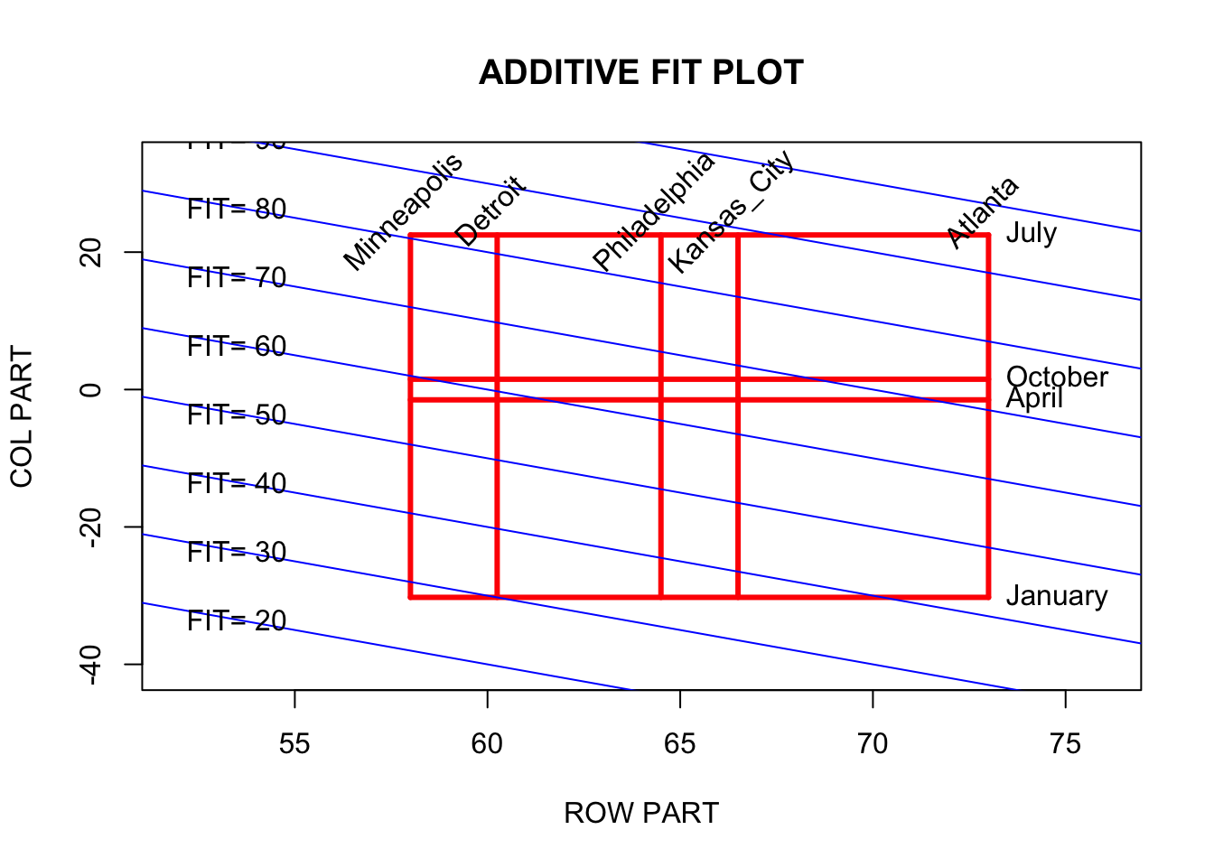
18.3 Making sense of the display
Since this graph may look weird to you, we should spend some time interpreting it.
First, note that the highest intersection (of horizontal and vertical lines) corresponds to the temperature of Atlanta in July. According to the additive fit, you should be in this city in July if you like heat. Conversely, Minneapolis in January is the coldest spot – this intersection has the smallest value of fit.
Which is a warmer spot – Philly in October or Kansas City in May? Looking at the figure, note that these two intersections are roughly at the same vertical position, which means that they have similar values of fit.
Looking at the figure, we see that the rectangular region is just slightly rotated off the vertical. This means that there is more variation between months in the table than in cities. The more critical dimension of fit is the time of the year.
18.4 Adding information about the residuals to the display
Of course, the fit is only one of two aspects of the data – we need also to examine the residuals to get a complete view of the data.
Here are the residuals from the median polish:
additive.fit$residual## January April July October
## Atlanta 7.25 1.50 -7.50 -1.50
## Detroit 0.00 -0.75 0.25 0.25
## Kansas_City -1.25 0.00 0.00 0.00
## Minneapolis -6.75 0.50 3.50 -0.50
## Philadelphia 3.75 0.00 -1.00 0.00To get an idea of the pattern of these residuals, we construct a stemplot:
aplpack::stem.leaf(c(additive.fit$residual),
                   unit=1, m=5)
## 1 | 2: represents 12
## leaf unit: 1
## n: 20
## 2 s | 76
## f |
## t |
## 7 -0* | 11100
## (10) 0* | 0000000001
## 3 t | 33
## f |
## 1 s | 7What we see is that most of the residuals are small – between -1 and 3, and there are only three large residuals that are set apart from the rest. These are -7.25 (Atlanta in January), -7.5 (Atlanta in July) and -6.75 (Minneapolis in January).
There are formal methods of deciding if these three extreme residuals are “large”, but it makes sense in this case to indicate on our graph that these three cells have large residuals. We do this by plotting a “-” or “+” on the display for these three cells:
So this extra residual information on the graph indicates that Atlanta has a relatively cool temperature in July, this city has a relatively warm January, and Minneapolis is unusually cold in January.