14 Plotting II
As you know, the United States takes a census every 10 years. The dataset us.pop in the LearnBayes package displays the population of the U.S. during each census from 1790 to 2000.
library(LearnEDAfunctions)
library(tidyverse)
head(us.pop)
## YEAR POP
## 1 1790 3.9
## 2 1800 5.3
## 3 1810 7.2
## 4 1820 9.6
## 5 1830 12.9
## 6 1840 17.1First we plot population against year. What do we see in this plot?
ggplot(us.pop, aes(YEAR, POP)) +
  geom_point() +
  ylab("Population")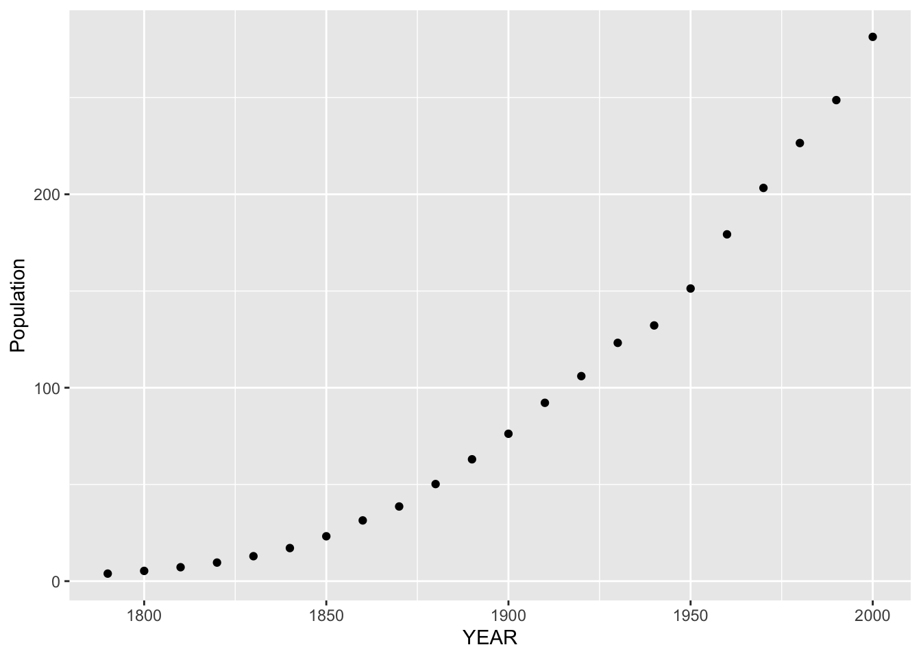
Obviously the population of the U.S. has been increasing over time and that’s the main message from this graph. But we already knew about the increasing population. We want to learn more. Specifically …
Can we describe how the population has increased over time? In other words, what is the pattern of growth of the U.S. population?
Once we have a handle on the rate of population growth, are there years where the population was different from this general pattern of growth?
14.1 Fitting a line to the population in the later years
Now the simplest model that we can fit to these data is a line. Can we fit a line effectively to this graph? No – one line won’t fit these data well. There is strong curvature in the plot for the early years of the U.S. history.
However, the graph for the later years looks pretty linear and it makes some sense to fit a line to the right-half of the plot. On the figure below, I’ve drawn a line by eye to the last nine points.
ggplot(us.pop, aes(YEAR, POP)) +
  geom_point() +
  ylab("Population") +
  geom_abline(slope = 2.3404, intercept = -4403.7)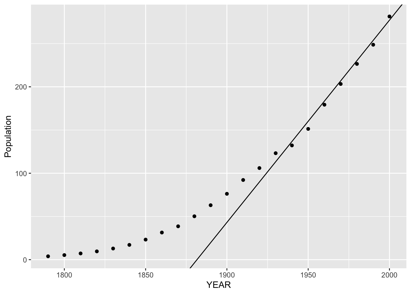
The equation of this line is \[ FIT = 2.3404 \, YEAR - 4403.7 \]
The slope is 2.3 which means that, for the later years (1930 – 2000), the population of the United States has been increasing by about 2.3 million each year.
After we have described the fit, then we look at the residuals. For each year, we compute
\[ RESIDUAL = POPULATION - FIT \] and we graph the residuals against the year.
us.pop %>%
  mutate(Fit = -4403.7 + 2.3404 * YEAR,
         Residual = POP - Fit) -> us.pop
ggplot(us.pop, aes(YEAR, Residual)) +
  geom_point() +
  geom_hline(yintercept = 0)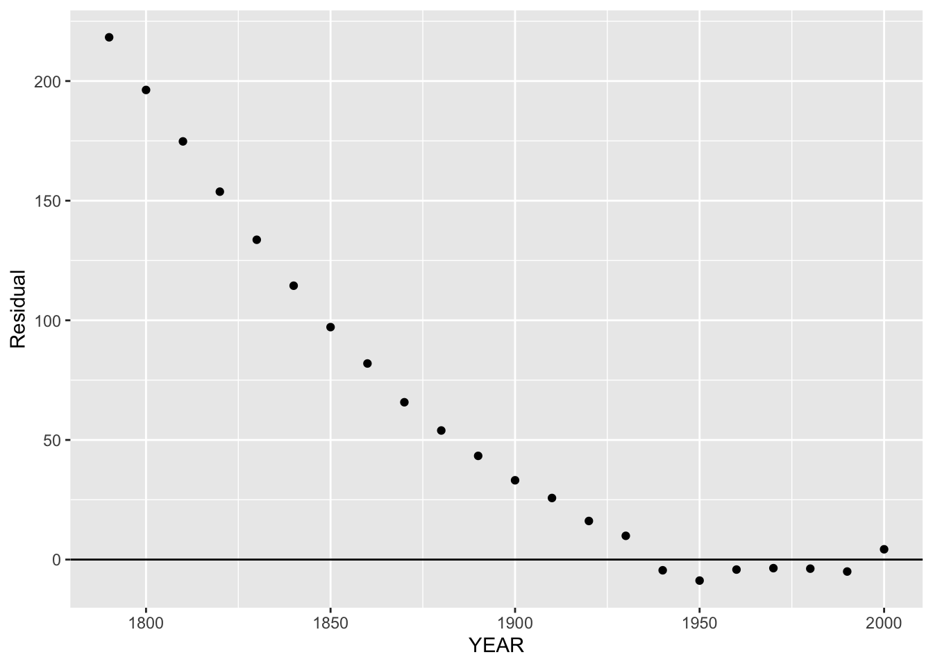
We notice the strong pattern in the residuals for the early years. This is expected, since the linear fit is only suitable for the population during the recent years. Actually, we don’t care about the large residuals for the early years – let’s look at the residual graph only for the later years.
ggplot(us.pop, aes(YEAR, Residual)) +
  geom_point() +
  geom_hline(yintercept = 0) +
  xlim(1930, 2000) + ylim(-10, 10)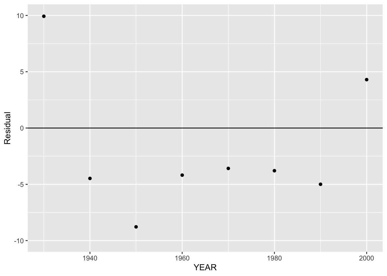
The residuals in this graph look relatively constant, with a few notable exceptions:
- There is a large residual in 1930 which means that the population is higher than what is predicted using the linear model.
- The residual in 1950 is smaller than the residuals in the surrounding years.
- The residual in 2000 is somewhat large.
Can we provide any explanation for these small or large residuals? The major event in the 1940’s was World War II. Many Americans participated in the war and I think this would account for some population decline – maybe this explains the small residual in 1950. The large residuals in 1930 and 2000 mean that the rate of population growth in these years was a bit higher than the 2.3 million per year. To me the large residual in 2000 is the most interesting – what is accounting for the extra population growth in the last ten years?
14.2 Fitting a line to the log population in the early years
Remember the curvature in the graph of population versus year that we saw in the early years? The interpretation of this curvature that the U.S. population growth in the early years was not linear but exponential. This means that the U.S. population was increasing at a constant rate during these formative years.
How can we summarize this exponential growth? First, we reexpress population by using a log – the figure below plots the log population against year.
us.pop %>% mutate(log.POP = log10(POP)) -> us.pop
ggplot(us.pop, aes(YEAR, log.POP)) +
  geom_point()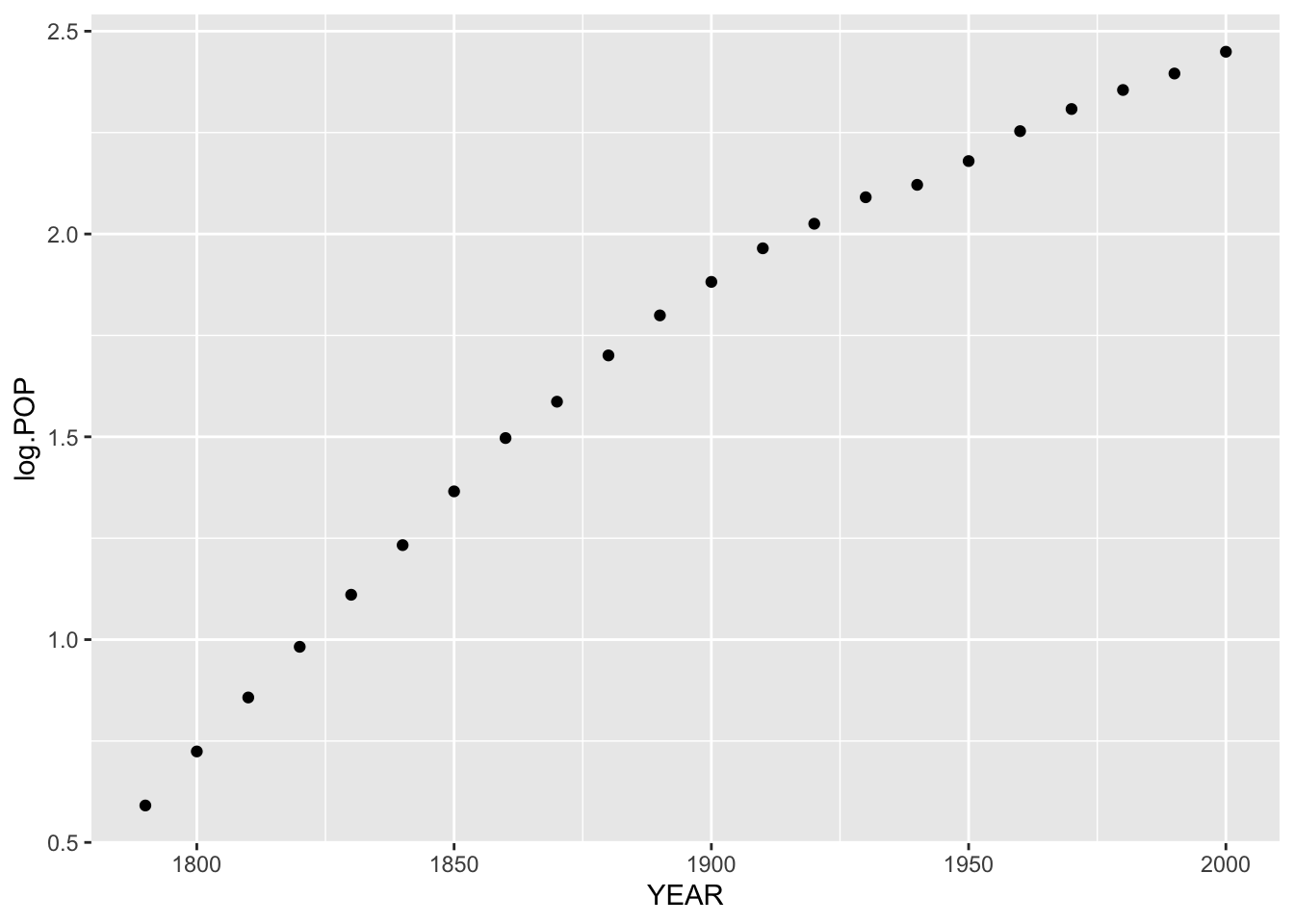
Looking at this plot, it looks pretty much like a straight-line relationship for the early years. So we fit a line by eye:
ggplot(us.pop, aes(YEAR, log.POP)) +
  geom_point() +
  geom_abline(slope = 0.0129, intercept = -22.455)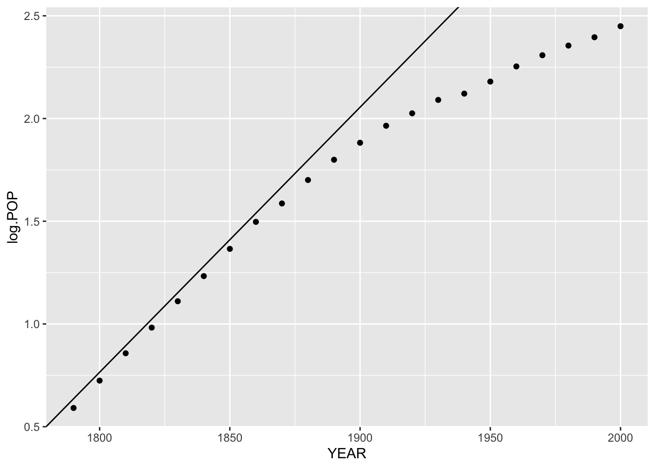
This line has slope .0129 and intercept \(-22.455\), so our fit for log population for the early years is
\[ FIT (log population) = .0129 year - 22.455. \]
If we take each side to the 10th power, then we get the relationship \[ FIT (population) = 10^{.0129 year - 22.455}. \]
Here \(10^{.0129} = 1.0301\), so the population of the U.S. was increasing by a 3 percent rate in the early years.
Looking further, we can compute residuals from our line fit to the (year, log population) data. Here the residual would be
\[ RESIDUAL = {\rm log \, population} - FIT ({\rm log \, population}). \]
Here is the corresponding residual plot.
us.pop %>%
  mutate(LogFit = -22.4553 + 0.0129 * YEAR,
         Residual = log.POP - LogFit) -> us.pop
ggplot(us.pop, aes(YEAR, Residual)) +
  geom_point() +
  geom_hline(yintercept = 0)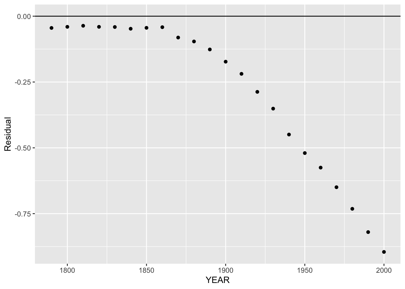
We focus our attention to the early years where the fit was linear.
ggplot(us.pop, aes(YEAR, Residual)) +
  geom_point() +
  geom_hline(yintercept = 0) +
  xlim(1790, 1900) +
  ylim(-0.2, 0.2)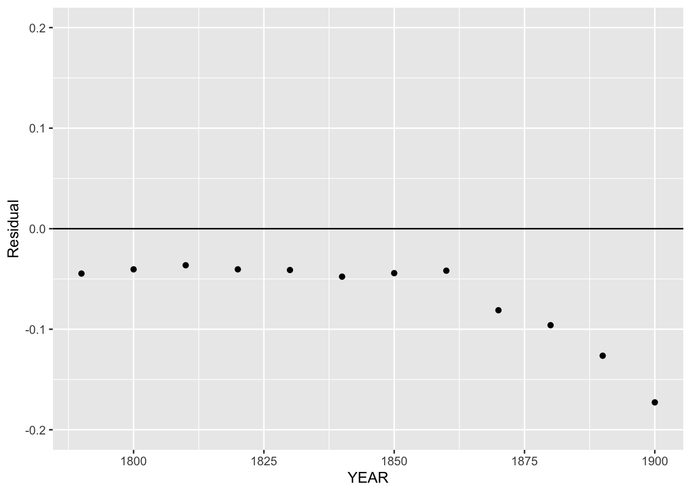
I don’t see any pattern in the residuals for the years 1790-1860, indicating that the line fit to the log population was pretty good in this time interval.