3 Working with a Single Batch – Displays
3.1 Meet the Data
Data: ACT Average Composite Scores by State, 2006-2007
Source: ACT, Inc. from the World Almanac and Book of Facts 2008.
One of the most important standardized tests given in the United States is the ACT exam. This test is used by many universities in deciding acceptance of prospective freshmen. The table below shows the ACT average composite score for 26 states. Here we are focusing only on the states where at least half of the high school graduates took this exam.
   State ACT State  ACT
         Avg       Avg
-------------------------------------
    AL  20.3  MO    21.6
    AR  20.5  MT    21.9
    CO  20.4  NE    22.1
    FL  19.9    NM  20.2
    ID  21.4    ND  21.6
    IL  20.5    OH  21.6
    IA  22.3    OK  20.7
    KS  21.9    SD  21.9
    KY  20.7    TN  20.7
    LA  20.1    UT  21.7
    MI  21.5    WV  20.6
    MN  22.5    WI  22.3
    MS  18.9    WY  21.5
3.2 The Basic Stemplot
Our first task in working with this batch of data is to organize it in some way so that we can see the distribution of ACT averages. A simple, yet effective display of a small amount of data is a stem and leaf diagram, or stemplot for short.
Here are the steps for drawing a stemplot.
- First, divide each data value into a stem and a leaf.
Here it is convenient to divide a ACT average, such as Alabama’s 20.3 value into a
stem of 20 and a leaf of 3.(Note: here we are dividing at the decimal point, but this won’t usually be the case.)
- Next, we write down all of the possible stems.
18
19
20
21
22- We record values by placing the leaf for each data item on its corresponding stem.
So Alabama’s 20.3 value is recorded as
18
19
20 3
21
22
We next record Arizona’s 20.5 value as
18
19
20 35
21
22- Continuing in this fashion, we record all 26 ACT averages.
 1 | 2: represents 1.2
 leaf unit: 0.1

     18 9
     19 9
     20 1234556777
     21 4556667999
     22 1335
Note that we have indicated the unit for each leaf. This is important since we have thrown away the decimal point in creating the stemplot. If we look at the stemplot, the first value is
18 9which we interpret as 189 (.1) = 18.9 since the unit is .1.
The stemplot is a quick way of grouping the averages. It resembles the better-known graphical display, the histogram. If you were to construct a histogram using the intervals 18-19, 19-20, and so on, you would obtain the following picture that resembles the stemplot above.
library(LearnEDAfunctions)
library(ggplot2)
ggplot(act.scores.06.07, aes(ACT)) +
  geom_histogram(breaks = 17:24,
                 color="black", fill="white")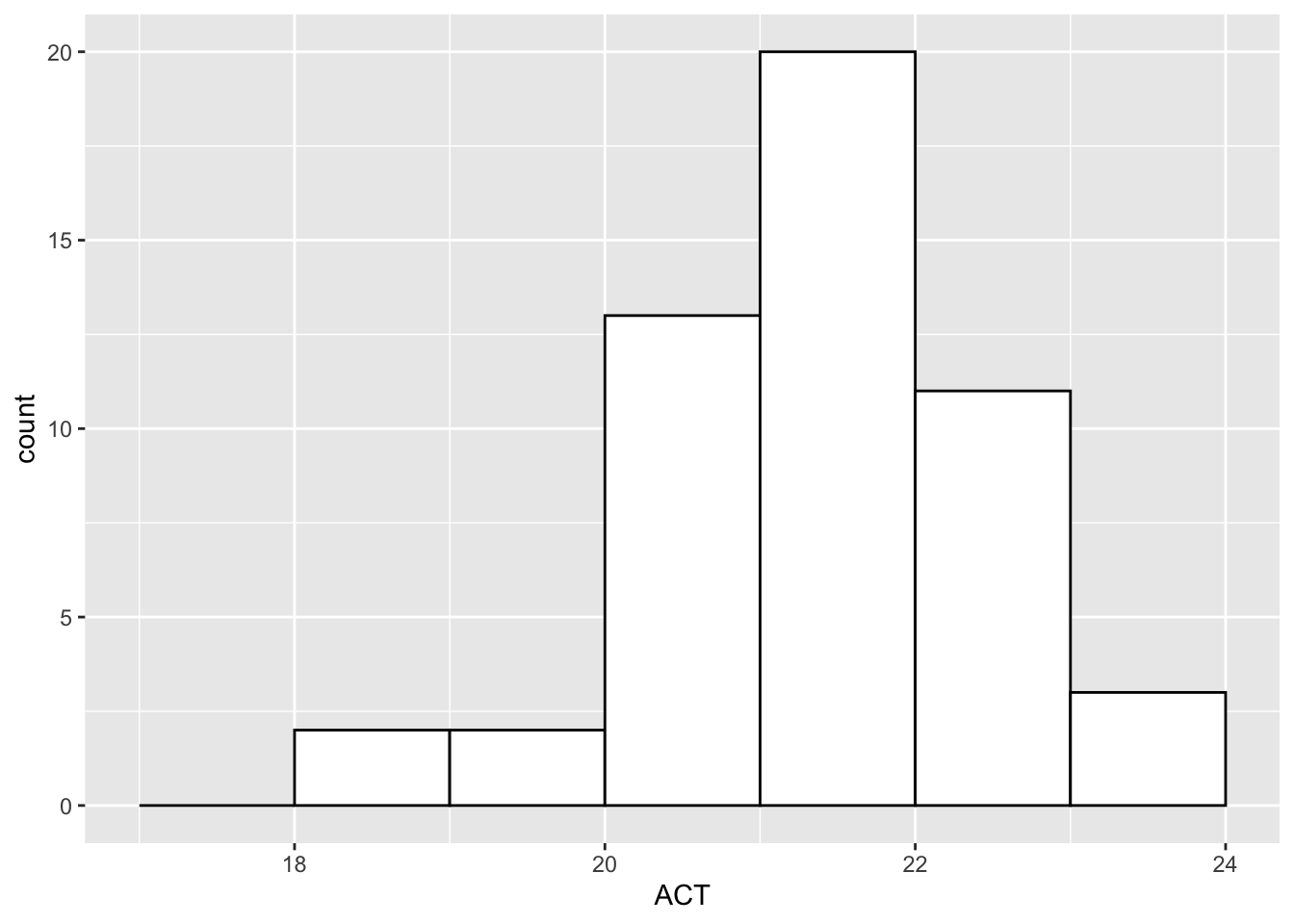
However, the stemplot has one strong advantage over a histogram. You can actually see the data values that fall in each interval. For example, we see that the last line contains the four largest ACT averages 22.1, 22.3, 22.3, 22.5 corresponding respectively to the states Nebraska, Iowa, Wisconsin, and Minnesota . In a histogram, we would lose this information about individual states when we group the data items in the individual classes.
3.3 Looking at a Data Distribution
What do we look for when we display data using a graph like a stemplot?
- First, we look at the general shape of the data. (The stemplot of the ACT averages has been redrawn below.)
     18 9
     19 9
     20 1234556777
     21 4556667999
     22 1335
Generally, we distinguish between three basic data shapes – symmetric, skewed right and skewed left.
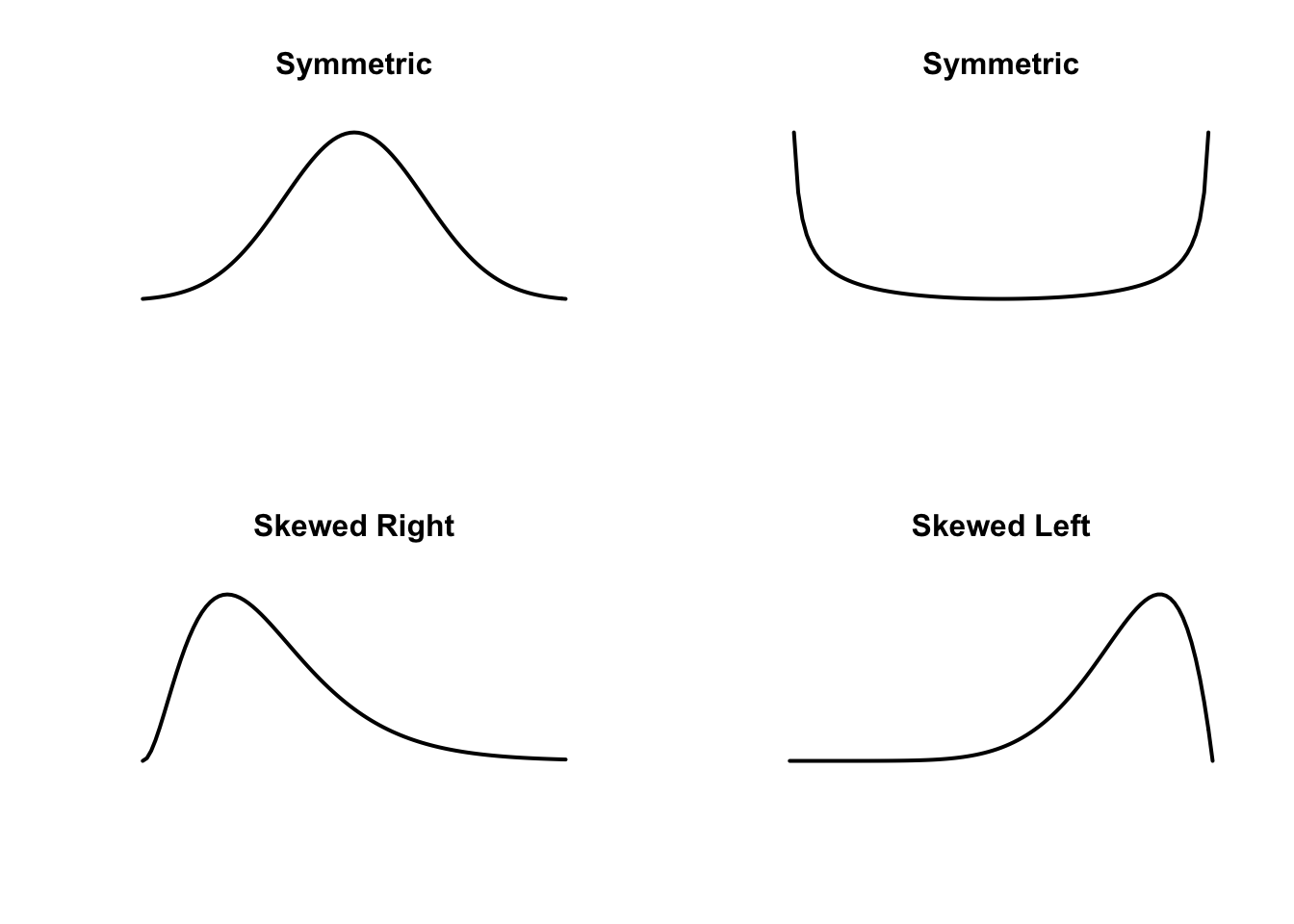
Symmetric is when the majority of the data is in the middle and the values drop off at the same rate at the low end and the right end. You can imagine dividing the data into two halves, where the left half is approximately a mirror image of the right half.
Skewed right is where the data values at the high end decrease at a much slower rate than the values at the low end. Conversely, skewed left is where the data values at the low end decrease at a slower rate than the values at the high end.
One can represent these three shapes by means of smoothed curves.
What can we say about our dataset? It is hard to tell (we will try alternative displays of these data to get a better look), but to me it appears somewhat skewed left. Most of the ACT averages fall in the 20-21 range and the values at the low end decrease at a slower rate than averages at the high end.
After we think about shape, we want to talk about a typical or average value}. We will later describe different types of “averages”, but we notice the large number of ACT averages in the 21 line, so 21.something would be a typical value.
Next, we describe the spread or variation in the data values. We see that most of the ACT averages fall between 20 and 22.1, with only a couple of states with averages below 20.
Last, we discuss any unusual data values or any distinctive features of this distribution. Here we might talk about
- unusually high or low values
- any gaps in the data
- the presence of several clusters of observations
- granularity in the data – possibly all of the data values end with an even last digit
Here we don’t see anything particularly unusual. The two low ACT averages were already mentioned. Part of the reason why we don’t see more is that we could improve our graphical display. This motivates talking about variations of the basic stemplot.
3.4 Stemplot variations – breaking the stem at different locations
In our stemplot, we formed the stem and leaf by dividing at the decimal point. But other break points are possible.
To illustrate, we could break Alabama’s 20.3 ACT average between the units and tens place:
2 | 03Then we would jot down Alabama’s value on the stemplot
     1
     2 0
Note that we use the one-digit leaf 0 – we drop off the last digit 2 in 03. (We typically draw stemplots using single digits for leaves.)
By the way, it is better to drop and not round. Rounding takes more time than dropping. Also it is easier to retrieve the original data from the stemplot when you drop digits.
With this breakpoint, we get the following display for the 26 ACT averages:
1 | 2: represents 12
 leaf unit: 1
      n: 26
   1  89
   2  000000000011111111112222
This is not a very effective display, since all the data is bunched up on only two lines.
Another possibility is to break an ACT average between the tenth and hundredth places. If we write Alabama’s value 20.3 as 20.30, we break as follows:
203 | 0Here there are quite a few possible stems – from 189 to 225. We could write down the corresponding display, but it would consist of 37 lines. Given that we have only 26 data values to show, it should be clear that the display would be stretched out too much.
3.5 Stemplot variations – 2, 5, and 10 leaves per stem
There is another choice in constructing a stemplot – the number of possible leaves on each stem. In our basic display (shown again)
     18 79
     19 69
     20 123345556777
     21 024455566667788999
     22 00011233355899
     23 125
there are 10 possible leaves on each line (that is, 0, 1, 2, …, 9), and so we call this display a stemplot with 10 leaves per stem.
One way of stretching out this display is to divide the ten possible leaves into a small group (0 through 4) and a large group (5 through 9). To draw this stemplot, we write down each stem twice
     18*
     18.
     19*
     19.
     20*
     20.
     21*
     21.
     22*
     22.
     23*
     23.
(the * indicates the first line and . the second) and then record the leaves
1 | 2: represents 1.2
 leaf unit: 0.1
        n: 26
    18. 9
    19*
    19. 9
    20* 1234
    20. 556777
    21* 4
    21. 556667999
    22* 133
    22. 5
We call this display a stemplot with 5 leaves per stem. I think this is a better graph than the 10-lines-per-stem since we see more structure. Now we see
- two clusters of observations – one cluster in the 20* line and a second in the 21. line. It might be reasonable to say that there are two modes or humps in the data.
- the 18.7 and 18.9 values appears to be somewhat low, since there is a gap between these ACT averages and the next largest
Another possible stemplot is to divide the 10 possible leaves in our basic display into 5 groups. We write the 18 line five times
  18*
    18t
    18f
    18s
    18.
The 0, 1 leaves are written on the first line (*), the 2, 3 leaves are put on the 2nd (t) line, the 4, 5 leaves on the (f) line, the 6, 7 leaves on the (s) line and the 8, 9 leaves on the (.) line. The use of the t, f, s labels is helpful, since TWO and THREE start with t, FOUR and FIVE start with f, and SIX and SEVEN start with s. (I guess this idea wouldn’t be helpful in drawing a stemplot with Chinese letters.)
We call this display a stemplot with 2 leaves per stem, since each line has two possible leaves. This stemplot for our data is shown below.
1 | 2: represents 1.2
 leaf unit: 0.1
            n: 26
   18. | 9
   19* |
     t |
     f |
     s |
   19. | 9
   20* | 1
     t | 23
     f | 455
     s | 6777
   20. |
   21* |
     t |
     f | 455
     s | 6667
   21. | 999
   22* | 1
     t | 33
     f | 5
Which is a better display, the previous one with 5 leaves per stem, or this one with 2 leaves per stem? This last display looks too spread out to me. You do see the two clusters in this 2-leaves-per-stem stemplot, but there are more gaps introduced since we stretched out the display.
3.6 Guidance in Constructing a Stemplot
In constructing a stemplot, there are two choices to make:
- how to break between the stem and leaf
- how many leaves per stem to use
It is best to try a few different stemplots and use the one that you think best represents the data. You will get some experience hand-drawing stemplots – every time you should try at least two displays. The second display is usually quick to draw once the first display is done.
3.7 Making the Stemplot Resistant
Let’s illustrate constructing stemplots using a second example. In our almanac (page 953), the the weights of the heaviest fish caught are listed for various species. I have jotted down the weights in pounds for the first 25 fish in the table (from Albacore to Summer Flounder):
88  155  85  21  26  13  10  563  78  31  19  18  21  23  135
98   35 133  88 113  94   9   36  20  22
To construct a stemplot, we first might trying breaking between the unit and the tens digits. If we do, we will get 56 lines, which won’t fit on a single page. The problem is that there is a single large weight 563 (corresponding to a Giant Sea Bass) which is larger than all of the remaining observations. We would like our display to be resistant or not distorted by a single large value. So what we do is to draw a stemplot of the values with the large value listed on a separate line labelled “HI”.
      0 9
      1 0389
      2 011236
      3 156
      4
      5
      6
      7 8
      8 588
      9 48
     10
     11 3
     12
     13 35
     14
     15 5

     HI  563,

     Unit = 1
This graph shows two clusters of weights, one in the 10-20 pound range, and a second in the 80’s. This display might spread out the data too much. So, as an alternative, let’s try breaking the data between the 10’s and 100’s places and using two leaves per stem.
       0* 01111
       0t 222222333
       0f
       0s 7
       0. 88899
       1* 1
       1t 33
       1f 5

       HI  563,

       Unit = 10
I like this display better than the previous one. I still see two basic clusters in the datasets separated by a gap. This means that many of the record fish weights are modest size (corresponding to small fish), a second group of weights correspond to moderate-size fish, and we can’t ignore the large weight of the Giant Sea Bass.
3.8 A Few Closing Comments
Although we have focused our discussion on the stemplot, it is not always the best graphical display. A stemplot is most effective for a dataset with no more than 50 values. If you have a larger dataset, it is likely that you would need too many stemplot lines. For large datasets, it is better to use a histogram.
It is instructive to experiment with different choices of breakpoint and leaves per stem to find the “best” stemplot. But it is handy to have a formula which gives a suggested stemplot for a given dataset.
Here is a useful rule-of-thumb. The stemplot should have L lines where
\[ L = [10 \log10(n)], \]
where \([ \, ]\) stands for the integer part of the argument.
How should we use this formula?
- Find the range R of the data and compute L.
- Divide R by L, and round the answer to 2, 5, or 10.
- This answer gives you the breakpoint and the number of leaves per stem.
Let’s illustrate this rule for our ACT scores. We have n = 26 scores and LO = 18.7, HI = 23.5.
The range is equal to
(R <- 23.5 - 18.7)## [1] 4.8and
(L <- floor(10 * log10(26)))## [1] 14So the ratio of R over L is given by
R / L## [1] 0.3428571which I round to 0.2 (it is closer to 0.2 than to 0.5) So the distance between the smallest value in two consecutive lines of the stemplot should be 0.2.
This rule tells us to use the display where we break 18.7 at the decimal point, and use two leaves per stem. This is the stemplot that started like
    18*
    18t
    18f
    18s 7
    18. 9
Actually, we decided that stemplot with 5 leaves per stem seemed better, but at least this rule gives us a stemplot that is close to the best one.