12 Introduction to Plotting
In this lecture, we introduce plotting of two-variable data and make some general comments about what we want to learn when we plot data.
12.1 Meet the data
Here is some data from one of the most famous track and field events, the Boston Marathon. This 26 mile race is run on Patriot’s Day every April. It receives a lot of attention in the media and runners from all over the world compete. The table below (from the 2001 ESPN Information Please Sports Almanac) gives the winning time in minutes of the men’s marathon for each year from 1950 to 2000. One interesting note is that the race has not always been the same length over the years. The length of the race was 26 miles, 385 through 1927-52 and all the years since 1957; it was (only) 25 miles, 958 yards in the years 1953-56.
This dataset is stored in boston.marathon.wtimes in the LearnEDAfunctions package.
library(LearnEDAfunctions)
library(tidyverse)
head(boston.marathon.wtimes)
## year minutes
## 1 1897 175
## 2 1898 162
## 3 1899 174
## 4 1900 159
## 5 1901 149
## 6 1902 16312.2 Graph the data
We are interested in how the race times change over the years. An obvious graph to make is a plot of TIME (vertical) against YEAR (horizontal) shown below. (This kind of graph is called a time-series plot, but we generally won’t give graphs special names.)
ggplot(boston.marathon.wtimes,
       aes(year, minutes)) +
  geom_point() +
  xlab("YEAR") + ylab("TIME")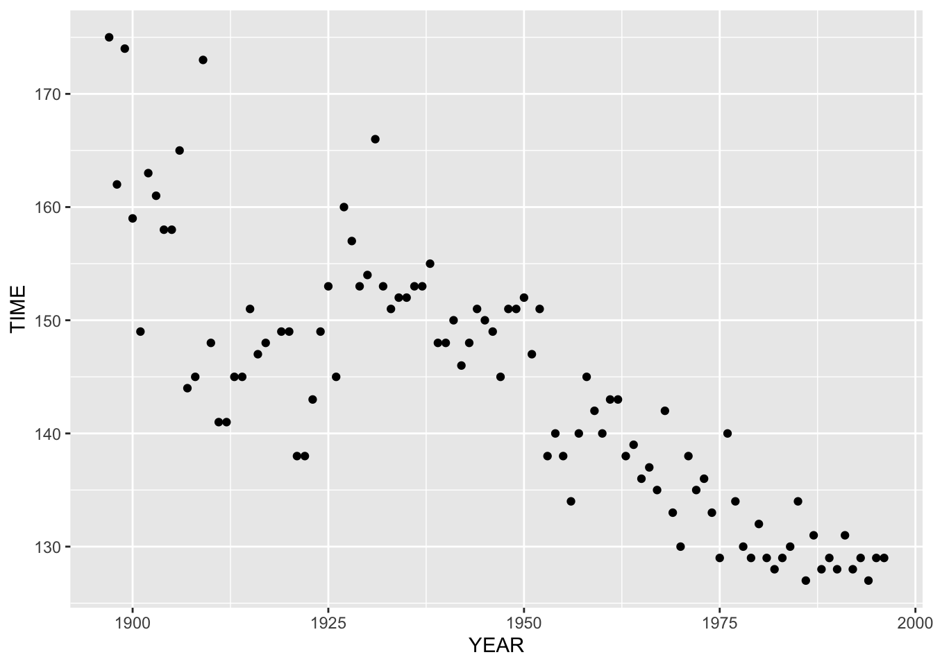
Looking at this graph, an obvious pattern is that the times are generally decreasing from 1950 to 2000. This means that the best runners are getting faster. We would notice this for practically all track-and-field events – athletes are improving due to better equipment, better training, etc.
When we see a pattern, we want to describe it in some detailed way. It is sort of obvious that runners are getting faster, but what is the rate of this change?
12.3 Describing the fit
To find the rate at which the runners are getting faster, we want to fit a curve to the data. The simplest type of curve that we can fit is a line and we focus on fitting lines in this class. The pattern in the above scatterplot looks approximately linear (straight-line), so it seems reasonable to fit a line. The figure below shows the scatterplot with a line fit on top.
ggplot(boston.marathon.wtimes,
       aes(year, minutes)) +
  geom_point() +
  geom_smooth(method = "lm", se = FALSE) +
  xlab("YEAR") + ylab("TIME")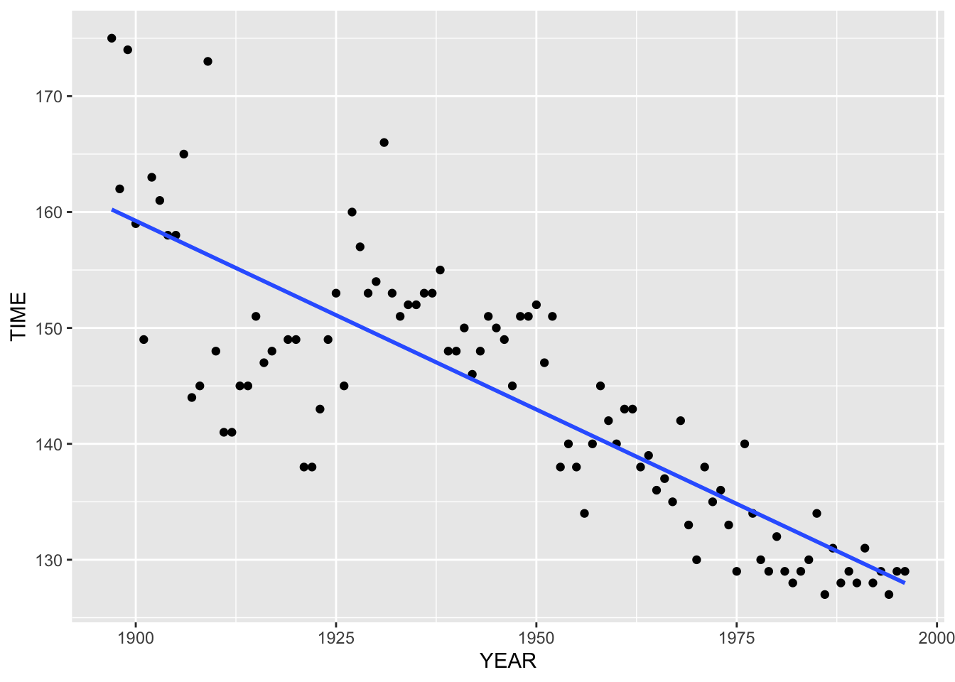
What is the interpretation of this line fit? The slope is \(m = -.3256\), so this means that the winning time in the marathon has generally been decreasing at a rate of .33 minutes (or about 20 seconds) per year. That’s a pretty large rate of decrease. One wonders if the winning time will continue to decrease at this rate for future years.
12.4 Looking at the residuals
We’ve summarized the basic pattern in our scatterplot by using a line. But now we wish to look deeper. Is there any structure in these data beyond what we see in the general decrease in the winning time over years? To look for deeper structure, we look at the residuals. A residual is the difference between the observed winning time and its fit – that is, \[ RESIDUAL = ACTUAL TIME - FIT . \] Here the fit is the line \[ FIT = -.3256 (YEAR - 1975) + 134.83 \] We construct a residual plot by graphing the residuals (vertical) against the time (horizontal). We add a reference line at residual = 0 – points close to this horizontal line are well-predicted using this fit.
boston.marathon.wtimes %>%
  mutate(FIT = -.3256 *
    (boston.marathon.wtimes$year - 1975) + 134.83,
    Residual = minutes - FIT) %>%
  ggplot(aes(year, Residual)) +
  geom_point() +
  geom_hline(yintercept = 0, color = "red") +
  xlab("YEAR")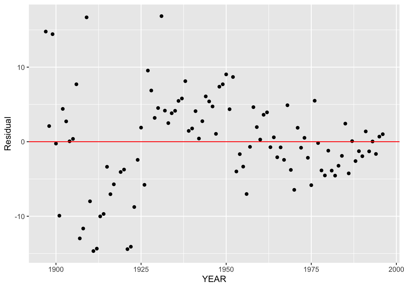
What do we see in this residual plot?
First, note that there is no general trend, up or down, in this plot. We have removed the trend by subtracting the fit from the times. Since there is no trend, our eye won’t be focusing at the general pattern that we saw earlier in our plot of time against year and we can look for deeper structure.
Although there is no general trend, I do notice a pattern in these residuals. The residuals for years 1950 until the early 1990’s seem to be equally scattered on both sides of zero. However, the last six residuals are all positive. This means that the linear fit underestimates the winning time for these recent years.
Remember our earlier remark that the distance for the Boston Marathon was slightly smaller for the years 1953-1956? Looking at the residual plot, note that the residuals for these four years are all negative. This is what we would expect given the shorter length of the race for these years.
Another pattern that I notice in this plot is that there is a change in the variability of the residuals across time. The residuals from 1950 to 1980 generally fall between -5 and 5 minutes. But the residuals for the years 1980 through 2000 fall in a much tighter band about 0, suggesting that there is smaller variation in these winning times.
Another thing we look for in this plot is any unusually large residuals (positive or negative). There are a couple of extreme values, say 1950 and 1951 (positive) and 1956 (negative). But the 1950 and 1951 outliers are explained by the larger variation in best winning times for these early years, and we just explained that the negative residual in 1956 was explained by the shorter distance of the race.
12.5 An alternative fit
The patterns in the residual plot suggest that maybe a line fit is not the best for these data. Later we will talk about a useful method called a resistant smooth of fitting a smooth curve through time series data.
We won’t talk about the details of this smooth yet, but here is the result of this smooth applied to our marathon data.
ggplot(boston.marathon.wtimes,
       aes(year, minutes)) +
  geom_point() +
  geom_smooth(method = "loess", span = 0.5,
              se = FALSE) +
xlab("YEAR") + ylab("TIME") 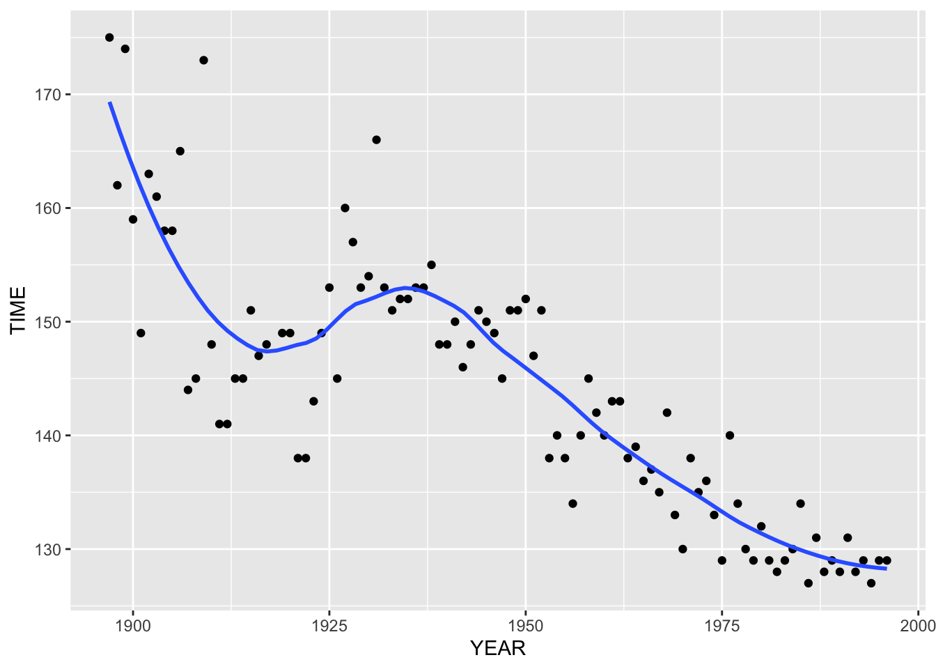
This smooth effectively shows some of the patterns in the graph that we observed earlier. There is a general decrease in the best winning time in the race over years. But …
- there is a dip in the graph in the mid-50’s – we explained earlier this was due to the shorter running distance
- there is a pretty steady decrease in the times between 1960 and 1980, although one might say that there is a leveling-off about 1970
- the times since 1980 have stayed pretty constant, suggesting that maybe there is a leveling off in performance in this race